antd-form-builder
The FormBuilder is a small helper (< 300 lines of source code) for building forms with React and ant.design easily while not preventing you from using the original antd form API.

Examples
You can see the live demo at: https://rekit.github.io/antd-form-builder
Philosophy
The key principle in my mind to create antd-form-builder is it should just help to define form fields and the layout while it doesn't reduce the flexibility of antd's original form API. So in simple patterns you can create a form very easily but if a form is much complicated you can still use the original form API. You can even use antd-form-builder together with the raw API in a mixed way.
Meta Driven
Besides the simplified API which helps to create form easily, the FormBuilder is also very useful if you have meta driven requirement. For example if your form structure needs to be configurable, the meta could be a pure JSON object which can be easily saved and managed separately.
Install
npm install --save-dev antd-form-builderUsage
The most simple usage is like below:
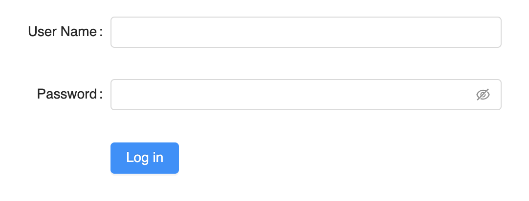
{ const meta = fields: key: 'username' label: 'User Name' key: 'password' label: 'Password' widget: 'password' return <Form> <FormBuilder meta=meta form=form /> <FormItem wrapperCol= span: 16 offset: 8 > <Button type="primary">Login</Button> </FormItem> </Form> }Then you get a form:
To see more examples, please go to https://rekit.github.io/antd-form-builder
API Reference
FormBuilder
Props:
| Name | Type | Description |
|---|---|---|
| form | object | The antd form instance, unnecessary in viewMode |
| meta | object/array | The meta for building the form. See below docs for detailed usage |
| viewMode | bool | In view mode, FormBuild uses viewWidget property for a field, show value directly if viewWidget not defined. And labels are left aligned in the form. Default to false. |
meta
meta property tells FormBuilder about all information of form structure.
Its basic structure is like below:
const meta = columns: 2 // how many columns to layout fields fields: // which fields in form;If meta is an array, it will be used as fields:
const realMeta = fields: meta If meta is an object without fields property, it's treated as a single field meta, so it will be converted to:
const realMeta = fields: meta Properties are list below:
| Name | Type | Default | Description |
|---|---|---|---|
| columns | number | 1 | How many columns of the form layout. |
| viewMode | bool | false | If in viewMode, will use viewWidget for field meta and labels are left aligned. You don't need to wrap FormBuilder in a Form in view mode. |
| formItemLayout | object/array | [8, 16] | The labelCol and wrapperCol passed to Form.Item. If it's an array, will be converted to { labelCol: { span: arr[0] }, wrapperCol: { span: arr[1] }}. If a filed has different layout, define it in its own meta. |
| disabled | bool | false | If true, all fields components will be given a disabled property. |
| initialValues | object | null | Set initialValues to the form, usually used in form which edit values or in viewMode. You can also set initialValue for each field. |
| fields | array | null | Fields definition for the form. See below info for how to define a field. |
| gutter | number | 0 | The gap between columns. |
Field meta
Field meta is used to define each field. Each field meta is an object defined in meta.fields. It's a central place to combine parameters to FormBuilder itself, <Form.Item> and getFieldDecorators. All options are listed below:
| Name | Type | Default | Description |
|---|---|---|---|
| key | string | Required. The field key. Could be nested like user.name.last. It's just the key value passed to getFieldDecorator(key, options) |
|
| label | string | Label text. | |
| viewMode | bool | false | Whether the field is in view mode. Note if a field is in viewMode but FormBuilder is not, the label in the field is still right aligned. |
| tooltip | string/React Node | If set, there is a question mark icon besides label to show the tooltip. | |
| widget | string/Component | Input | Which component used to render field for editing. The component should be able to be managed by antd form. |
| widgetProps | object | Props passed to widget. | |
| viewWidget | string/Component | text | Which component used to render field in view mode. |
| viewWidgetProps | object | Props passed to viewWidget | |
| formItemLayout | object/array | [8, 16] | This applies formItemLayout only to this field rather than which defined in the root meta. |
| render | function | If provided, this is used for rendering the whole field in both edit and view mode, should render <Form.Item>, getFieldDecorator itself. widget property will be ignored. |
|
| renderView | function | If provided, this is used for rendering field value in view mode, viewWidget will be ignored. |
|
| colSpan | number | 1 | How many columns the field should take up. |
| initialValue | any | The initialValue to be passed to the field widget. In view mode, it's the value to be display. | |
| getInitialValue | func(field, initialValues, form) | Get the initialValue of the field. This may be used to combine multiple fields into one field |
|
| disabled | bool | false | If set to true, every widget in field will be given a disabled property regardless of if it's supported. |
| clear | enum | In multiple columns layout, used to clear left, right or both side fields. Like the clear property in css. Could be left: the field starts from a new row; right: no fields behind the field; both: no other fields in the same row. |
|
| forwardRef | bool | If your field widget is a funcional component which doesn't implement forwardRef, set this to true so that React doesn't prompt warning message. | |
| noFormItem | bool | false | By default, each field is wrapped with <Form.Item>, if set to true, it just use `getField |
| children | ReactNode | The children of widget defined in meta. |
|
| required | bool | false | Whether the field is required. |
| message | string | If a field is required, you can define what message provided if no input. By default, it's ${field.label} is required. |
|
| options | array | Only used by select, radio-group. checkbox-group components, explained below. | |
| formItemProps | object | The props passed to <Form.Item>. Below properties are short way to pass props to <Form.Item>. See more from antd's doc | |
| colon | bool | true | Used with label, whether to display : after label text. |
| extra | string/ReactNode | The extra prompt message. It is similar to help. Usage example: to display error message and prompt message at the same time. | |
| hasFeedback | bool | false | Used with validateStatus, this option specifies the validation status icon. Recommended to be used only with Input. |
| help | string/ReactNode | The prompt message. If not provided, the prompt message will be generated by the validation rule. | |
| htmlFor | string | Set sub label htmlFor. |
|
| labelCol | object | The layout of label. You can set span offset to something like {span: 3, offset: 12} or sm: {span: 3, offset: 12} same as with <Col>. |
|
| validateStatus | string | The validation status. If not provided, it will be generated by validation rule. options: 'success' 'warning' 'error' 'validating' | |
| wrapperCol | object | The layout for input controls, same as labelCol. |
|
| fieldProps | object | The options to pass to getFieldDecorator(id, options). Below properties are short way to pass options to getFieldDecorator(id, options). See more from antd's doc |
|
| getValueFromEvent | function(..args) | Specify how to get value from event or other onChange arguments | |
| getValueProps | function(value) | Get the component props according to field value. | |
| normalize | function(value, prevValue, allValues) | Normalize value to form component | |
| preserve | bool | true | Keep the field even if field removed.NOTE: the default value is true for FormBuilder. |
| rules | object[] | Includes validation rules. Please refer to "Validation Rules" part for details. | |
| trigger | string | 'onChange' | When to collect the value of children node |
| validateFirst | bool | true | Whether stop validate on first rule of error for this field. NOTE: the default value is true for FormBuilder. |
| validateTrigger | string / string[] | 'onChange' | When to validate the value of children node. |
| valuePropName | string | Props of children node, for example, the prop of Switch is 'checked'. |
Use String Key to Define a Widget
To define the widget for a field, you can use either a string which maps to a widget or a react component directly.
const meta = key: 'name' label: 'Name' widget: 'input'// orconst meta = key: 'name' label: 'Name' widget: Input The reason why you can use a string for widget property is because there are some key-component mapping pre-defined in antd-form-builder/defineAntdWidget.js. Normally you can use a component for widget/viewWidget property of a field meta, but sometimes it's more convenient to use string so that you don't need to import the component while defining meta. And it's especially useful if you want to save meta in some config json.
The predefined components are list below:
| key | Component | meta convention |
|---|---|---|
| input | Input | |
| password | Input.Password | |
| textarea | Input.TextArea | |
| number | InputNumber | |
| select | Select | Typically you need to provide children property for Option array to the field meta metioned above. To make it easy to use, you can provide an options array to the field meta, internally it will be convented to children property. Explained below. |
| date-picker | DatePicker | |
| radio | Radio | |
| checkbox | CheckBox | |
| checkbox-group | CheckBox.Group | Use options for children, same as select. |
| switch | Switch | |
| radio-group | Radio.Group | Use options for children, same as select. Also you can set buttonGroup to true for tab button style instead of radio style. |
| button | Button |
options
options is a special field meta just mentioned. It's only used for select, checkbox-group or radio-group. You can define children by options in 3 formats:
-
[opt1, opt2, opt3, ...], here value and label are same as opt1, opt2, opt3.... -
[[value1, label1], [value2, label2], ...] -
[{value: 'v1', label: 'label1'}, {value: 'v2', label: 'label2'}, ...]
Extend FormBuilder: Define Keys for Your Components
Besides built-in pre-defined components, you can define your own by FormBuilder.defineWidget static method like below:
const MyComp = {...}FormBuilderThen you can use it:
const meta = key: 'comp' label: 'Comp' widget: 'my-comp' This mechanism not only makes it easy to define meta easily in your project, but also useful if you want your meta could be pure JSON object.
FormBuilder.defineWidget(key, component, metaConvertor)
Define the key for a widget so that you can use string key in the meta like 'date-picker', 'select'. You can also provide a meta convertor to to provide easier way to give props to the widget.
key
string key to used for the widget
component :
The react component to used in form field
metaConvertor
function, convert field meta to a new meta.
For example: to make it easier to define a Select widget for the field, FormBuilder uses below code internally:
const mapOptions = { if !_ throw 'Options should be array in FormBuilder meta.' return options} FormBuilderThen you can define options for select component with below meta:
const meta = key: 'select' label: 'Select' options: 'opt1' 'opt2'Here options property from meta is converted to chilren property to Select component. You can define options in two mode:
value1 label1 value2 label2// orvalueAndLabel1 valueAndLabel2Otherwise without metaConvertor, you have to define your meta like below:
const meta = key: 'select' label: 'Select' children: 'opt1' 'opt2';So if you define you own widget, you can give a metaConvertor to provide a convenient way to define field widget.
Contribute
Local development
This project is bootstraped by create-react-library. To start development locally, follow below steps:
# 1. Clone repo git clone https://github.com/rekit/antd-form-builder.git # 2. Install dependencies cd antd-form-buildernpm install # 3. Run rollup in watch mode npm start # 4. Start example dev server (in anther tab) cd examplenpm startNow, anytime you make a change to your library in src/ or to the example app's example/src, create-react-app will live-reload your local dev server so you can iterate on your component in real-time.
Build examples
cd examplesnpm run buildThis will build examples into root docs folder which is used as gh-pages root. So after build, commit or pr the changes to the repo.
License
MIT © supnate