angular2-time-duration-picker
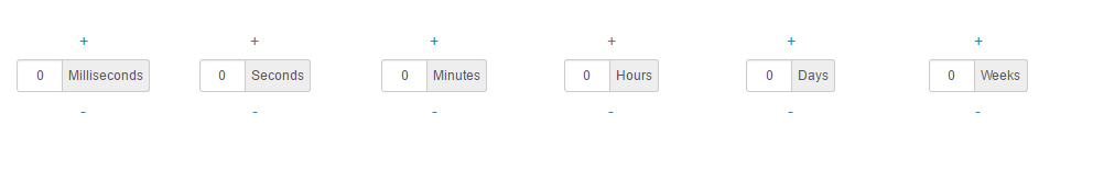
A generic time duration picker Angular component (v. 2.0.0+) for Twitter Bootstrap
Installation
To install this library, run:
$ npm install angular2-time-duration-picker --saveRequirements
UI Dependency
- Twitter Bootstrap (3.3.5+)
usage
Import the TimeDurationPickerComponent in your app.module and add it to the declarations array.
Alternatively, you can import the TimeDurationPickerComponent to a shared module, to make it available across all modules in your Angular application.
You need to import the Angular FormsModule and ReactiveFormsModule as well.
and then from your Angular AppModule:
;; ; // Import the library; Once your library is imported, you can use its components in your Angular application:
Add the time-duration-picker component to the page where you want to use the picker, with disired Time unit time-duration-picker-unit.
time-duration-picker Field Schema
| Attribute | Type | Required | Description |
|---|---|---|---|
| returnedValueUnit | [input] String | No | The unit of returned Value. default: 'second' |
| inputDisabled | [input] Boolean | No | Defines if the input input should be disabled / editable by the user. default: true |
| onChange | (output) Number | No | The onChange event of the component. Emits the value of the picker every time the user has clicked the - or + button. |
time-duration-picker-unit Field Schema
| Attribute | Type | Required | Description |
|---|---|---|---|
| name | [input] String | Yes | The units of the picker, supported values: 'week', 'day', 'hour', 'minute', 'second' and 'millisecond' |
| label | [input] String | No | The label of the picker, default: name capitalized |
| min | [input] number | No | The Minimum value can be set, default: 0 |
| max | [input] number | No | The Maximum value can be set, default: (check the code) |
| step | [input] number | No | The step value, default: 1 |
| inputDisabled | [input] Boolean | No | Defines if the input input should be disabled / editable by the user. default: true |
| onChange | (output) Number | No | The onChange event of the component. Emits the value of the picker every time the user has clicked the - or + button. |
License
MIT © Mohammad Nuairat