ac-react-simple-image-slider
A simple image slider built with React, emotion and hooks

Install
npm install --save ac-react-simple-image-slideror
yarn add ac-react-simple-image-sliderUsage
View raw code
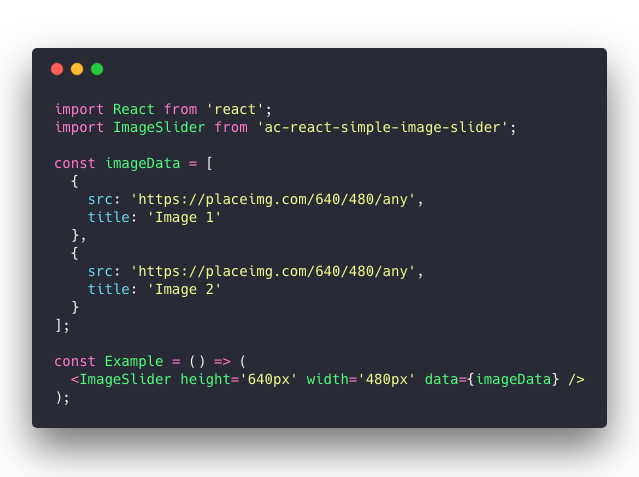
import React from 'react';import ImageSlider from 'ac-react-simple-image-slider'; const imageData = src: 'https://placeimg.com/640/480/any' title: 'Image 1' src: 'https://placeimg.com/640/480/any' title: 'Image 2' ; const Example = <ImageSlider ='640px' ='480px' = />;Props
| Name | Type | Default | Description |
|---|---|---|---|
| initialIndex | number |
0 |
The index of the initial slide image. 0 points to first slide image. |
| height | string |
100% |
Custom slider height. e.g.: 640px |
| width | string |
100% |
Custom slider width. e.g.: 480px |
| data | arrayOfObject |
[] |
(required) Slider images array. |
| -> src | string |
- |
(required) Slider item image URL. |
| -> title | string |
- |
(required) Slider item title. This also be used for alternative image text. |
| showArrows | bool |
true |
Whether the navigation arrows will display or not |
| showDots | bool |
true |
Whether the dots will display bottom of the slider or not |
| autoPlay | bool |
true |
(optional) Whether the slideshow should start automatically |
| duration | number |
3 |
(optional) How long wait (seconds) before the next transition starts. It also uses by animation duration |
| infinite | bool |
false |
(optional) Whether the transition should loop throughout |
| elementWrapperStyles | object |
null |
(optional) Slide image wrapper styles |
| itemStyles | object |
null |
(optional) Slide image style |
Todo
- Tests
- Add following props:
| Name | Type | Default | Description |
|---|---|---|---|
| dotComponent | node |
null |
Custom component for the dots |
| leftArrowComponent | string |
< |
Custom left arrow |
| rightArrowComponent | string |
> |
Custom right arrow |
License
MIT © abdullahceylan