Modal
Message box that is displayed on top of your screen.


❇ Introduction
React Native component that that is displayed on top of the screen. Modals put an overlay on the screen; therefore, they take visual precedence over all the other elements.
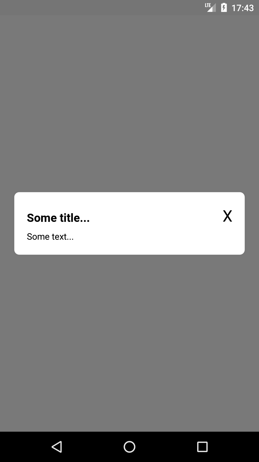
🖼 Gallery

❓ How to use
- Install the component
$ npm install --save @wniemiec-component-reactnative/modal
- Import the component
import Modal from '@wniemiec-component-reactnative/modal';
- Use it
[...]

import React, { useState } from 'react';
import { View } from 'react-native';

[...]

const [visible, setVisible] = useState(true);

[...]

<View style={{ display: 'flex', flex: 1, justifyContent: 'center', alignItems: 'center' }}>
  <Modal visible={visible} setVisible={setVisible} title='Some title...'>
	<Text>Some text...</Text>
  </Modal>
</View>

[...]
📖 Documentation
| Property | Type | Description | Default |
|---|---|---|---|
| visible | object |
Indicates whether the modal should be displayed | - |
| setVisible | function(void): void |
Function that is called when the close button is pressed indicating that the modal should no longer be visible | - |
| style | string |
Custom style | null |
| title | string |
Modal title | "" |
🚩 Changelog
Details about each version are documented in the releases section.
🤝 Contribute!
See the documentation on how you can contribute to the project here.
📁 Files
/
| Name | Type | Description |
|---|---|---|
| docs | Directory |
Documentation files |
| src | Directory |
Source files |