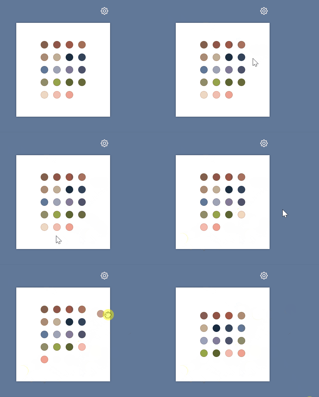
svelte-use-drop-outside
Svelte action to drop an element outside an area and more...
Demo
Installation
yarn add @untemps/svelte-use-drop-outsideUsage
Basic usage
<script>
    import { useDropOutside } from '@untemps/svelte-use-drop-outside'

    const _onDropOutside = (node) => {
        console.log(`You\'ve just dropped #${node.id} outside the area`)
    }
</script>

<main>
    <div class="container">
        <div class="area">
            <div
                id="target"
                use:useDropOutside={{
                    areaSelector: '.area',
                    onDropOutside: _onDropOutside,
                }}
                class="target"
            >
                Drag me outside the white area
            </div>
        </div>
    </div>
</main>

<style>
    main {
        display: flex;
        align-items: center;
        justify-content: center;
        height: 100%;
        padding: 1rem;
        background-color: #617899;
    }

    .container {
        max-width: 640px;
        display: flex;
        flex-direction: column;
        align-items: center;
        row-gap: 3rem;
    }

    .area {
        width: 300px;
        height: 300px;
        display: flex;
        align-items: center;
        justify-content: center;
        background-color: white;
        box-shadow: 0 0 5px 0 rgba(0, 0, 0, 0.5);
    }

    .target {
        width: 10rem;
        background-color: black;
        color: white;
        text-align: center;
        display: flex;
        align-items: center;
        justify-content: center;
        padding: 1rem;
    }
</style>
API
| Props | Type | Default | Description |
|---|---|---|---|
areaSelector |
string | null | Selector of the element considered as the "inside" area. |
dragImage |
element or object or string | null | The image used when the element is dragging. |
dragClassName |
string | null | A class name that will be assigned to the dragged element. |
animate |
boolean | false | A flag to enable animation back. |
animateOptions |
object | { duration: .2, timingFunction: 'ease' } | Optional options for the animation back (see Animation Options). |
dragHandleCentered |
boolean | false | A flag to handle the dragged element by its center. |
onDropOutside |
function | null | Callback triggered when the dragged element is dropped outside the area. |
onDropInside |
function | null | Callback triggered when the dragged element is dropped inside the area |
onDragCancel |
function | null | Callback triggered when the drag is cancelled (Esc key) |
Area Selector
You can define the DOM element which will be treated as the "inside" area by passing the selector of this element.
When dropping the dragged element, the action reconciles the boundaries of this element with the boundaries of the area to assert inside/outside stuff.
When pressing the Escape key, wherever the dragged element is, it is put back to its original position.
Drag Image
By default, the action clones the target element and sets its opacity to 0.7.
Alternately, you may use the dragImage prop to customize the image displayed during the drag.
The dragImage prop may be:
A DOM element such a <img> or a <template>:
<main>
    <div class="container">
        <div class="area">
            <div
                id="target"
                use:useDropOutside={{
                    areaSelector: '.area',
                    dragImage: document.querySelector('#drag-image'),
                }}
                class="target"
            >
                Drag me outside the white area
            </div>
        </div>
    </div>
</main>
<img id="drag-image" src="./assets/drag-image.png" alt="Dragging image" width="48" height="48"/>
An object with 3 properties:
| Props | Description |
|---|---|
src |
Path of the image. |
width |
Width of the image (optional). |
height |
Height of the image (optional). |
<main>
    <div class="container">
        <div class="area">
            <div
                id="target"
                use:useDropOutside={{
                    areaSelector: '.area',
                    dragImage: {
                        src: './assets/drag-image.png',
                        width: 48,
                        height: 48
                    },
                }}
                class="target"
            >
                Drag me outside the white area
            </div>
        </div>
    </div>
</main>
A string as path of the image:
<main>
    <div class="container">
        <div class="area">
            <div
                id="target"
                use:useDropOutside={{
                    areaSelector: '.area',
                    dragImage: './assets/drag-image.png',
                }}
                class="target"
            >
                Drag me outside the white area
            </div>
        </div>
    </div>
</main>
Drag styles
You may assign a class to the dragged element to customize its display, whether it is a clone of the target element or it is an image, by using the dragClassName prop.
The class declaration will be parsed and set to the style attribute of the dragged element to avoid priority issues. Thus, you are guaranteed your custom styles override the previous values.
Please note the class has to be global
<main>
    <div class="container">
        <div class="area">
            <div
                id="target"
                use:useDropOutside={{
                    areaSelector: '.area',
                    dragClassName: 'custom-drag',
                }}
                class="target"
            >
                Drag me outside the white area
            </div>
        </div>
    </div>
</main>

<style>
    .target {
        background-color: black;
    }

    :global(.custom-drag) {
        opacity: .5;
        background-color: red;
    }
</style>
Animation
By default, when the dragged element is dropped inside the area or if the drag is cancelled, the dragged element is plainly removed.
When setting the animate to true, when those events happen, the dragged element is smoothly moved back to its original position.
Animation Options
The animation can be configured through the animateOptions prop:
| Argument | Type | Default | Description |
|---|---|---|---|
| duration | number | .2 | Duration of the animation (in seconds). |
| timingFunction | string | 'ease' | Function that defines the animation effect (see animation-timing-function). |
Center Drag Handle
In some cases, usually when you customize the dragged element, through the dragImage or the dragClassName prop, you may want to center the dragged element under the pointer when moving to avoid weird behaviours.
Same regarding the position the dragged element has to move back when it is dropped.
The dragHandleCentered prop allows to control the way the dragged element is handled:
- If
true, the center point the dragged element will be used. - If
false, the top left point of the dragged element will be used.
Callbacks
All callbacks are triggered with the following arguments:
| Argument | Description |
|---|---|
| [0] | Dragged element. |
| [1] | Element considered as the "inside" area. |
const _onDropOutside = (node, area) => {
  console.log(`You\'ve just dropped #${node.id} outside the #${area.id}`)
}

const _onDropInside = (node, area) => {
  console.log(`You\'ve just dropped #${node.id} inside the #${area.id}`)
}

const _onDragCancel = (node, area) => {
  console.log(`You\'ve just cancelled the drag of #${node.id} against #${area.id} boundaries`)
}
Recipes
Switching Container
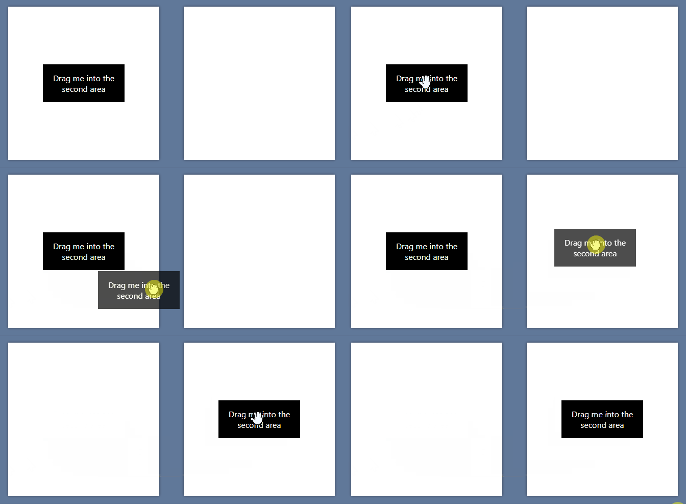
You may use the action to implement a classic drag and drop container switch using the onDropInside callback:
<script>
    import { useDropOutside } from '@untemps/svelte-use-drop-outside'

    const _onDropInside = (node, area) => {
        area.appendChild(node)
    }
</script>

<main>
    <div class="container">
        <div id="origin-area" class="area">
          <div
            id="target"
            use:useDropOutside={{
                areaSelector: '#destination-area',
                onDropInside: _onDropInside,
            }}
            class="target"
          >
            Drag me into the second area
          </div>
        </div>
        <div id="destination-area" class="area"></div>
    </div>
</main>

<style>
    main {
        display: flex;
        align-items: center;
        justify-content: center;
        height: 100%;
        padding: 1rem;
        background-color: #617899;
    }

    .container {
        max-width: 640px;
        display: flex;
        flex-direction: row;
        align-items: center;
        gap: 3rem;
    }

    .area {
        width: 300px;
        height: 300px;
        display: flex;
        align-items: center;
        justify-content: center;
        background-color: white;
        box-shadow: 0 0 5px 0 rgba(0, 0, 0, 0.5);
    }

    .target {
        width: 10rem;
        background-color: black;
        color: white;
        text-align: center;
        display: flex;
        align-items: center;
        justify-content: center;
        padding: 1rem;
    }
</style>
Development
The action can be served for development purpose on http://localhost:5000/ running:
yarn devContributing
Contributions are warmly welcomed:
- Fork the repository
- Create a feature branch
- Develop the feature AND write the tests (or write the tests AND develop the feature)
- Commit your changes using Angular Git Commit Guidelines
- Submit a Pull Request


