


[!NOTE] This is one of 192 standalone projects, maintained as part of the @thi.ng/umbrella monorepo and anti-framework.
🚀 Please help me to work full-time on these projects by sponsoring me on GitHub. Thank you! ❤️
Immediate mode GUI with flexible state handling & data only shape output.
Currently still somewhat bare-bones, but already usable & customizable immediate mode GUI implementation, primarily for @thi.ng/hdom-canvas / @thi.ng/hiccup-canvas and @thi.ng/webgl, however with no direct dependency on either and only outputting data structures.
IMGUI components are largely ephemeral and expressed as simple functions, producing a visual representation of a user state value. IMGUIs are reconstructed from scratch each frame and don't exist otherwise (apart from some rudimentary input state & config). If a component's function isn't called again, it won't exist in the next frame shown to the user. Components only return a new value if an user interaction produced a change. Additionally, each component produces a number of shapes & text labels, all of which are collected internally and are, from the user's POV, a mere side effect. At the end of the update cycle IMGUI produces a tree of @thi.ng/hiccup-canvas compatible elements, which can be easily converted into other formats (incl. SVG).
Note: The WebGL conversion still in the early stages and not yet published, pending ongoing development in other packages...
- No direct user state mutation (unlike most other IMGUI impls)
- Flexible & nestable grid layout with support for cell-spans
- Theme stack for scoped theme switches / overrides
- Stack for scoped disabled GUI elements & to create modals
- Hashing & caching of component local state & draws shapes / resources
- Hover-based mouse cursor overrides
- Hover tooltips
- Re-usable hover & activation behaviors (for creating new components)
- Fully keyboard controllable & Tab-focus switching / highlighting
- All built-in components based on @thi.ng/geom shape primitives
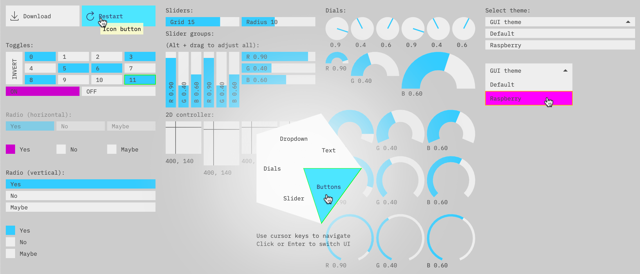
The above screenshot shows most of the currently available components:
- Push button (horizontal / vertical)
- Icon button (w/ opt text label)
- 2x dial types & dial groups (h / v)
- Dropdown
- Radial menu
- Radio button group (h / v)
- Slider & slider groups (h / v)
- Text input (single line, filtered input)
- Text label
- Toggle button
- XY pad
All components are:
- Skinnable (via theme)
- Keyboard controllable (incl. focus switching)
- Support tooltips
All built-in components only return a result value if the component was interacted with and would result in a state change (i.e. a slider has been dragged or button pressed). So, unlike the traditional IMGUI pattern (esp. in languages with pointer support), none of the components here directly manipulate user state and this task is left entirely to the user. This results in somewhat slightly more verbose code, but offers complete freedom WRT how user state is & can be organized. Also, things like undo / redo become easier to handle this way.
import { Atom, History } from "@thi.ng/atom";
import { toggle } from "@thi.ng/imgui";

// example state (see @thi.ng/atom)
const STATE = new History(new Atom({ foo: true }));

//...IMGUI initialization omitted here

// get atom snapshot
const curr = STATE.deref();

// toggle component will only return result if user clicked it
let res = toggle(gui, layout, "foo", curr.foo, false, curr.foo ? "ON" : "OFF");
// conditional immutable update (w/ automatic undo snapshot)
res !== undefined && STATE.resetIn("foo", res);Most component functions exist in two versions: Using a
@thi.ng/layout-compatible
grid layout manager or not (e.g. dial vs. dialRaw). The latter
versions are more "low-level" & verbose to use, but offer complete
layout freedom and are re-used by other component types.
The components in this package not needing a layout manager are only
expecting a ILayout or IGridLayout interface, allowing for custom
implementations. Furthermore / alternatively, the
@thi.ng/layout
package also defines a LayoutBox
interface,
which can be passed instead and too is the type ILayout
implementations are expected to produce when allocating space for a
component.
The GridLayout class supports infinite nesting and column/row-based
space allocation, based on an initial configuration and supporting
multiple column/row spans.
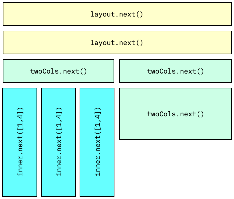
The code producing this structure:
// create a single column layout @ position 10,10 / 200px wide
// the last values are row height and cell spacing
const layout = gridLayout(10, 10, 200, 1, 16, 4);

// get next layout box (1st row)
// usually you don't need to call .next() manually, but merely pass
// the layout instance to a component...
layout.next();
// { x: 10, y: 10, w: 200, h: 16, cw: 200, ch: 16, gap: 4 }

// 2nd row
layout.next();
// { x: 10, y: 30, w: 200, h: 16, cw: 200, ch: 16, gap: 4 }

// create nested 2-column layout (3rd row)
const twoCols = layout.nest(2);

twoCols.next();
// { x: 10, y: 50, w: 98, h: 16, cw: 98, ch: 16, gap: 4 }

twoCols.next();
// { x: 112, y: 50, w: 98, h: 16, cw: 98, ch: 16, gap: 4 }

// now nest 3-columns in the 1st column of twoCols
// (i.e. now each column is 1/6th of the main layout's width)
const inner = twoCols.nest(3);

// allocate with col/rowspan, here 1 column x 4 rows
inner.next([1, 4])
// { x: 10, y: 70, w: 30, h: 76, cw: 30, ch: 16, gap: 4 }
inner.next([1, 4])
// { x: 44, y: 70, w: 30, h: 76, cw: 30, ch: 16, gap: 4 }
inner.next([1, 4])
// { x: 78, y: 70, w: 30, h: 76, cw: 30, ch: 16, gap: 4 }

// back to twoCols (2nd column)
twoCols.next([1, 2]);
// { x: 112, y: 70, w: 98, h: 36, cw: 98, ch: 16, gap: 4 }The entire UI is fully keyboard controllable, built-in behaviors:
| Keys | Scope | Description |
|---|---|---|
Tab / Shift+Tab
|
Global | Switch focus |
Enter / Space
|
Global | Activate focused button |
Up / Down or drag mouse |
Slider, Dial, XY | Adjust value |
Shift+Up/Down |
Slider, Dial, XY | Adjust value (5x step) |
Left/Right |
Radial menu | Navigate menu CW/CCW |
Left/Right |
Textfield | Move cursor to prev/next word |
Left/Right |
XY | Adjust X value |
Alt+Left/Right |
Textfield | Move cursor to prev/next word |
More complex behaviors can be achieved in user land. E.g. in the
demo,
holding down Alt whilst adjusting a slider or dial group will set all
values uniformly...
Some of the most obvious missing features:
- [ ] variable width font support (currently monospace only)
- [ ] more granular theme options
- [ ] theme-aware layouting (font size, padding etc.)
- [ ] image / texture support (Tex ID abstraction)
- [ ] windows / element containers
- [ ] menu / tree components
- [ ] scrolling / clipping
- [ ] drag & drop
STABLE - used in production
Search or submit any issues for this package
- @thi.ng/hdom-canvas - @thi.ng/hdom component wrapper for declarative canvas scenegraphs
- @thi.ng/hiccup-canvas - Hiccup shape tree renderer for vanilla Canvas 2D contexts
- @thi.ng/rdom-canvas - @thi.ng/rdom component wrapper for @thi.ng/hiccup-canvas and declarative canvas drawing
yarn add @thi.ng/imguiESM import:
import * as imgui from "@thi.ng/imgui";Browser ESM import:
<script type="module" src="https://esm.run/@thi.ng/imgui"></script>Package sizes (brotli'd, pre-treeshake): ESM: 6.65 KB
- @thi.ng/api
- @thi.ng/checks
- @thi.ng/geom
- @thi.ng/geom-api
- @thi.ng/geom-isec
- @thi.ng/geom-tessellate
- @thi.ng/layout
- @thi.ng/math
- @thi.ng/transducers
- @thi.ng/vectors
Several projects in this repo's /examples directory are using this package:
| Screenshot | Description | Live demo | Source |
|---|---|---|---|
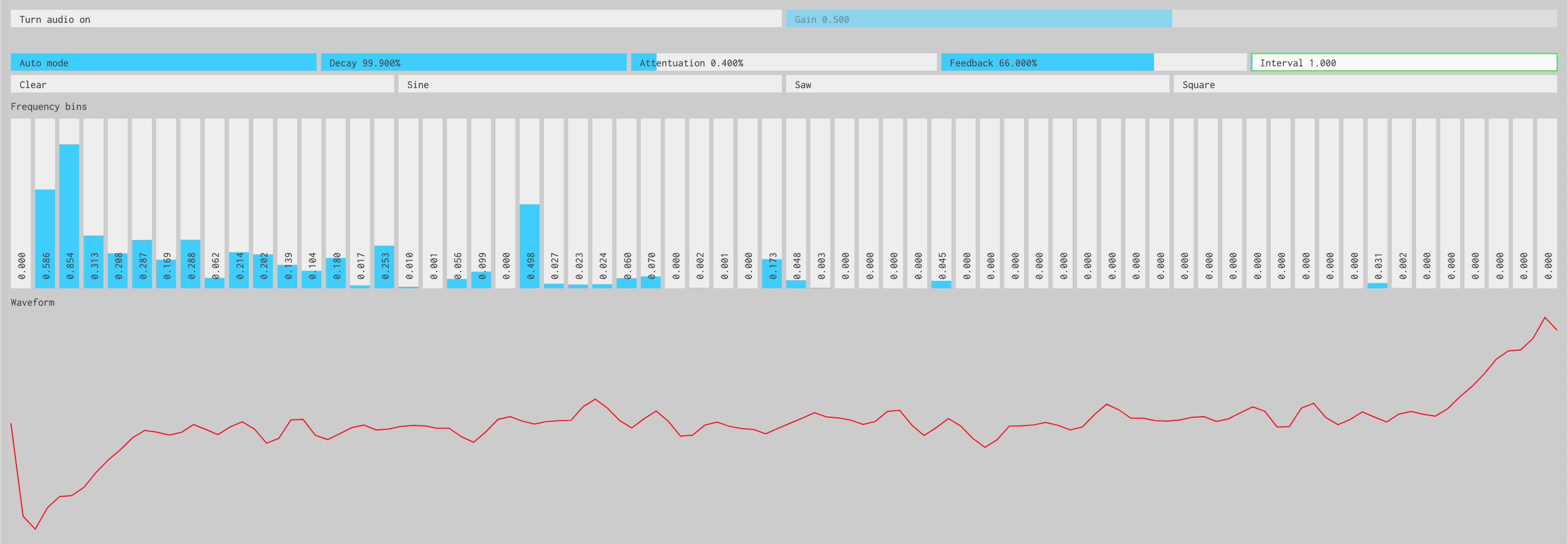 |
Interactive inverse FFT toy synth | Demo | Source |
|
Canvas based Immediate Mode GUI components | Demo | Source |
 |
Minimal IMGUI usage example | Demo | Source |
TODO
If this project contributes to an academic publication, please cite it as:
@misc{thing-imgui,
  title = "@thi.ng/imgui",
  author = "Karsten Schmidt",
  note = "https://thi.ng/imgui",
  year = 2019
}© 2019 - 2024 Karsten Schmidt // Apache License 2.0