
The Angular Navigation package includes the following list of components.
The Angular Accordion component is a container-based control with vertically collapsible panels (vertical accordion) and stacked headers that expand or collapse one or more panels at a time within the available space.
Getting Started . Online demos . Learn more
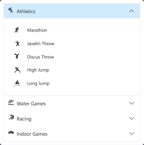
- Rendering - Can be rendered based on the items collection and HTML elements.
- Expand mode - Supports to define single or multiple expand mode for Accordion panels.
- RTL Support - Supports right-to-left alignment.
- Accessibility - Provides built-in compliance with the WAI-ARIA specifications and it is achieved through attributes. By default, it allows to interact with Accordion by using keyboard shortcuts.
The Angular AppBar component displays information and actions related to the current application screen. It is used to show branding, screen titles, navigation, and actions.
Getting Started . Online demos . Learn more
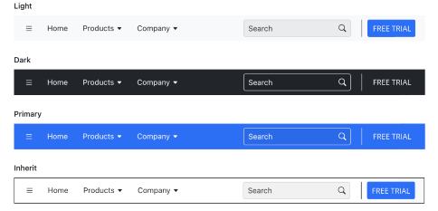
- Modes - Regular, Prominent, and Dense modes that define the AppBar height.
- Content arrangement - Spacer and separator options can be used to align the content based on the UI requirement with minimal effort.
- Color - Primary, Light, Dark, and Inherit options to customize the AppBar color.
- Position - AppBars can be placed at the top or bottom of the screen. It can also be sticky.
The Angular Breadcrumb component is a graphical user interface that serves as a navigation header for your web application or site. It helps to identify or highlight the current location within the hierarchical structure of a website. It has several built-in features such as templates, icons, binding to location, overflow mode, and UI customizations.
Getting Started . Online demos . Learn more
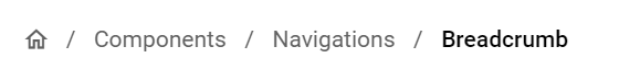
- Icons - Icons can be specified in Breadcrumb items.
- Template - Supports template for item and separator.
- Bind to location - Supports items to be rendered based on the URL or current location.
- Overflow mode - Used to limit the number of breadcrumb items to be displayed.
- Accessibility - Provided with built-in accessibility support that helps to access all the Breadcrumb component features through the keyboard, screen readers, or other assistive technology devices.
The Angular Carousel component allows users to display images with content, links, etc., like a slide show. Typical uses of carousels include scrolling news headlines, featured articles on home pages, and image galleries.
Getting Started . Online demos . Learn more
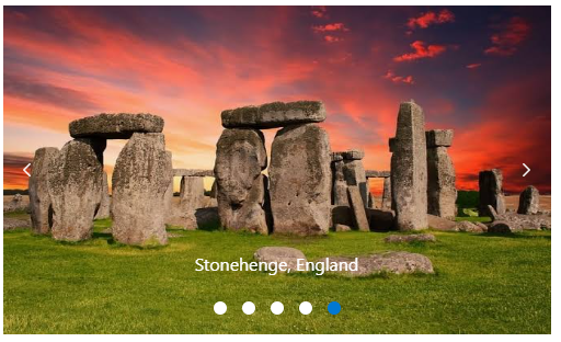
- Rendering - The Carousel component can be rendered based on the items collection and data binding.
- Animation - Supports animation effects for moving previous/next item of Carousel.
- Template support - The Carousel component items and buttons can also be rendered with custom templates.
- Keyboard support - By default, the Carousel allows interaction with commands by using keyboard shortcuts.
- Accessibility - The Carousel provides built-in compliance with the WAI-ARIA specifications and it is achieved through attributes.
The Angular ContextMenu component is a graphical user interface control that appears when the user right-clicks or performs a touch and hold action.
Getting Started . Online demos . Learn more
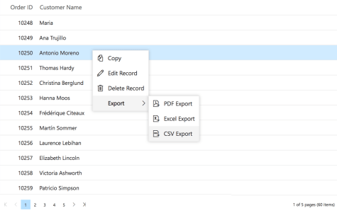
- Separator - Supports menu items grouping by using the Separator.
- Icons and Navigations - Supports items to have Icons and Navigation URL's.
- Template and Multilevel nesting - Supports template and multilevel nesting in ContextMenu.
- Accessibility - Provided with built-in accessibility support that helps to access all the ContextMenu component features through the keyboard, screen readers, or other assistive technology devices.
The Angular Sidebar component is an expandable and collapsible component that typically acts as a side container to place primary or secondary content alongside the main content.
Getting Started . Online demos . Learn more
- Target - The sidebar can be initialized in any HTML element other than the body element.
- Types - Provides complete control over the appearance of the sidebar component. The different types of the sidebar control give flexibility to view or hide the content (primary/secondary) over/above the main content by pushing, sliding, or overlaying it.
- Left or right positions - The sidebar control can be positioned to the left or right side of the main content area. This option allows placement of two sidebars in a page, at the left and right, to show primary content and secondary content, simultaneously.
- Docking - Docking lets the sidebar occupy a small vertical area in a page always and typically contains shortened view of navigation options.
- Auto close - Auto closing the sidebar control’s content allows the main content area to be more readable based on screen resolution.
The Angular Tab component is a simple user interface (tabs UI) for organizing related content and occupying a compact space. The tabs are aligned horizontally, and each tab is associated with its header.
Getting Started . Online demos . Learn more
- Rendering - Can be rendered based on the items collection and HTML elements.
- Adaptive - Supports responsive rendering with scrollable Tabs and popup menu.
- Customization - Provides customization support for header with icons and orientation.
- Animation - Supports animation effects for moving previous/next contents of Tab.
- Accessibility - Provides built-in compliance with the WAI-ARIA specifications and it is achieved through attributes. By default, it allows to interact with Tab headers by using keyboard shortcuts.
The Angular Toolbar component is a feature-rich control that provides an interface for selecting a command from a collection of commands.
Getting Started . Online demos . Learn more

- Scrollable - Scrollable display mode displays Toolbar commands in a single line with horizontal scrolling enabled when the commands overflow available space.
- Popup - Popup display mode displays commands in the popup when the commands overflow available space.
- Template support - The Toolbar component can also be rendered based on the given HTML element aside from item based collection rendering.
- Keyboard support - By default, the Toolbar allows interaction with commands by using keyboard shortcuts.
- RTL Support - The Toolbar supports right-to-left alignment.
- Accessibility - The Toolbar provides built-in compliance with the WAI-ARIA specifications and it is achieved through attributes.
The Angular TreeView component is a graphical user interface control that to represents hierarchical data in a tree structure.
Getting Started . Online demos . Learn more
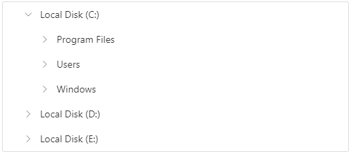
- Data binding - Binds the TreeView component with an array of JavaScript objects or DataManager.
- CheckBox - Allows you to select more than one node in TreeView without affecting the UI appearance.
- Drag and drop - Allows you to drag and drop any node in TreeView.
- Multi selection - Allows you to select more than one node in TreeView.
- Node editing - Allows you to change the text of a node in TreeView.
- Sorting - Allows display of the TreeView nodes in an ascending or a descending order.
- Template - Allows you to customize the nodes in TreeView.
- Accessibility - Provides built-in accessibility support that helps to access all the TreeView component features through the keyboard, on-screen readers, or other assistive technology devices.
The Angular Menu component is a graphical user interface control that serves as a navigation header for your web application or site. It supports data binding, templates, icons, multilevel nesting, and horizontal and vertical menus.
Getting Started . Online demos . Learn more
- Rendering - Supports to render based on the items collection (array of JavaScript objects) and HTML elements.
- Separator - Supports menu items grouping by using the Separator.
- Icons and Navigations - Supports items to have Icons and Navigation URL's.
- Template and Multilevel nesting - Supports template and multilevel nesting in Menu.
- Hamburger Menu - Supports Hamburger Menu that provides an adaptive view.
- Accessibility - Provided with built-in accessibility support that helps to access all the Menu component features through the keyboard, screen readers, or other assistive technology devices.
The Angular Stepper component enables users to navigate through a series of steps or stages in a process within a web application. Stepper displays a list of steps with the current step highlighted, allowing users to move between steps. It includes several built-in features, such as different step types, orientation, linear flow, label positions, and template customization.
Getting Started . Online demos . Learn more
- Step Types - Display steps with indicators and labels, only indicators, or only labels.
- Orientation - A layout to display steps in a horizontal or vertical orientation.
- Linear Flow - Enable a step-by-step progression, completing one step before moving on to the next.
- Label Positioning - Show the label at the top, bottom, left, or right.
- Tooltip - Show additional information when users hover over a step, such as a label or customized text.
- Templates - Customize the default appearance and content of each step using templates.
Trusted by the world's leading companies

To install navigations and its dependent packages, use the following command.
npm install @syncfusion/ej2-angular-navigationsNavigation components are also offered in following list of frameworks.
 JavaScript |
 React |
 Vue |
 ASP.NET Core |
 ASP.NET MVC |
|---|
Product support is available through following mediums.
- Support ticket - Guaranteed Response in 24 hours | Unlimited tickets | Holiday support
- Community forum
- GitHub issues
- Request feature or report bug
- Live chat
Check the changelog here. Get minor improvements and bug fixes every week to stay up to date with frequent updates.
This is a commercial product and requires a paid license for possession or use. Syncfusion® licensed software, including this component, is subject to the terms and conditions of Syncfusion® EULA. To acquire a license for 80+ Angular UI components, you can purchase or start a free 30-day trial.
A free community license is also available for companies and individuals whose organizations have less than $1 million USD in annual gross revenue and five or fewer developers.
See LICENSE FILE for more info.
© Copyright 2025 Syncfusion® Inc. All Rights Reserved. The Syncfusion® Essential Studio® license and copyright applies to this distribution.