
The Angular Charts component is a well-crafted charting component for visualizing data with 50+ charts and graphs, ranging from line to financial types. It can bind data from datasource such as array of JSON objects, OData web services or DataManager. All chart elements are rendered using Scalable Vector Graphics (SVG).
The Angular Charts package includes the following list of components.
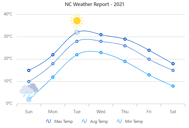
The Angular Chart Component is a feature-rich chart component with built-in support for over 50 chart types, technical indictors, trendline, zooming, tooltip, selection, crosshair and trackball.
Getting started . Online demos . Learn more
- Chart types: Supports 50+ interactive chart types starting from line to financial chart. Few chart types include:
- Data binding: Bind the Chart component with an array of JSON objects or DataManager. Other than chart series, data label and tooltip can also bound to your data.
- Axis types: Supports multiple axes, and able to plot different data such as numbers, datetime, logarithmic and string.
- Rendering modes: Supports two type of rendering: SVG and Canvas. By default chart rendered in SVG, You can easily switch between the two simple configuration.
- Data label: Supports data label to annotate points with label to improve the readability of data.
- Annotation: Provides support to mark any specific area of interest by adding custom element.
- Zooming and panning: Provides options to visualize the data points under any region using rectangular selection, pinch, or mouse wheel zooming.
- Crosshair & trackball: Provides options to track data points closer to the mouse position or touch action.
- Selection: Allows you to select any data point or subset of points using selection feature.
- Export: Provides the options to Export the chart to PDF, SVG and CSV formats.
- RTL support: Provides a full-fledged right-to-left mode which aligns axis, tooltip, legend and data in the chart component from right to left.
- Appearance: Colors for the charts are picked by the built-in theme, but each element of the chart can be customized by simple configuration options.
- Accessibility: Designed to be accessible to users with disabilities, with features such as WAI-ARIA standard compliance and keyboard navigation to ensure that the chart can be effectively used with assistive technologies such as screen readers.
- Localization: The Localization library enables you to adapt the default text content of the chart to fit the language and cultural preferences of your target audience.
Built-in support for pie, doughnut, pyramid and funnel chart types, to show the proportions and percentages between the categories.
Getting started . Online demos . Learn more
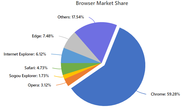
- Chart types: Supports Pie, Doughnut, Pyramid and Funnel charts.
- Smart labels: Supports arrangement of data labels smartly to avoid overlapping when the data point value falls in close range.
- Grouping: Supports grouping of data points based on value and point count.
- Semi-pie: Provides options to customize the start and end angle of the pie chart.
- Legend: Provides options to display additional information about the points with the help of legend.
- Tooltip: Provides great user experiance by including a set of interactive features such as tooltip, drill-down, events, and selection.
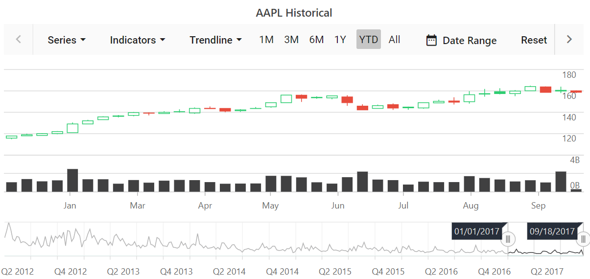
The Angular Stock Chart Component is a well-crafted, easy-to-use financial charting package to track and visualize stock price of any company over a specific period using charting and range tools.
Getting started . Online demos . Learn more
- Data binding: Bind the stock chart component with an array of JSON objects or DataManager. Other than chart series, data label and tooltip can also bound to your data.
- Range selector: Supports range selector to filter a date range for data that needs to be visualized.
- Period selector: Supports period selector to select predefined periods just by a single click.
- Technical indicators: Incidators allows to analyze the past and predict the future market trends based on historic price, volume, or open interest.
- Trendlines: Predicts the future trends with predetermined data for any measurements.
- Stock events: Supports stock events to show different kinds of market events on the chart.
- Export: Provides the options to Export the stock chart to PDF, SVG and CSV formats.
- Appearance: Colors for the stock chart are picked by the built-in theme, but each element of the stock chart can be customized by simple configuration options.
- Tooltip: Provides great user experiance by including a set of interactive features such as tooltip, events, and trackball.
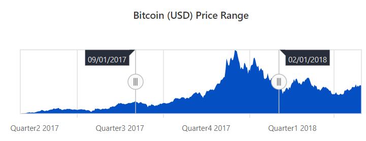
The Angular Range Navigator Component is an interface for selecting a small range from a large collection. It is commonly used in financial dashboards to filter a date range for data that needs to be visualized.
Getting started . Online demos . Learn more
- Data sources: Bind the range navigator component with an array of JSON objects or DataManager.
- Tooltip: Provides great user experiance by including a set of interactive features such as tooltip, events, and animation.
- Lightweight: Supports light-weight range navigator to load in mobile device.
- Period selector: Provides options to select the data over the custom period.
- Axis types: Supports multiple axis and able to plot different data such as numbers, datetime, logarithmic and string.
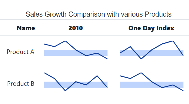
The Angular Sparkline Component is a very small chart control drawn without axes or coordinates. The sparklines are easy to interpret and convey more information to users by visualizing data in a small amount of space.
Getting started . Online demos . Learn more
- Series types: Supports five types of sparklines : line, area, column, win loss, and pie to show data trends.
- Axis types: Supports multiple axis and able to plot different data such as numbers, datetime, logarithmic and string.
- Data label: Supports data label to annotate points with label to improve the readability of data.
- Range band: Provides options to highlight specific range of values.
- Tooltip: Provides great user experiance by including a set of interactive features such as tooltip, events, and trackball.
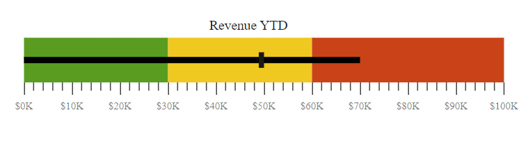
The Angular Bullet Chart Component is a interface to visually compare measures, similar to the commonly used bar chart. A bullet chart displays one or more measures and compares them with a target value.
Getting started . Online demos . Learn more
- Multiple measures: Provides options to render multiple measure bars as well as multiple target bars to allow comparison of several measures at once.
- Legend: Provides options to display additional information about the target and actual bar.
- RTL support: Provides a full-fledged right-to-left mode which aligns axis, tooltip, legend and data in the chart component from right to left.
- Tooltip: Provides options to display additional information about target and actual on mouse hover.
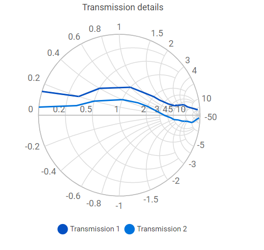
The Angular Smith Chart Component visualize data of high frequency circuit applications. It contains two sets of circles to plot parameters of transmission lines.
Getting started . Online demos . Learn more
- Legend: Provides options to display additional information about the series.
- Data label: Supports data label to annotate points with label to improve the readability of data.
- Tooltip: Provides options to display additional information about data points on mouse hover.
- Print and Export: Provides support to print and export the rendered smith chart for future use.
You can use Angular CLI to setup your Angular applications. To install the Angular CLI, use the following command.
npm install -g @angular/cliCreate a new Angular application using the following Angular CLI command.
ng new my-app
cd my-appAll Syncfusion Angular packages are available in npmjs.com. To install the Angular chart package, use the following command.
ng add @syncfusion/ej2-angular-chartsThe above command does the below configuration to your Angular app.
- Adds
@syncfusion/ej2-angular-chartspackage and its peer dependencies to yourpackage.jsonfile. - Imports the
ChartModulein your application moduleapp.module.ts. - Registers the Syncfusion UI default theme (material) in the
angular.jsonfile.
This makes it easy to add the Syncfusion Angular Charts module to your project and start using it in your application.
In src/app/app.component.ts, use <ejs-chart> selector in the template attribute of the @Component directive to render the Syncfusion Angular Chart component.
import { Component, OnInit } from '@angular/core';

@Component({
    selector: 'app-root',
    template: `<ejs-chart id="chart-container" [primaryXAxis]='primaryXAxis'>
               <e-series-collection>
                  <e-series [dataSource]='chartData' type='Line' xName='month' yName='sales' name='Sales'></e-series>
               </e-series-collection>
               </ejs-chart>`
})
export class AppComponent implements OnInit {

    public data: object[] = [];

    ngOnInit(): void {
         this.chartData = [
         { month: 'Jan', sales: 35 }, { month: 'Feb', sales: 28 },
         { month: 'Mar', sales: 34 }, { month: 'Apr', sales: 32 },
         { month: 'May', sales: 40 }, { month: 'Jun', sales: 32 },
         { month: 'Jul', sales: 35 }, { month: 'Aug', sales: 55 },
         { month: 'Sep', sales: 38 }, { month: 'Oct', sales: 30 },
         { month: 'Nov', sales: 25 }, { month: 'Dec', sales: 32 }
         ];
         this.primaryXAxis = {
           valueType: 'Category'
         };
    }
}Chart components are available in following list of frameworks.
 JavaScript |
 React |
 Vue |
 ASP.NET Core |
 ASP.NET MVC |
|---|
- Expense Tracker - Source, Live Demo
- Loan Calculator - Source, Live Demo
- Angular Stock Chart demo
- Fitness Tracker - Source, Live Demo
Product support is available through the following mediums.
- Support ticket - Guaranteed Response in 24 hours | Unlimited tickets | Holiday support
- Community forum
- GitHub issues
- Request feature or report bug
- Live chat
Check the changelog here. Get minor improvements and bug fixes every week to stay up to date with frequent updates.
This is a commercial product and requires a paid license for possession or use. Syncfusion’s licensed software, including this component, is subject to the terms and conditions of Syncfusion's EULA. To acquire a license for 80+ Angular UI components, you can purchase or start a free 30-day trial.
A free community license is also available for companies and individuals whose organizations have less than $1 million USD in annual gross revenue and five or fewer developers.
See LICENSE FILE for more info.
© Copyright 2025 Syncfusion® Inc. All Rights Reserved. The Syncfusion® Essential Studio® license and copyright applies to this distribution.