@raketa-cms/raketa-cms
Raketa CMS is a framework for building block based websites. It allows blocks (widgets) to be defined, provides admin interface for managing page content and functionality to render pages to visitors.
It plays nicely with Next.js and requires basic understanding of how React works.
Install
yarn add @raketa-cms/raketa-cmsDevelopment
- Install dependencies in both root directory and
exampledirectory - Run the package watcher in the root directory with
yarn start - Start the example project with
yarn start - Visit http://localhost:3000/admin to build pages or http://localhost:3000 to veiw them
Usage
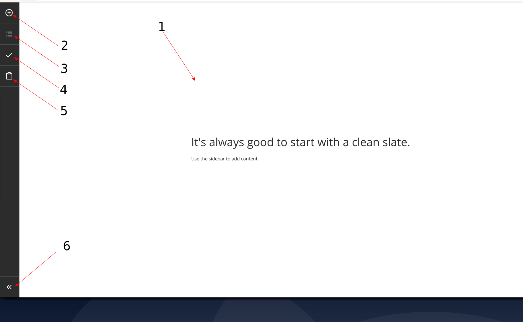
User Interface overview
- Canvas: where widgets are added
- Library: a list that allows editors to add widgets from a predefined library
- Reorder: opens a modal to reorder widgets on the page
- Save: a butto to save changes (shows in green if there are any changes)
- Paste: an option to paste previoysly copied widget with its contents
- Exit: Close the builder and go back to the previous screen
Data structure
Information for a page is kept in a JSON structure. It requires a widgets key, an array of widgets that keep reference to the following:
-
widgetId: unique ID for each component -
component: which widget from the library configuration to be used for rendering frontend and admin configuration -
settings: key-value pair for each widget setting
{
  widgets: [
    {
      widgetId: 'xsmkfai',
      component: 'SectionTitleWidget',
      settings: {
        align: 'text-center',
        title: 'Section title',
        containerSettings: {
          theme: 'dark',
          spacing: 'bottom'
        }
      },
    }
  ]
}
How to add the admin interface
Follow the example in: https://github.com/studioraketa/raketa-cms/blob/master/example/src/AdminBuilder.js
How to integrate the frontend
Follow the example in: https://github.com/studioraketa/raketa-cms/blob/master/example/src/PageRender.js
Widget definitions
A widget is a reusable and editable content block, based on a component from a design system.
Each widget consists of several key pieces:
- frontend: what gets rendered to the visitors
- defaults: default values for newly added widgets
- settings modal: an admin interface to manage the widgets settings and content
Widgets’s adminFields setting can be either a JSON structure or a component. We tend to use the component style when we have a list widget and the JSON struct when we have a list.
The anotated code for a simple widget:
import React from 'react'
import { Container } from '@raketa-cms/raketa-cms'

// The frontend
import React from 'react'
import { Container } from '@raketa-cms/raketa-cms'

const Widget = ({ align, title, containerSettings }) => (
  <Container settings={containerSettings}>
    <div className={`section-title ${align}`}>
      <div className='container'>
        <h2 className='title'>{title}</h2>
      </div>
    </div>
  </Container>
)

const Config = {
  title: 'Section title',
  category: 'General',
  primaryField: 'title'
}

const Defaults = {
  align: 'text-center',
  title: 'Section title',
  containerSettings: {}
}

const Admin = {
  align: {
    type: 'select',
    options: [
      ['text-center', 'Center'],
      ['text-left', 'Left']
    ]
  },
  title: { type: 'text', placeholder: 'Enter something...', hint: '3 words' },
  button: { type: 'button' }
}

export { Widget, Config, Admin, Defaults }
Widget settings
In order to build the admin interface for a widget we can use the following types of inputs:
- text: plain old text input
- textarea: multiline text input
- select: a drop-down menu
- link: CMS specific input for setting up link specific settings
- button: CMS specific input for setting up button specific settings
-
custom: You can supply your own React components, they need to provide the following interface –
label,valueandonChange
Admin schema is defined in the Admin configuration exported from the main widget file:
const Admin = {
  align: {
    type: 'select',
    options: [
      ['text-center', 'Center'],
      ['text-left', 'Left']
    ]
  },
  title: { type: 'text', placeholder: 'Enter something...', hint: '3 words' },
  button: { type: 'button' }
}
Container settings
Besides the specific settings per widget type, the CMS also provides a common set of settings, that is the same for all widgets and is applied to the container.
The schema for the container settings follows the same format as the widget settings definition, but it's saved under containerSettings key under the widget settings.
It can be configured globally and passed to the configuration object (see example in https://github.com/studioraketa/raketa-cms/blob/master/example/src/AdminBuilder.js):
const SPACINGS = [
  ['', 'None'],
  ['spacing-both', 'Both'],
  ['spacing-top', 'Top'],
  ['spacing-bottom', 'Bottom']
];

const THEMES = [
  ['', 'None'],
  ['light-bg', 'Light'],
  ['dark-bg', 'Dark'],
  ['brand-bg', 'Brand']
];

const containerAdmin = {
  spacing: { type: 'select', options: SPACINGS },
  theme: { type: 'select', options: THEMES },
  containerID: { type: 'text', label: 'Section ID', hint: 'HTML ID attribute for use in anchors' },
  className: { type: 'text', label: 'CSS class' },
  containerType: { type: 'select', options: [['container', 'Standard'], ['extended-container', 'Extended container']] },
};

const configuration = {
  containerAdmin,
};
Starter projects
License
MIT © studioraketa


