
@prasiddha/react-image-loader
@prasiddha/react-image-loader allows you to show a shimmer/skeleton, placeholder image or your custom component until image is loaded in the browser.
Even if your image src changes dynamically then this package will again show the loading component until new image source is full loaded.
Installation
Use the package manager npm to install @prasiddha/react-image-loader.
npm install @prasiddha/react-image-loader --save
Usage
With @prasiddha/react-image-loader you can pass props to display either shimmer/skeleton, placeholder image or your custom component.
Shimmer
import { ImageLoader } from '@prasiddha/react-image-loader';
const App = () => {
return (
<ImageLoader
loadType="shimmer"
style={{ height: '40vh', width: '40vh', objectFit: 'cover' }}
alt="random-image"
src="https://images.pexels.com/photos/12430047/pexels-photo-12430047.jpeg"
/>
);
};
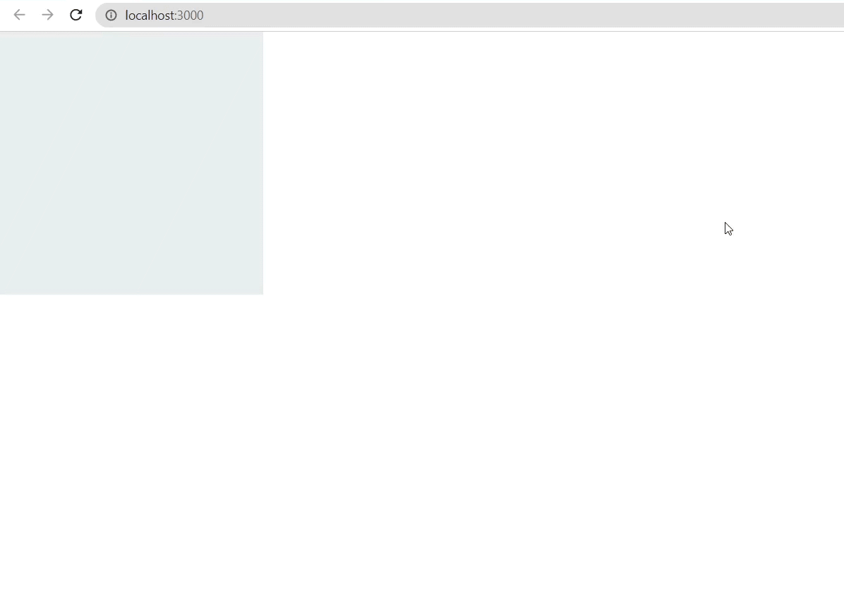
export default App;If you are using the shimmer effect, a beautiful shimmer/skeleton is loaded until the actual image is loaded in you app.
Placeholder

import { ImageLoader } from '@prasiddha/react-image-loader';
import Placeholder from './placeholder.png';

const App = () => {
  return (
    <ImageLoader
      loadType="placeholder"
      placeholderImage={Placeholder} // or placeholderImage={'https://actualimageurl.com'}
      style={{ height: '40vh', width: '40vh', objectFit: 'cover' }}
      alt="random-image"
      src="https://images.pexels.com/photos/12430047/pexels-photo-12430047.jpeg"
    />
  );
};

export default App;
If you are using the placeholder load type, then it provides you the option to specify which image you want to put as a placeholder image until the actual image loads.
Note: If you do not specify the placeholderImage, it uses the default placeholder image specified already in the package.
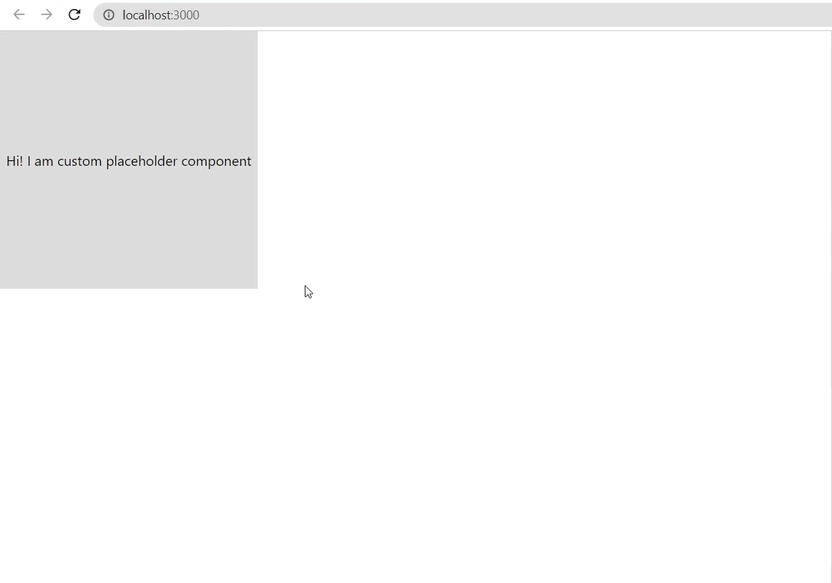
Custom
import { ImageLoader } from '@prasiddha/react-image-loader';

const App = () => {
  const myCustomComponent = (
    <>My custom component to load unless actual image is loaded</>
  );

  return (
    <ImageLoader
      loadType="custom"
      customComponent={myCustomComponent}
      style={{ height: '40vh', width: '40vh', objectFit: 'cover' }}
      alt="random-image"
      src="https://images.pexels.com/photos/12430047/pexels-photo-12430047.jpeg"
    />
  );
};

export default App;
If you are using the custom load type, then it provides you the option to specify your own component to load until the actual image loads.
Note: If you do not specify the customComponent, it uses the default component specified already in the package.
Props
| Property | Required | Default value | Description |
|---|---|---|---|
src: string |
yes | ||
alt: string |
yes | ||
loadType?: 'placeholder' | 'shimmer' | 'custom' |
yes | 'shimmer' | Provide load type to display until actual image is loaded |
style?: React.CSSProperties |
no | { maxWidth: '100%', height: '30vh' } | Provide style for images as well as the loading component for all load types |
className?: string |
no | Provide class name for the images as well as the loading component for all load types | |
placeholderImage?: string |
no | default specified image | Provide placeholder image until actual image is loaded. This props is only in effect if loadType = "placeholder"
|
customComponent?: React.ReactNode |
no | default specified component | Provide placeholder custom component until actual image is loaded. This props is only in effect if loadType = "custom"
|
Contributing
Pull requests are welcome. For major changes, please open an issue first to discuss what you would like to change.