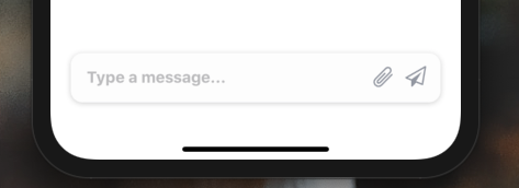
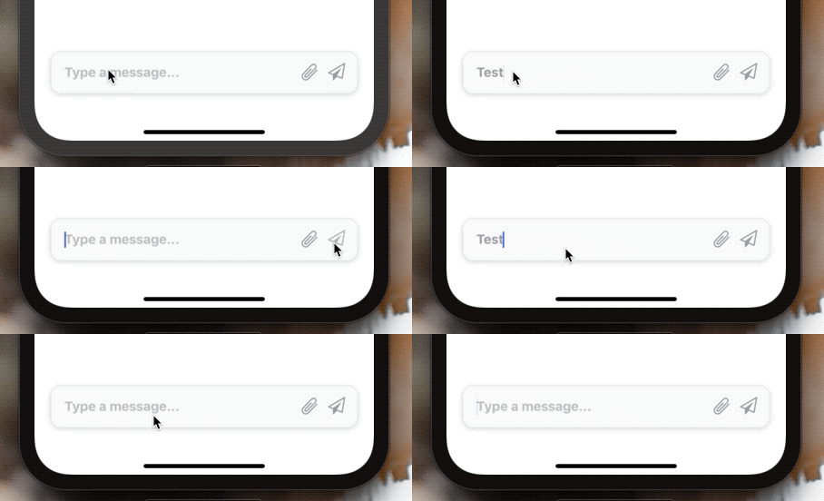
Installation
Add the dependency:
npm i @paraboly/react-native-input-barPeer Dependencies
IMPORTANT! You need install them
"react": ">= 16.x.x",
"react-native": ">= 0.55.x",
"react-native-spinkit": ">= 1.5.0",
"react-native-androw": ">= 0.0.34",
"react-native-vector-icons": ">= 6.6.0",
"react-native-dynamic-vector-icons": ">= 0.2.1"
Note: Do not for get to pod install for installing properly SpinKit
Usage
InputBar should stay at the bottom therefore, please do not forget to set flex: 1 on your main container. Example is available for the real usage.
Import
import InputBar from "@paraboly/react-native-input-bar";Usage
<InputBar />Auto-Grow InputBar Usage
All you need to do is set the multiline and set the height prop as null.
<InputBar multiline height={null} minHeight={50} />Configuration - Props
| Property | Type | Default | Description |
|---|---|---|---|
| width | string/number | 90% of screen width | change the InputBar's width |
| height | string/number | 50 | change the InputBar's height |
| bottom | string/number | 24 | change the InputBar's bottom position |
| value | string | undefined | set the TextInput's value |
| onChangeText | function | undefined | handle onChangeText function |
| backgroundColor | color | #fdfdfd | set your own color for InputBar's background color |
| textColor | color | #9da1ab | set your own color for TextInput's text color |
| shadowColor | color | #757575 | set your own color for TextInput's shadow color |
| placeholder | string | Type a message... | change the TextInput's placeholder |
| textInputStyle | style | default | set your own style for TextInput |
| disablePrimaryIcon | boolean | false | disable the primary icon |
| disableSecondaryIcon | boolean | false | disable the secondary icon |
| primaryIconName | string | send | change the primary icon's name |
| primaryIconType | string | FontAwesome | change the primary icon's type |
| primaryIconColor | string | #9da1ab | change the primary icon's color |
| primaryIconSize | number | 21 | change the primary icon's size |
| primaryIconOnPress | function | undefined | set a function when primary icon is on pressed |
| secondaryIconName | string | attachment | change the secondary icon's name |
| secondaryIconType | string | Entypo | change the secondary icon's type |
| secondaryIconColor | string | #9da1ab | change the secondary icon's color |
| secondaryIconSize | number | 21 | change the secondary icon's size |
| secondaryIconOnPress | function | undefined | set a function when secondary icon is on pressed |
| spinnerVisibility | boolean | false | make the spinner visible instead of primarty icon |
| spinnerType | string | FadingCircleAlt | change the spinner type |
| spinnerSize | number | 20 | change the spinner number |
| spinnerColor | color | #9da1ab | change the spinner color |
| spinnerStyle | style | undefined | set your own style for spinner |
| multiline | boolean | false | if you want auto-grow text InputBar then you need to use this prop & set the height prop to null ! |
| minHeight | string/number | 50 | change the minimum height of the InputBar
|
| maxHeight | string/number | null | change the maximum height of the InputBar
|
Change Log
0.1.0 (2020-02-25)
Auto-grow feature is here
0.0.5 (2019-12-19)
Full Changelog
We need to install react-native-spinkit for this and above versions. Simply do not forget to pod install after the new implementation.
spinnerVisibility prop is available for controlling the Spinner :) Furthermore, of course it is fully customizable :)
0.0.4 (2019-12-18)
0.0.2 (2019-12-18)
* This Change Log was automatically generated by github_changelog_generator
Roadmap
- [x]
LICENSE - [x]
CHANGELOG - [x]
Auto-Grow Feature - [ ] Optional Spinkit for secondary icon
- [ ] Better Example
Credits
Thanks to Mayurksgr for this awesome inspiration. Credit Design Inpsiration
Author
FreakyCoder, kurayogun@gmail.com
License
React Native Input Bar is available under the MIT license. See the LICENSE file for more info.


