
@opeepsfun/avatar-illustration-system
Description
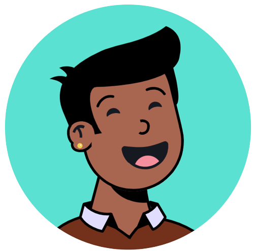
Introducing the @opeepsfun/avatar-illustration-system, a pure JavaScript npm package that powers the avatar illustration system. This package provides an API to create unique, hand-drawn avatar illustrations which can be used in a myriad of applications such as user profiles, product illustrations, or any creative project you envision. No external libraries are required, making it a seamless addition to any project, irrespective of the tech stack.
The illustrations are designed by Micah Lanier. Explore the beautiful artwork and get inspired!
Try It Out
You can delve into the creative world of avatars by heading to the official builder. Explore and interact with various options to create personalized avatars, get a hands-on experience, and see all the features in action.
For a live React example, check out this CodeSandbox demo.
Installation
Getting started is a breeze. Install the package via npm with the following command:
npm install @opeepsfun/avatar-illustration-systemUsage
Here's a simplistic example to kickstart your creativity:
import { Avatar } from "@opeepsfun/avatar-illustration-system";

const avatar = Avatar({
    circle: { backgroundColor: "brown" },
    size: 600,
    glasses: "Square",
    ear: "Attached",
    eye: "Round",
    shirt: "Crew"
});

const parser = new DOMParser();
const svgDOM = parser.parseFromString(avatar, "image/svg+xml");

document.getElementById("illustration").appendChild(svgDOM.documentElement);
In this snippet, we import the Avatar module, configure the avatar properties, parse the generated SVG string into a DOM element, and append it to a designated HTML element.
Features
-
Pure JavaScript:
- Being a pure JavaScript library, it can effortlessly integrate with any project, regardless of the underlying libraries or frameworks.
-
Vast Customization:
- From facial features to clothing, a broad spectrum of customizable options allows for the creation of unique avatars.
-
Dynamic Rendering:
- The system dynamically renders SVG elements based on the specified properties, ensuring optimal performance and versatility.
-
Seamless Integration:
- The package is designed for easy integration into existing projects, with no additional dependencies required.
-
SVG Output:
- The avatars are generated as SVG elements, ensuring crisp visuals and scalability across devices.
Components and Props
The Avatar function accepts an object with the following properties:
- size: Required. Specifies the size of the avatar.
- circle: Optional. An object specifying background color of a circular mask.
- ear: Optional. Specifies the type of ears.
- mouth: Optional. Specifies the type of mouth.
- nose: Optional. Specifies the type of nose.
- glasses: Optional. Specifies the type of glasses.
- eyebrow: Optional. Specifies the type of eyebrows.
- eye: Optional. Specifies the type of eyes.
- shirt: Optional. Specifies the type of shirt.
- top: Optional. Specifies the type of top.
Here's a Markdown table for the Avatar component props:
| Prop | Type | Description |
|---|---|---|
size |
number |
The size of the avatar. |
circle |
{ backgroundColor?: string; } |
Optional. The background color of the circle around the avatar. |
ear |
"Attached", "Detached" |
Optional. The type of ear. Default is "Detached". |
mouth |
"Laughing", "Frown", "Nervous", "Pucker", "Sad", "Smile", "Smirk", "Surprised" |
Optional. The type of mouth. Default is "Laughing". |
nose |
"Round", "Pointed", "Curved" |
Optional. The type of nose. Default is "Round". |
glasses |
"Round", "Square" |
Optional. The type of glasses. |
eyebrow |
"Up", "Down", "EyelashesDown", "EyelashesUp" |
Optional. The type of eyebrow. Default is "Up". |
eye |
"Smiling", "Ellipse", "EllipseShadow", "Round" |
Optional. The type of eye. Default is "Smiling". |
shirt |
"Collared", "Crew", "Tee" |
Optional. The type of shirt. Default is "Collared". |
top |
"MisterT", "Fonze", "Full", "Bald", "Doug", "Phantom", "Turban", "Pixie" |
Optional. The type of top. Default is "Fonze". |
color |
{ outlineColor?: string; skinColor?: string; topColor?: string; shirtColor?: string; collarColor?: string; glassFrameColor?: string; } |
outlineColor: Optional. The color of the avatar's outline. Default is "#171921".skinColor: Optional. The color of the avatar's skin. Default is "#AC6651".topColor: Optional. The color of the avatar's top.shirtColor: Optional. The color of the avatar's shirt.collarColor: Optional. The color of the avatar's collar.glassFrameColor: Optional. The color of the avatar's glasses frame. |
Build
To build the project, run:
npm run buildContributing
If you'd like to contribute, please fork the repository and make changes as you'd like. Pull requests are warmly welcome.
License
MIT
Author
- Emre Çakır
- Homepage