
This library was generated with Nx using floating-ui for Angular apps.
See Demo
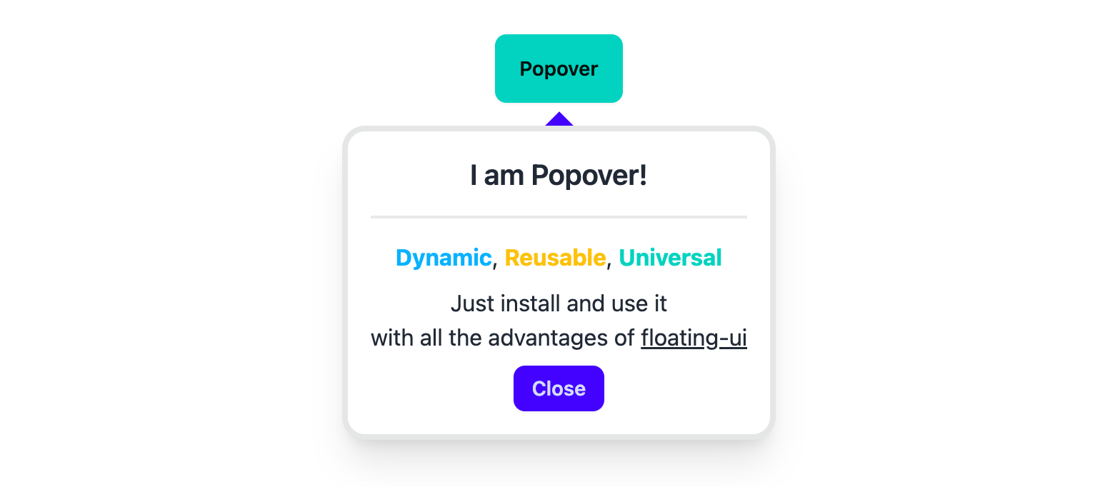
The popover is a simple-to-use component with a straightforward API. Just install and use.
Note: You need to install the core package for all functionalities.
Both the core and popover packages have the same versions.
To install, use the following command:
npm i @ngx-popovers/coreThe Popover component displays content next to the trigger element on mouse click.
Refer to the official documentation at floating-ui for more information about the properties.
First, import the popover module:
import { PopoverModule } from '@ngx-popovers/popover';This module contains all the necessary components. Then, you can use the Popover in your templates.
<ngx-popover>
  <button>
    Toggle Popover
  </button>

  <!--
    Angular doesn't destroy elements in <ng-content />, so
    the PopoverTemplate directive is used for conditional content projection.

    https://angular.io/guide/content-projection#conditional-content-projection
  -->
  <ng-template ngx-popover-template>
    <div class="example-class">
      <p>
        Lorem ipsum dolor sit amet.
      </p>
    </div>
  </ng-template>
</ngx-popover>To use the Arrow component, you should install the core package.
import { Arrow } from '@ngx-popovers/core';Example usage:
<ngx-popover>
  <button>
    Toggle Popover
  </button>

  <ng-template ngx-popover-template>
    <div class="example-class">...</div>
  </ng-template>

  <ngx-arrow padding="8" />
</ngx-popover>The NgxPopoverClose directive closes the popover when a specified element is clicked.
<ngx-popover>
  <button>
    Toggle Popover
  </button>

  <ng-template ngx-popover-template>
    <div class="example-class">
      ...
      <button ngx-popover-close>Close</button>
    </div>
  </ng-template>
</ngx-popover>You can have multiple components inside the <ngx-popover />. By default, the popover handles all user clicks, but it can be changed.
The ngxPopoverAnchor directive can be useful if you want to change the trigger inside <ngx-popover />.
<ngx-popover>
  <p>
    Clicks on this paragraph
    will not trigger the popover.
  </p>

  <button ngx-popover-anchor>
    Anchor
  </button>

  <ng-template ngx-popover-template>
    <div class="example-class">
      ...
    </div>
  </ng-template>
</ngx-popover>Input Parameters
| Input | Description | Type | Default |
|---|---|---|---|
placement |
Popover position | Placement |
'bottom' |
middleware |
List of floating-ui middlewares without arrow
|
MiddlewareList |
offset(4), flip() |
bindTo |
Render popover into element | string | HTMLElement |
'.body' |
autoUpdate |
Auto update the position of the Popover | boolean |
true |
disabled |
Disable open/close on trigger clicks | boolean |
false |
animationDisabled |
Disable show/hide animations | boolean |
false |
value |
Show or hide state of popover | boolean |
false |
Output Parameters
| Output | Description | Type |
|---|---|---|
valueChange |
Emitter for changes in value
|
EventEmitter<boolean> |
show |
Emitter for popover showing | EventEmitter |
hide |
Emitter for popover hiding | EventEmitter |
clickedOutside |
Emitter for clicks outside the floating element | EventEmitter<Element> |
clickedInside |
Emitter for clicks inside the floating element | EventEmitter<Element> |
animationStart |
Emitter for animation start | EventEmitter<AnimationEvent> |
animationDone |
Emitter for animation end | EventEmitter<AnimationEvent> |
computePosition |
Emitter for every computePosition call |
EventEmitter<ComputePosition> |
Use the NGX_POPOVER_CONFIG token to change default properties with the NgxPopoverConfig class.
import { Provider } from '@angular/core';
import { NGX_POPOVER_CONFIG, NgxPopoverConfig } from '@ngx-popovers/popover';
/**
 * You have to install @ngx-popovers/core to import middleware.
 * Version of @ngx-popovers/core is the same as @ngx-popovers/popover
 */
import { flip, offset, shift } from '@ngx-popovers/core';

export const PopoverConfigProvider: Provider = {
  provide: NGX_POPOVER_CONFIG,
  useValue: new NgxPopoverConfig({
    placement: 'top-end',
    arrow: true,
    closeOnClickedOutside: true,
    /* Middleware list from floating-ui */
    middleware: [
      flip(),
      shift(),
      offset(8)
    ]
  })
};
Add your new provider to any module:
@Component({
  selector: 'example-app-module',
  standalone: true,
  imports: [],
  providers: [
    PopoverConfigProvider
  ],
  template: ``,
})Refer to the core package
Another npm packages from this library: