
This library was created using Nx and floating-ui for Angular apps.
Check out the Demo
To use, install the package using the following command:
npm i @ngx-popovers/dialogThe dialog component provides a simple way to display dialog elements.
<ngx-dialog>
<button ngx-dialog-trigger>
Toggle
</button>
<ng-template ngx-dialog-template>
<div class="modal-box">
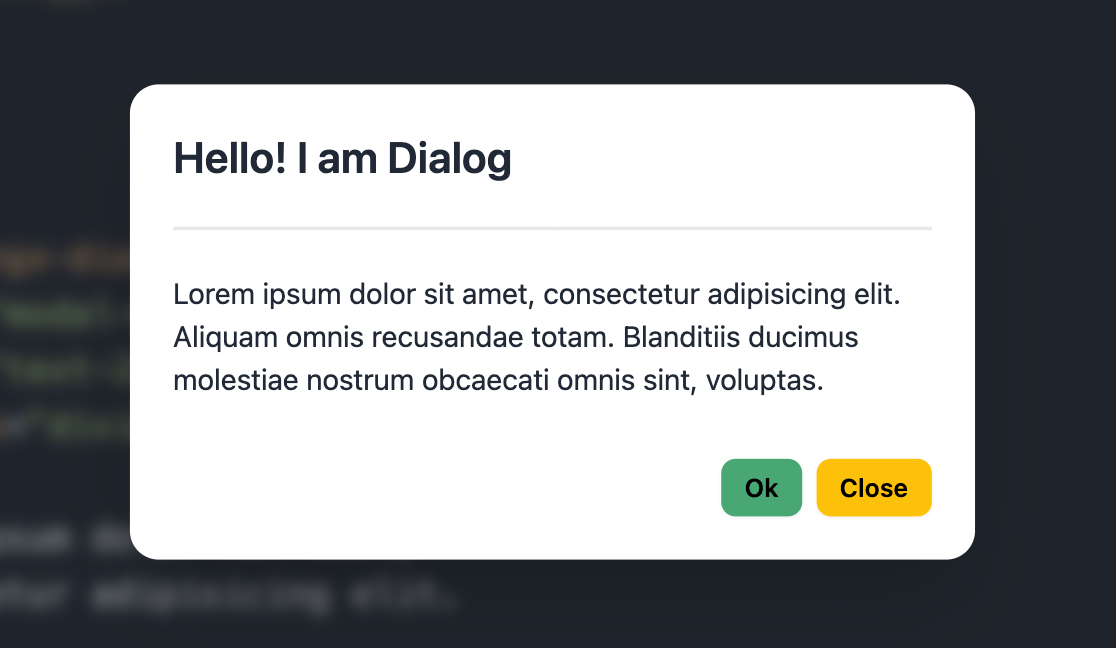
<p class="text-2xl">Hello! I am Dialog</p>
<p>
Lorem ipsum dolor sit amet,
consectetur adipisicing elit.
</p>
<button ngx-dialog-close>
Close
</button>
</div>
</ng-template>
</ngx-dialog>You can include multiple components inside the <ngx-dialog />.
The ngxDialogTrigger directive can be used to set the trigger button inside <ngx-dialog /> as default.
<ngx-dialog>
  <!--
    The dialog opens when
    the button[ngx-dialog-trigger] is clicked
  -->
  <button ngx-dialog-trigger>
    Toggle
  </button>

  <ng-template ngx-dialog-template>
    <div class="dialog-box">
      <p>Dialog content</p>
    </div>
  </ng-template>
</ngx-dialog>The NgxDialogTemplate directive helps locate the template for the dialog.
<ngx-dialog [value]="true">
  <!--
    Angular doesn't destroy elements in <ng-content />, so
    the DialogTemplate directive is used for conditional content projection.

    https://angular.io/guide/content-projection#conditional-content-projection
  -->
  <ng-template ngx-dialog-template>
    <div class="dialog-box">
      <p>Dialog content</p>
    </div>
  </ng-template>
</ngx-dialog>The NgxDialogClose directive closes the dialog when a click event is detected on the specified element.
<ngx-dialog [value]="true">
  <ng-template ngx-dialog-template>
    <div class="dialog-box">
      <p>Dialog content</p>

      <!--
        The dialog will close when
        button[ngx-dialog-close] is clicked
      -->
      <button ngx-dialog-close>Close</button>
    </div>
  </ng-template>
</ngx-dialog>Input Parameters
| Input | Description | Type | Default |
|---|---|---|---|
closeOnBackdropClick |
Close dialog when clicking backdrop | boolean |
true |
backdropClass |
Class for the backdrop element | string |
'' |
contentClass |
Class for the dialog wrapper element | string |
'' |
animationDisabled |
Disable show/hide animations | boolean |
false |
value |
Show or hide dialog | boolean |
false |
Output Parameters
| Output | Description | Type |
|---|---|---|
valueChange |
Emits when value changes |
EventEmitter<boolean> |
show |
Emits when the popover shows | EventEmitter |
hide |
Emits when the popover hides | EventEmitter |
animationStart |
Emits when animation starts | EventEmitter<AnimationEvent> |
animationDone |
Emits when animation ends | EventEmitter<AnimationEvent> |
There is a configuration token NGX_DIALOG_CONFIG.
Use the NgxDialogConfig class to change default properties.
import { Provider } from '@angular/core';
import { NGX_DIALOG_CONFIG, NgxDialogConfig } from '@ngx-popovers/dialog';

export const DialogConfigProvider: Provider = {
  provide: NGX_DIALOG_CONFIG,
  useValue: new NgxDialogConfig({
    backdropClass: 'backdrop',
    contentClass: 'content',
    closeOnBackdropClick: false,
    animationDisabled: false
  })
};Other npm packages from this library: