Responsive Dark Mode theme built with Bootstrap 5 with Dark Mode toggle button that switches between dark and light themes.
Check out Bootstrap Dark Mode Documentation for detailed instructions & even more examples.
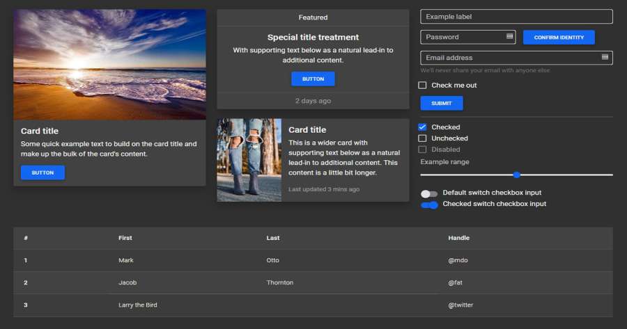
Dark Mode toggle/switch button
To create a dark mode toggle button add dark mode styles to your main scss file. Use the @include rule for any customized class. After that create a toggle button for switching those classes within the entire body.
Learn more how to create your own theming systems and advanced configurations in our theming docs.
<button class="btn btn-primary" id="skinToggler">Toggle skin</button>@import '~mdb-ui-kit/src/scss/mdb.pro.scss';
// DARK SKIN
$my-theme-primary: #1266f1;
$my-theme-secondary: #b23cfd;
$my-dark-theme: mdb-dark-theme($my-theme-primary, $my-theme-secondary);
.dark {
@include mdb-theme($my-dark-theme);
}const skinToggler = document.getElementById('skinToggler');
const toggleSkin = () => {
document.body.classList.toggle('dark');
}
skinToggler.addEventListener('click', toggleSkin);How to use?
-
Download MDB 5 - free UI KIT
-
Choose your favourite customized component and click on the image
-
Copy & paste the code into your MDB project
More extended Bootstrap documentation
- Bootstrap Address Form
- Bootstrap Avatar
- Bootstrap Back To Top Button
- Bootstrap Carousel Slider with Thumbnails
- Bootstrap Chat
- Bootstrap Code Blocks
- Bootstrap Comments
- Bootstrap Comparison Table
- Bootstrap Credit Card Form
- Bootstrap Drawer
- Bootstrap Nested Dropdown
- Bootstrap FAQ component / section
- Bootstrap Gallery
- Bootstrap Hamburger Menu
- Bootstrap Invoice
- Bootstrap Jumbotron
- Bootstrap Login Form
- Bootstrap Maps
- Bootstrap Media Object
- Bootstrap Mega Menu
- Bootstrap Multiselect
- Bootstrap News Feed
- Bootstrap Offcanvas
- Bootstrap Order Details
- Bootstrap Page Transitions
- Bootstrap Payment Forms
- Bootstrap Product Cards
- Bootstrap Profiles
- Bootstrap Quotes
- Bootstrap Registration Form
- Bootstrap Expanding Search Bar
- Bootstrap Shopping Carts
- Bootstrap Side Navbar
- Bootstrap Sidebar
- Bootstrap Social Media Icons & Buttons
- Bootstrap Square Buttons
- Bootstrap Survey Form
- Bootstrap Testimonial Slider
- Bootstrap Testimonials
- Bootstrap Textarea
- Bootstrap Timeline
- Bootstrap To Do List
- Bootstrap Video Carousel / Gallery
- Bootstrap Weather
- Bootstrap Padding
- Bootstrap Modal Size
- Bootstrap Modal Methods
- Bootstrap Modal Backdrop
- Bootstrap Card Deck
- Bootstrap Table Filter
- Bootstrap Slider
- Bootstrap Logo
- Bootstrap Popup
- Bootstrap Max Width
- Bootstrap Hero
- Bootstrap Select Dropdown
- Bootstrap Labels
- Bootstrap Dialog
- Bootstrap Screen Sizes
- Bootstrap Dropdown Button
- Bootstrap Widgets