Vue 2 DatePicker


A date picker Vue component. Compatible with Vue 2.x
About
A date picker Vue component that can pick from days, from months or years. Compatible with Vue 2.x.
Vue 3 is out of scope in this repo. I needed a 2.6+ version and this repo is based on https://github.com/charliekassel/vuejs-datepicker#readme
This repo has been modified to use Vite and Vitest and the goal is to support Vue 2.6+ with pretty default styling.
See the strategy for more info about what will likely happen with this repo.
Table of contents
- Vue 2 DatePicker
Demo
Codesandbox
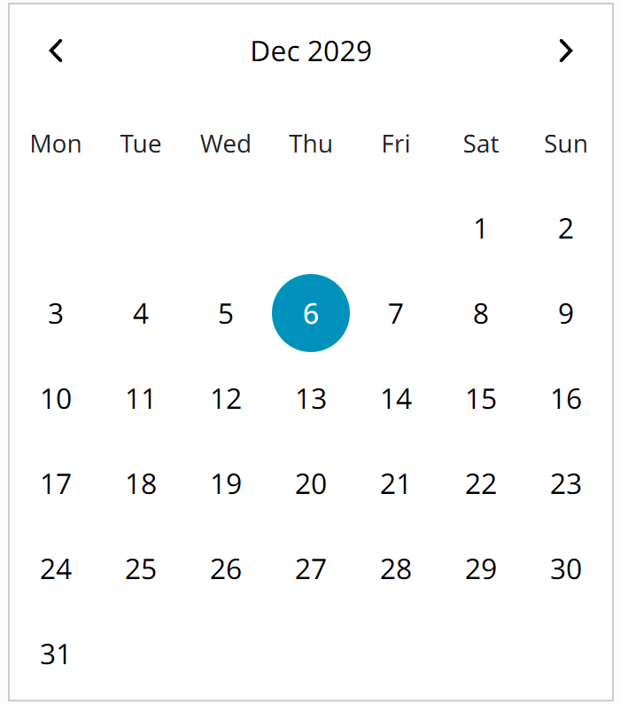
The click-able areas are: the arrows, the date headline and the date numbers.
To view a demo online:
| Codesandbox |  |
View | Edit |
Storybook
The github pages contains Storybook examples.
https://kunukn.github.io/vue-2-datepicker
Locally
To view demo examples locally clone the repo and run yarn install && yarn dev
Install
CSS required
import "@kunukn/vue-2-datepicker/dist/date-picker.css"or CDN
<link
  rel="stylesheet"
  href="https://unpkg.com/@kunukn/vue-2-datepicker/dist/date-picker.css"
/>
Add package
yarn add -D @kunukn/vue-2-datepickerimport { DatePicker } from '@kunukn/vue-2-datepicker'
import '@kunukn/vue-2-datepicker/dist/date-picker.css'
export default {
// ...
components: {
DatePicker,
},
// ...
}Directly from a CDN
<link
  rel="stylesheet"
  href="https://unpkg.com/@kunukn/vue-2-datepicker/dist/date-picker.css"
/>
<div id="app">
  <date-picker></date-picker>
</div>
<script src="https://cdnjs.cloudflare.com/ajax/libs/vue/2.6.14/vue.min.js"></script>
<script src="https://unpkg.com/@kunukn/vue-2-datepicker/dist/date-picker.umd.cjs"></script>
<script>
  const app = new Vue({
    el: '#app',
    components: {
      DatePicker,
    },
  })
</script>
Size
| name | size | gzip |
|---|---|---|
| date-picker.css | ~5 kB | ~1.2 kB |
| date-picker.js | ~53 kB | ~11 kB |
| date-picker.umd.cjs | ~34 kB | ~8 kB |
Usage
Formatting and localization patterns
You can either try to handle all the formatting yourself using these props with a day utility like dayjs.
useRtl = true | false
mondayFirst = true | false

// index will be from 0 to 6 representing the weekdays index
dayFormatter = (value, index) => 'something'

// index will be from 0 to 11 representing the month index
monthFormatter = (value, index) => 'something'

// value will be the year number option
yearFormatter = (value) => 'something'

headlineDayFormatter = ({ pageDate, selectedDate }) =>
  dayjs(pageDate).format('MMM YYYY')

// pageYearName is the year number
headlineMonthFormatter = ({ pageDate, selectedDate, pageYearName }) =>
  myCustomYearConverter(pageYearName)

// getPageDecade is the year range
headlineYearFormatter = ({ pageDate, selectedDate, getPageDecade }) =>
  myCustomYearDecadeConverter(getPageDecade)
Or you can let the library do the formatting and localization using the loaded language.
Code snippets
<date-picker></date-picker>value prop if passed should be a Date object
<script>
  let state = {
    date: new Date(2023, 6, 27),
  }
</script>
<date-picker :value="state.date"></date-picker>
support name attribute for normal html form submission
<date-picker :value="state.date" name="uniquename"></date-picker>Using v-model
<date-picker v-model="state.date" name="uniquename"></date-picker>Emits events
<date-picker
  @selected="doSomethingInParentComponentFunction"
  @opened="datepickerOpenedFunction"
  @closed="datepickerClosedFunction"
></date-picker>
always Inline open version
<date-picker inline></date-picker>Custom styling
Look in the file @kunukn/vue-2-datepicker/dist/date-picker.css to see what exists.
Override the CSS custom properties to set the desired size.
.vdp-datepicker {
  --vdp-cell-size: 40px;
  --vdp-color-theme: #4bd;
  --vdp-color-selected: hotpink;

  @media (min-width: 768px) {
    --vdp-cell-size: 56px;
  }
}
Override the CSS classnames
.vdp-datepicker {
  .vdp-datepicker__picker {
    padding: 1rem;
    margin-inline: auto;
  }
}

.vdp-datepicker__header {
  :nth-child(2) {
    font-weight: bold;
  }
}
Default CSS custom property values.
These can be overriden.
.vdp-datepicker {
  --vdp-cell-size: 44px;
  --vdp-cell-gap: 4px;
  --vdp-header-gap: 4px;
  --vdp-cell-border-radius-square: 50%;
  --vdp-cell-border-radius-rectangle: 8px;
  --vdp-color-theme-bg: #fff;
  --vdp-color-theme: #007da0;
  --vdp-color-selected: #fff;
  --vdp-color-border: #ccc;
  --vdp-color-disabled: #ddd;
  --vdp-color-button-disabled: #999;
  --vdp-color-header-button-hover: #f2f2f2;
  --vdp-color-header-bg: #fff;
  --vdp-color-highlighted-bg: #cae5ed;
  --vdp-color-highlighted-disabled-fg: #a3a3a3;
  --vdp-color-grey: #a3a3a3;
  --vdp-font-size-day-header: 14px;
}
Available props
| Prop | Type | Default | Description |
|---|---|---|---|
| value | Date|String | Date value of the datepicker | |
| name | String | Input name property | |
| id | String | Input id | |
| format | String|Function | dd MMM yyyy | Date formatting string or function |
| dayFormatter | Function | Custom day cell formatter | |
| monthFormatter | Function | Custom month cell formatter | |
| yearFormatter | Function | Custom year cell formatter | |
| headlineDayFormatter | Function | Custom day headline formatter | |
| headlineMonthFormatter | Function | Custom month headline formatter | |
| headlineYearFormatter | Function | Custom year headline formatter | |
| full-month-name | Boolean | false | To show the full month name |
| language | Object | en | Translation for days and months |
| disabled-dates | Object | See below for configuration | |
| placeholder | String | Input placeholder text | |
| inline | Boolean | To show the datepicker always open | |
| calendar-class | String|Object | CSS class applied to the calendar el | |
| input-class | String|Object | CSS class applied to the input el | |
| wrapper-class | String|Object | CSS class applied to the outer div | |
| monday-first | Boolean | false | To start the week on Monday |
| ensure-min-height | Boolean | false | Ensure day picker view has same height |
| day-cell-content | Function | Use to render custom content in day cell | |
| bootstrap-styling | Boolean | false | Output bootstrap v4 styling classes. |
| initial-view | String | minimumView | If set, open on that view |
| disabled | Boolean | false | If true, disable Datepicker on-screen |
| required | Boolean | false | Sets html required attribute on input |
| typeable | Boolean | false | If true, allows the user to type the date |
| use-utc | Boolean | false | use UTC for time calculations |
| use-rtl | Boolean | null | Force set the RTL language |
| days-custom-display | Array | null | Force set day headlines |
| months-custom-display | Array | null | Force set month headlines |
| open-date | Date|String | If set, open on that date | |
| minimum-view | String | 'day' | If set, lower-level views won't show |
| maximum-view | String | 'year' | If set, higher-level views won't show |
Events
These events are emitted on actions in the date picker
| Event | Output | Description |
|---|---|---|
| opened | The picker is opened | |
| closed | The picker is closed | |
| selected | Date|null | A date has been selected |
| selectedDisabled | Object | A disabled date has been selected |
| input | Date|null | Input value has been modified |
| cleared | Selected date has been cleared | |
| changedMonth | Object | Month page has been changed |
| changedYear | Object | Year page has been changed |
| changedDecade | Object | Decade page has been changed |
Date formatting
String formatter
NB. This is not very robust at all - use at your own risk! Needs better implementation. EDIT: by new author. This feature will likely be revisited in newer versions.
| Token | Desc | Example |
|---|---|---|
| d | day | 1 |
| dd | 0 prefixed day | 01 |
| D | abbr day | Mon |
| su | date suffix | st, nd, rd |
| M | month number (1 based) | 1 (for Jan) |
| MM | 0 prefixed month | 01 |
| MMM | abbreviated month name | Jan |
| MMMM | month name | January |
| yy | two digit year | 16 |
| yyyy | four digit year | 2016 |
Function formatter
Delegates date formatting to provided function.
The function will be called with date and it has to return formatted date as a string.
This allow us to use dayjs, date-fns or any other library to format date.
<script>
  methods: {
    customFormatter(date) {
      return dayjs(date).format('ddd, DD MMM');
    }
  }
</script>
<date-picker :format="customFormatter"></date-picker>
Disabled Dates
Dates can be disabled in several ways.
<script>
  let state = {
    disabledDates: {
      to: new Date(2016, 0, 5), // Disable all dates up to specific date
      from: new Date(2016, 0, 26), // Disable all dates after specific date
      days: [6, 0], // Disable Saturday's and Sunday's
      daysOfMonth: [29, 30, 31], // Disable 29th, 30th and 31st of each month
      dates: [
        // Disable an array of dates
        new Date(2016, 9, 16),
        new Date(2016, 9, 17),
        new Date(2016, 9, 18),
      ],
      ranges: [
        {
          // Disable dates in given ranges (exclusive).
          from: new Date(2016, 11, 25),
          to: new Date(2016, 11, 30),
        },
        {
          from: new Date(2017, 1, 12),
          to: new Date(2017, 2, 25),
        },
      ],
      // A custom function that returns true if the date is disabled.
      // This can be used for wiring your own logic to disable a date if none
      // of the above conditions serve your purpose.
      // This function should accept a date and return true if is disabled
      customPredictor: function (date) {
        // disables the date if it is a multiple of 5
        if (date.getDate() % 5 == 0) {
          return true
        }
      },
    },
  }
</script>
<date-picker :disabled-dates="state.disabledDates"></date-picker>
Highlighted Dates
Dates can be highlighted (e.g. for marking an appointment) in a number of ways. Important:
By default disabled dates are ignored, to highlight disabled dates set the includeDisabled
property to true. Note: Both to and from properties are required to define a range of
dates to highlight.
<script>
  var state = {
    highlighted: {
      to: new Date(2016, 0, 5), // Highlight all dates up to specific date
      from: new Date(2016, 0, 26), // Highlight all dates after specific date
      days: [6, 0], // Highlight Saturday's and Sunday's
      daysOfMonth: [15, 20, 31], // Highlight 15th, 20th and 31st of each month
      dates: [
        // Highlight an array of dates
        new Date(2016, 9, 16),
        new Date(2016, 9, 17),
        new Date(2016, 9, 18),
      ],
      // a custom function that returns true of the date is highlighted
      // this can be used for wiring you own logic to highlight a date if none
      // of the above conditions serve your purpose
      // this function should accept a date and return true if is highlighted
      customPredictor: function (date) {
        // highlights the date if it is a multiple of 4
        if (date.getDate() % 4 == 0) {
          return true
        }
      },
      includeDisabled: true, // Highlight disabled dates
    },
  }
</script>
<date-picker :highlighted="state.highlighted"></date-picker>
Slots
Slots will help you customize content.
beforeCalendarHeader
Sometimes you need to show custom content before the calendar header. For such cases, you can use the named slot beforeCalendarHeader.
An example would be to use bootstrap's input-group-prepend and input-group-append
to show some custom text:
<date-picker :bootstrap-styling="true">
  <div slot="beforeCalendarHeader" class="calender-header">Choose a Date</div>
</date-picker>
afterDateInput
To implement some custom styling (for instance to add an animated placeholder) on DateInput, you might need to add elements as DateInput siblings. Slot named
afterDateInput allows you to do that:
<date-picker>
  <span slot="afterDateInput" class="animated-placeholder">
    Choose a Date
  </span>
</date-picker>
prevButton and nextButton
Enables to apply custom prev and next button design.
<date-picker>
  <span slot="prevButton">👈</span>
  <span slot="nextButton">👉</span>
</date-picker>
Translations
Obs! This strategy is likely to be refactored over time where Intl.DateTimeFormat will be used.
list is used as the translation property.
- Add your language as a module in the
src/locale/translationsdir. - Import and export it in the
src/locale/all.jsfile Add the Language to the available languages in the readme file.Runyarn lintto make sure your code formatting is in line with the required code style.
How to apply language
Below script tag in a component.
Beware! importing the all.js file will load all the existing languages in the memory and JS bundle.
import { en, es, de } from '@kunukn/vue-2-datepicker/src/locale/all.js'In component data.
data() {
    return {
      en,
      es,
      de,
    }
}
html.
<date-picker :language="es"></date-picker>Lazy loaded approach
<date-picker :language="language"></date-picker> props: {
isoLanguage: { /* e.g. Spanish ISO code: 'es' */
type: String,
default: 'en'
},
},
data() {
return {
language: null,
}
},
async created() {
let langObject = await import(
`@kunukn/vue-2-datepicker/src/locale/translations/${isoLanguage}.js`
)
let newLang = langObject.default || langObject
if (newLang) {
this.language = newLang
}
},Available languages
| Abbr | Language | |
|---|---|---|
| af | Afrikaans | |
| ar | Arabic | |
| bg | Bulgarian | |
| bs | Bosnian | |
| ca | Catalan | |
| cs | Czech | |
| da | Danish | |
| de | German | |
| ee | Estonian | |
| el | Greek | |
| en | English | Default |
| es | Spanish | |
| fa | Persian (Farsi) | |
| fi | Finnish | |
| fo | Faroese | |
| fr | French | |
| ge | Georgia | |
| gl | Galician | |
| he | Hebrew | |
| hu | Hungarian | |
| hr | Croatian | |
| id | Indonesian | |
| is | Icelandic | |
| it | Italian | |
| ja | Japanese | |
| kk | Kazakh | |
| ko | Korean | |
| lb | Luxembourgish | |
| lt | Lithuanian | |
| lv | Latvian | |
| mk | Macedonian | |
| mn | Mongolian | |
| nbNO | Norwegian Bokmål | |
| nl | Dutch | |
| pl | Polish | |
| ptBR | Portuguese-Brazil | |
| ro | Romanian | |
| ru | Russian | |
| sk | Slovak | |
| slSI | Slovenian | |
| sv | Swedish | |
| sr | Serbian (Latin) | |
| srCyrl | Serbian (Cyrl) | |
| th | Thai | |
| tr | Turkish | |
| uk | Ukrainian | |
| ur | Urdu | |
| vi | Vietnamese | |
| zh | Chinese | |
| zhHK | Chinese_HK |
Strategy for this project
This date-picker will over time be modified to focus on the date logic handling. The presentation and localization of how to display the dates will be refactored to injectable formatter props.
Modern browser API can do language date formatting. Intl.DateTimeFormat
https://developer.mozilla.org/en-US/docs/Web/JavaScript/Reference/Global_Objects/Intl/DateTimeFormat
It has high Browser support 96+ %.
https://caniuse.com/?search=Intl.DateTimeFormat
The text input field parsing will likely also be refactored.