
io.Connect Launchpad & Global Search · 


The @interopio/launchpad-react-ui library enables you create custom io.Connect Launchpad and Global Search apps.
The library exports two main components: <LaunchPad /> and <GlobalSearch />.
- io.Connect Desktop - you can download a trial version from the official interop.io site.
Create a React app using create-react-app. In your project directory, run the following command:
npx create-react-app my-launchpad
Install the necessary dependencies:
npm install --save @interopio/launchpad-ui-react @interopio/react-hooks react-router-dom
Create a .env file in your project directory and specify the port at which you want to host the Launchpad:
PORT=3008
SKIP_PREFLIGHT_CHECK=trueBy default, io.Connect Desktop uses the Floating Toolbar as a shell app. To instruct io.Connect Desktop to use the Launchpad instead, set the "useEmbeddedShell" top-level key to false in the system.json system configuration file of io.Connect Desktop located in %LocalAppData%/interop.io/io.Connect Desktop/Desktop/config:
{
    "useEmbeddedShell": false
}
Provide an app definition for the Launchpad. You can use and modify the default definition file named launchpad.json located in the %LocalAppData%/interop.io/io.Connect Desktop/Desktop/config/apps folder. Set the "disabled" top-level key to false and provide the location of the Launchpad using the "url" property of the "details" top-level key:
{
    "disabled": false,
    "details": {
        "url": "http://localhost:3008/launchpad"
    }
}
For users to be able to start the Global Search app from the Launchpad menu, in the Launchpad definition you must also provide the name of the app (as specified in its definition) you will be using as a Global Search app. Use the "globalSearchAppName" property of the "customProperties" top-level key:
{
    "disabled": false,
    "details": {
        "url": "http://localhost:3008/launchpad"
    },
    "customProperties": {
        "globalSearchAppName": "my-global-search"
    }
}
For more details on how to configure the Launchpad, see the Launchpad > Configuration section in the io.Connect Desktop documentation.
Provide an app definition for the Global Search app. You can use and modify the default definition file named global-search.json located in the %LocalAppData%/interop.io/io.Connect Desktop/Desktop/config/apps folder. Provide the location of the Global Search app using the "url" property of the "details" top-level key. If you want users to be able to start the Global Search from the Launchpad menu, the app name set here must be identical to the one specified in the "globalSearchAppName" property in the Launchpad definition:
{
    "name": "my-global-search",
    "details": {
        "url": "http://localhost:3008/global-search"
    }
}The <LaunchPad /> and <GlobalSearch /> components depend on the functionalities provided by the initialized API object of the @interopio/desktop library. Use the <IOConnectProvider /> component from the @interopio/react-hooks library to achieve this automatically. For the Launchpad to function properly and retrieve all necessary information about the available io.Connect apps and Layouts, you must set the appManager and layouts properties of the configuration object to "full":
import { createRoot } from "react-dom/client";
import { BrowserRouter, Route, Routes } from "react-router-dom";
import IODesktop from "@interopio/desktop";
import { IOConnectProvider } from "@interopio/react-hooks";
import { LaunchPad, GlobalSearch } from "@interopio/launchpad-ui-react";
import "@interopio/launchpad-ui-react/dist/vnext.css";
import "@interopio/launchpad-ui-react/dist/GlobalSearch/styles/styles.css";

// Settings for configuring the `@interopio/desktop` library that will
// enable the Launchpad to function properly and retrieve all necessary
// information about the available io.Connect apps and Layouts.
const settings = {
    desktop: {
        config: { appManager: "full", layouts: "full" },
        factory: (config) => IODesktop(config)
    }
};

const root = createRoot(document.getElementById("root"));

root.render(
    <IOConnectProvider settings={settings}>
        <BrowserRouter>
            <Routes>
                <Route path="/launchpad" element={<LaunchPad />} />
                <Route path="/global-search" element={<GlobalSearch placeholder="Search..."/>} />
            </Routes>
        </BrowserRouter>
    </IOConnectProvider>
);
To initialize the project, execute the following command:
npm start
Start io.Connect Desktop. You should now be able to open the Launchpad with the default shortcut SUPER + \ ("Windows" key + backslash), and the Global Search app with the SUPER + / ("Windows" key + forward slash) shortcut.
The io.Connect Launchpad is a Windows style launcher that is hidden on startup of io.Connect Desktop and the user can open it via a keyboard shortcut whenever necessary. The Launchpad is non-intrusive, as it shows up on the screen only when the user needs it, and doesn't need to be moved or minimized manually.
The Launchpad is especially beneficial for power users who feel comfortable working mainly with keyboard shortcuts. Use the TAB and the arrow keys to navigate through the sections and their items. Select an item with the ENTER key, or by clicking on it, and the Launchpad will close automatically. You can also press ESC or click anywhere outside the Launchpad to close it without selecting an item.
Some of the main functionalities of the Launchpad include:
- sorted lists with apps and Layouts;
- activating the Launchpad through a configurable shortcut;
- using the search bar to find apps or Layouts;
- starting apps;
- saving, restoring and removing Layouts;
- marking favorite items;
- pinning the Launchpad so it stays always on screen;
- from the Launchpad Menu you can restart or shutdown io.Connect Desktop, save Layouts, see system info, send feedback and more;
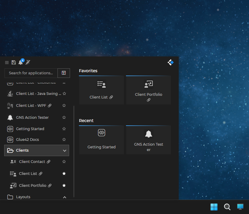
The search bar of the Launchpad supports the following:
- marking search results as favorite;
- marking search results as recently used;
- loading results from the default search provider of io.Connect Desktop;
- loading results from other registered search providers.
The <LaunchPad /> component has the following properties:
<LaunchPad
    showFavoritesAndRecentsPanel={true}
    showNotificationsButton={true}
    showSaveButton={true}
    customSortOrder={() => {}}
    components={{
        hamburgerMenuItems: [];
        logo: () => {};
        renderApplicationsAndLayoutsItem: () => {};
        renderFavoriteItem: () => {};
        renderRecentItem: () => {};
        renderHeaderContents: () => {};
        renderShutdownDialog: () => {};
        renderRestartDialog: () => {};
    }}
/>To show or hide the panel with favorite and recent apps:
<LaunchPad
    showFavoritesAndRecentsPanel={false}
/>
To show or hide the "Save Layout" button:
<LaunchPad
    showSaveButton={false}
/>
To show or hide the "Notifications" button:
<LaunchPad
   showNotificationsButton={false}
/>You can customize the sort order for list items in the Launchpad. Use the customSortOrder property of the <LaunchPad /> component and provide a sorting function that returns a number - the lowest the number, the higher the item will be in the list. Items with identical numbers will be sorted alphabetically. Your function will receive as an argument an AppInfo object describing the current item:
<LaunchPad
    customSortOrder={(item) => {
        if (item.title === "My Most Important Item") {
            return -100;
        } else if (item.title === "My Second Most Important Item") {
            return -99;
        } else {
            // My other items that will be sorted alphabetically.
            return 1000;
        };
    }}
/>To reorder the items in the hamburger menu of the Launchpad, or to provide your own custom components, use the hamburgerMenuItems property of the components object. It accepts an array of components that will be rendered in the order they are passed in the array. To make your custom component use the default styles for the menu items, wrap it in a <DropdownItem /> component:
import {
    DropdownItem,
    DividerMenuItem,
    AboutMenuItem,
    FeedbackMenuItem,
    RestartAppMenuItem,
    ShutdownAppMenuItem
} from "@interopio/launchpad-ui-react";

<LaunchPad
    components={{
        hamburgerMenuItems: [
            () => <DropdownItem>My Custom Item</DropdownItem>,
            DividerMenuItem
            AboutMenuItem,
            FeedbackMenuItem,
            RestartAppMenuItem,
            ShutdownAppMenuItem
        ]
    }}
/>
The following table lists the available default components for the hamburger menu:
| Component | Description |
|---|---|
<AboutMenuItem /> |
Provides information about io.Connect Desktop. |
<DividerMenuItem /> |
Inserts a divider between adjacent menu items. |
<FeedbackMenuItem /> |
Opens the Feedback Form. |
<LaunchGlobalSearchMenuItem /> |
Launches the Global Search app. |
<RestartAppMenuItem /> |
Restarts io.Connect Desktop. |
<SaveLayoutMenuItem /> |
Opens a dialog for saving the current arrangement of apps as a Global Layout. |
<ShutdownAppMenuItem /> |
Shuts down io.Connect Desktop. |
<SwitchThemesMenuItem /> |
Switches between the available themes. |
<SystemInfoEnvRegion /> |
Displays information about the current environment and region of io.Connect Desktop. |
<SystemInfoGatewayURL /> |
Displays the URL for the Gateway of io.Connect Desktop. |
<SystemInfoHeader /> |
Displays system information. |
<SystemInfoUser /> |
Displays the current user. |
<SystemInfoVersion /> |
Displays the platform version. |
To customize the content of the dialogs for restarting and shutting down io.Connect Desktop, use the renderShutdownDialog and renderRestartDialog properties of the components object.
The following example demonstrates how to create custom components for the restart and shutdown dialogs. Each component receives a closeDialog() function as a prop and you can use it for closing the respective dialog:
<LaunchPad
    components={{
        renderShutdownDialog: ({ closeDialog }) => {
            return (
                <div>
                    <p>Shut down io.Connect Desktop?</p>
                    <button onClick={() => io.appManager.exit({ showDialogs: false })}>Yes</button>
                    <button onClick={closeDialog}>No</button>
                </div>
            );
        },
        renderRestartDialog: ({ closeDialog }) => {
            return (
                <div>
                    <p>Restart io.Connect Desktop?</p>
                    <button onClick={() => io.appManager.restart()}>Yes</button>
                    <button onClick={closeDialog}>No</button>
                </div>
            );
        }
    }}
/>To replace the default logo with your custom one, use the logo property of the components object:
import MyLogo from "./MyLogo";

<LaunchPad
    components={{
        logo: MyLogo
    }}
/>To customize the list items in the Launchpad, use the renderApplicationsAndLayoutsItem property of the components object:
import MyCustomListItem from "./MyCustomListItem";

<LaunchPad
    components={{
        renderApplicationsAndLayoutsItem: MyCustomListItem
    }}
/>
Your custom component will receive the following properties:
| Property | Type | Description |
|---|---|---|
app |
object |
AppInfo object describing the current item. |
focusOrder |
number |
Represents the position at which the current item should receive focus. Used internally. |
level |
number |
Represents the nesting level of the current item. |
markFavorite() |
function |
Marks the current item as favorite. Receives the AppInfo object from the app property as an argument. When used, the item must also be synchronized across the platform by using the syncFavWithLP() method. |
markRecentlyUsed() |
function |
Marks the current item as recently used. Receives the AppInfo object from the app property as an argument. |
setAppForContextMenu() |
function |
Processes the current item in order to determine the context menu items to display. Receives the AppInfo object from the app property as an argument. |
setContextMenuCoordinates() |
function |
Defines the coordinates for the context menu. |
setIsContextMenuOpen() |
function |
Opens and closes the context menu. |
setShowcaseApp() |
function |
Processes the current item in order to display it in the showcase panel of the Launchpad when the user hovers on it. Receives the AppInfo object from the app property as an argument. |
syncFavWithLP() |
function |
Synchronizes the current item that is marked as favorite across the platform. This is necessary so that all apps that display information about favorite items (like the Global Search) may be updated. You must pass the persistable form of the item as an argument by using the getPersistableForm() method of the AppInfo object from the app property. |
syncUnfavWithLP() |
function |
Synchronizes the current item that is unmarked as favorite across the platform. This is necessary so that all apps that display information about favorite items (like the Global Search) may be updated. You must pass the persistable form of the item as an argument by using the getPersistableForm() method of the AppInfo object from the app property. |
unmarkFavorite() |
function |
Unmarks the current item as favorite. Receives the AppInfo object from the app property as an argument. When used, the item must also be synchronized across the platform by using the syncUnfavWithLP() method. |
To customize the favorite items in the Launchpad, use the renderFavoriteItem property of the components object:
import MyCustomFavoriteItem from "./MyCustomFavoriteItem";

<LaunchPad
    components={{
        renderFavoriteItem: MyCustomFavoriteItem
    }}
/>
Your custom component will receive the following properties:
| Property | Type | Description |
|---|---|---|
app |
object |
AppInfo object describing the current item. |
focusOrder |
number |
Represents the position at which the current item should receive focus. Used internally. |
markRecentlyUsed() |
function |
Marks the current item as recently used. Receives the AppInfo object from the app property as an argument. |
setAppForContextMenu() |
function |
Processes the current item in order to determine the context menu items to display. Receives the AppInfo object from the app property as an argument. |
setContextMenuCoordinates() |
function |
Defines the coordinates for the context menu. |
setIsContextMenuOpen() |
function |
Opens and closes the context menu. |
setShowcaseApp() |
function |
Process the current item in order to display it in the showcase panel of the Launchpad when the user hovers on it. Receives the AppInfo object from the app property as an argument. |
To customize the recent items in the Launchpad, use the renderRecentItem property of the components object:
import MyCustomRecentItem from "./MyCustomRecentItem";

<LaunchPad
    components={{
        renderRecentItem: MyCustomRecentItem
    }}
/>
Your custom component will receive the following properties:
| Property | Type | Description |
|---|---|---|
app |
object |
AppInfo object describing the current item. |
focusOrder |
number |
Represents the position at which the current item should receive focus. Used internally. |
markRecentlyUsed() |
function |
Marks the current item as recently used. Receives the AppInfo object from the app property as an argument. |
setAppForContextMenu() |
function |
Processes the current item in order to determine the context menu items to display. Receives the AppInfo object from the app property as an argument. |
setContextMenuCoordinates() |
function |
Defines the coordinates for the context menu. |
setIsContextMenuOpen() |
function |
Opens and closes the context menu. |
setShowcaseApp() |
function |
Process the current item in order to display it in the showcase panel of the Launchpad when the user hovers on it. Receives the AppInfo object from the app property as an argument. |
To add your custom component to the top of the Launchpad, use the renderHeaderContents property of the components object:
<LaunchPad
    components={{
        renderHeaderContents: () => <p>My custom component.</p>
    }}
/>The <GlobalSearch /> component has the following properties:
<GlobalSearch
    placeholder="io.Connect Global Search"
    components={{
        renderGlobalSearchItem: () => {};
    }}
/>To customize the placeholder for the search bar, use the placeholder property of the <GlobalSearch /> component:
<GlobalSearch
    placeholder="Search..."
/>To customize the search result items in the Global Search app, use the renderGlobalSearchItem property of the components object:
import MyCustomResultItem from "./MyCustomResultItem";

<GlobalSearch
    components={{
        renderGlobalSearchItem: MyCustomResultItem
    }}
/>
Your custom component will receive the following properties:
| Property | Type | Description |
|---|---|---|
app |
object |
AppInfo object describing the current item. |
focusOrder |
number |
Represents the position at which the current item should receive focus. Used internally. |
markFavorite() |
function |
Marks the current item as favorite. Receives the AppInfo object from the app property as an argument. When used, the item must also be synchronized across the platform by using the syncFavWithLP() method. |
setShowcaseApp() |
function |
Processes the current item in order to display it in the showcase panel of the Global Search when the user hovers on it. Receives the AppInfo object from the app property as an argument. |
showSavedLayoutAlert() |
function |
Displays a message for a saved Layout. Receives the AppInfo object from the app property as an argument. |
syncFavWithLP() |
function |
Synchronizes the current item that is marked as favorite across the platform. This is necessary so that all apps that display information about favorite items (like the Launchpad) may be updated. You must pass the persistable form of the item as an argument by using the getPersistableForm() method of the AppInfo object from the app property. |
syncRecentWithLP() |
function |
Synchronizes the current item that is marked as recently used with the Launchpad. Receives the AppInfo object from the app property as an argument. |
syncUnfavWithLP() |
function |
Synchronizes the current item that is unmarked as favorite across the platform. This is necessary so that all apps that display information about favorite items (like the Launchpad) may be updated. You must pass the persistable form of the item as an argument by using the getPersistableForm() method of the AppInfo object from the app property. |
unmarkFavorite() |
function |
Unmarks the current item as favorite. Receives the AppInfo object from the app property as an argument. When used, the item must also be synchronized across the platform by using the syncUnfavWithLP() method. |