
@imgix/angular provides custom components for integrating imgix into Angular applications.


- Overview / Resources
- Get Started
- Usage
- What Is the
ixlibParam on Every Request? - Code of Conduct
- Contributors
- License
Overview / Resources
Before you get started with this library, it's highly recommended that you read Eric Portis' seminal article on srcset and sizes. This article explains the history of responsive images in responsive design, why they're necessary, and how all these technologies work together to save bandwidth and provide a better experience for users. The primary goal of this library is to make these tools easier for developers to implement, so having an understanding of how they work will significantly improve your experience with this library.
Below are some other articles that help explain responsive imagery, and how it can work alongside imgix:
-
Using imgix with
<picture>. Discusses the differences between art direction and resolution switching, and provides examples of how to accomplish art direction with imgix. -
Responsive Images with
srcsetand imgix. A look into how imgix can work withsrcsetandsizesto serve the right image.
Get Started
- Firstly, follow this quick start guide to set-up an imgix account.
- Then, install @imgix/angular from npm with:
npm install @imgix/angularoryarn add @imgix/angular - Add the module to your app module declaration (usually in
src/app/app.module.ts):
import { ImgixAngularModule } from '@imgix/angular';

@NgModule({
  // ...
  imports: [
    ImgixAngularModule.forRoot({
      domain: '<your source url, e.g. assets.imgix.net>',
      defaultImgixParams: {
        // This enables the auto format and compress imgix parameters by default for all images, which we recommend to reduce image size, but you might choose to turn this off.
        auto: 'format,compress',
      },
      /* Add more imgix config here, see the API section for a full list of options */
    }),
  ],
  // ...
})
export class AppModule {}
Polyfills Required
A polyfill for Object.assign must be supplied for browsers that need it. You probably have this already set up, so you likely don't need to do anything.
Angular Ivy Support
The current recommendation as of writing this library is that all Angular libraries are compiled and published using View Engine. Then, if your application is using Ivy, your application will automatically recompile this library when it is installed. This ensures this library will also work with older versions of Angular, or if you haven't chosen to update to Ivy yet.
Usage
This library exports an Angular component, and to help you get started as quickly as possible, this component has been designed to follow the API of a native <img> tag as much as possible. You can expect most uses of the <img> tag to work just the same for <ixImg>.
Examples
Basic Use Case
To render a simple image that will display an image based on the browser's DPR and the width of the rendered element using the power of srcsets, add the following code to your view template:
<img ixImg path="examples/pione.jpg" sizes="100vw" />Please note: 100vw is an appropriate sizes value for a full-bleed image. If your image is not full-bleed, you should use a different value for sizes. Eric Portis' "Srcset and sizes" article goes into depth on how to use the sizes attribute. An important note here is that sizes cannot be a percentage based value, and must be in terms of vw, or a fixed size (px, em, rem, etc)
This will generate HTML similar to the following:
<img
src="https://assets.imgix.net/examples/pione.jpg?auto=format"
sizes="100vw"
srcset="
https://assets.imgix.net/examples/pione.jpg?auto=format&w=100 100w,
https://assets.imgix.net/examples/pione.jpg?auto=format&w=200 200w,
...
"
/>Why the attribute ixImg rather than a component? Unfortunately, due to Angular restrictions, if this library had simply used a ix-img component (e.g. <ix-img src="..."></ix-img>), the resulting img would have been wrapped in a wrapper component, which would cause issues with layout, and also with the picture element.
Flexible Image Rendering
This component acts dynamically by default. The component will leverage srcset and sizes to render the right size image for its container. This is an example of this responsive behaviour.
sizes should be set properly for this to work well, and some styling should be used to set the size of the component rendered. Without sizes and correct styling the image might render at full-size.
width and height be set on all images to provide an aspect ratio hint to the browser. The browser can then use this aspect ratio hint to reserve a space for the image (even if the image is responsive!). The following example explains all how to do it. You can also read more about this development in this amazing Smashing Magazine article.
For the width/height placeholder image, we need three requirements to be met:
-
widthandheightattributes set on the img element - some
widthCSS value (e.g.10px,100%,calc(100vw - 10px)) -
height: autoas a CSS property
./styles.css
.test-img {
  /* These next two lines are critical for the new browser feature. */
  width: 100%;
  height: auto; /* This tells the browser to set the height of the image to what it should be, and ignore the height attribute set on the image */
}
./app.js
For the width and height attributes, they can be any value as long as their aspect ratio is the same as what the image's aspect ratio is. E.g. width = 100, height = 50 is fine, and also width = 2, height = 1 is fine. In this case, the image has an aspect ratio of ~0.66:1, so we have set set a width of 66 and a height of 100, but we could have also used a width and height of 33 and 50, or 660 and 1000, for example.
<img
  ixImg
  path="examples/pione.jpg"
  sizes="calc(100vw - 128px)"
  class="test-img"
  width="66"
  height="100"
/>
Aspect Ratio: A developer can pass a desired aspect ratio, which will be used when
generating srcsets to resize and crop your image as specified. For the ar parameter to take effect, ensure that the fit parameter is set to crop.
<img
  ixImg
  path="examples/pione.jpg"
  sizes="calc(100vw - 128px)"
  [imgixParams]="{ ar: '16:9', fit: 'crop' }"
  // It's important to set these attributes to the aspect ratio that we manually specify.
  width="16"
  height="9"
/>
The aspect ratio is specified in the format width:height. Either dimension can be an integer or a float. All of the following are valid: 16:9, 5:1, 1.92:1, 1:1.67.
Fixed Image Rendering (i.e. non-flexible)
If the fluid, dynamic nature explained above is not desired, the width and height can be set explicitly along with a fixed prop. The imgix CDN will then render an image with these exact dimensions
<img
  ixImg
  path="image.jpg"
  width="100" // This width and the height below sets what resolution the component should load from the CDN and the size of the resulting image
  height="200"
  fixed // This toggles on fixed rendering
/>
This will generate an image element like:
<img
  src="https://.../image.jpg?w=100&h=200" // Notice the w and h parameters here
  srcset="
    image.jpg?w=100&h=200&dpr=1 1x,
    image.jpg?w=100&h=200&dpr=2 2x, ..." // This allows the image to respond to different device DPRs
  width="100"
  height="200"
/>
Fixed image rendering will automatically append a variable q parameter mapped to each dpr parameter when generating a srcset. This technique is commonly used to compensate for the increased file size of high-DPR images. Since high-DPR images are displayed at a higher pixel density on devices, image quality can be lowered to reduce the overall file size without sacrificing perceived visual quality. For more information and examples of this technique in action, see this blog post.
This behavior will respect any overriding q value passed in via imgixParams and can be disabled altogether with the boolean property disableVariableQuality.
<img ixImg path="image.jpg" width="100" disableVariableQuality />will generate the following srcset:
https://.../image.jpg?q=75&w=100&dpr=1 1x,
https://.../image.jpg?q=50&w=100&dpr=2 2x,
https://.../image.jpg?q=35&w=100&dpr=3 3x,
https://.../image.jpg?q=23&w=100&dpr=4 4x,
https://.../image.jpg?q=20&w=100&dpr=5 5x
Lazy-Loading
For lazy loading, there are a few options to choose from. They're listed here, along with our recommendation at the end.
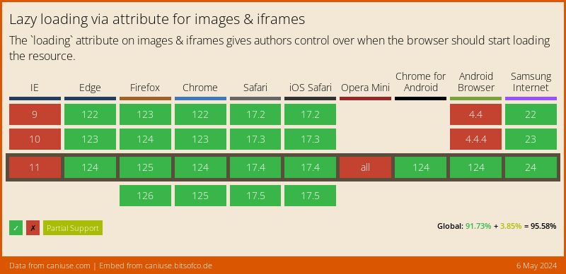
- Native lazy-loading with
loading="lazy". As of May 2020, this is shipped in stable versions of Chrome and Firefox. Example - Lazy-loading with an Intersection observer library (we recommend Lozad.js)
- Lazy-loading with a scroll-based library (we recommend Lazysizes)
Our recommendation is to use a combination of native lazy loading and Lozad.js. See how to do this below.
Lazy-loading (Native + Interaction Observer) Recommended
This approach uses native lazy loading for browsers that support it, which is more and more every day, and uses Lozad.js for those that don't. Lozad.js uses Interaction Observers to watch for changes to DOM elements, and is more performant than using event listeners.
The approach taken here is to create a custom directive that will work differently based on whether native lazy loading is supported or not.
You will need to ensure you polyfill Interaction Observer for older browsers. Here's one.
Add a directive to your application with the following code:
import { AfterViewChecked, Directive, ElementRef } from '@angular/core';
import lozad from 'lozad';

const isNativeLazyLoadingSupported = 'loading' in HTMLImageElement.prototype;

@Directive({
  selector: '[lazy-img]',
})
export class LazyloadDirective implements AfterViewChecked {
  private observer: lozad.Observer;
  constructor(private el: ElementRef) {}
  ngAfterViewChecked() {
    const nativeEl = this.el.nativeElement;
    if (
      isNativeLazyLoadingSupported ||
      nativeEl.getAttribute('data-loaded') === 'true'
    ) {
      // If native lazy loading is supported, we want to redirect the "lazyload"
      // data-attributes to the actual attributes, and let the browser do the work
      nativeEl.setAttribute('src', nativeEl.getAttribute('data-src'));
      nativeEl.setAttribute('srcset', nativeEl.getAttribute('data-srcset'));
      return;
    }
    // Otherwise, we tell lozad to listen for when this element scrolls into the viewport
    if (!this.observer) {
      this.observer = lozad(nativeEl);
      this.observer.observe();
    }
  }
}
That's all the set-up we need to do! Now there's a lazy-img directive available for us to use on our images! So let's do that. To use this directive with ixImg, make sure you're using attribute-config to redirect the src and srcset to data-src and data-srcset, which will be picked up either by Lozad, or the code we just wrote before.
<img
  ixImg
  path="blog/unsplash-kiss.jpg"
  [attributeConfig]="{ src: 'data-src', srcset: 'data-srcset' }"
  lazy-img
  loading="lazy"
/>
Lazy-loading (Native)
To use pure browser native lazy-loading, just add a loading="lazy" attribute to every image you want to lazy load.
<img ixImg path="..." loading="lazy" />There's more information about native lazy loading in this web.dev article, and in this CSSTricks article.
Lazy-loading (Interaction Observer)
Lazy loading can be done with an Interaction Observer. The best way to do this is with a library (we recommend Lozad.js), but you might also want to roll your own.
You could modify the recommended code above to remove the native lazy loading support in order to create a Lozad directive.
Here's a CSSTricks article about using Lozad.js, and another one about rolling your own lazy loading.
Lazy-loading (Event Listener)
The last way to implement lazy loading is to use an event listener. This is not recommended these days due to performance concerns, which have been solved by other solutions (the previous solutions mentioned above).
If you'd still like to use an event listener, we recommend using lazysizes. In order to use this library with lazysizes, you can simply tell it to generate lazysizes-compatible attributes instead of the standard src, srcset by changing some configuration settings:
<img
  ixImg
  class="lazyload"
  path="..."
  [attributeConfig]="{
    src: 'data-src',
    srcSet: 'data-srcset',
  }"
/>
NB: It is recommended to use the attribute change plugin in order to capture changes in the data-* attributes. Without this, changing the props to this library will have no effect on the rendered image.
Picture Support
With the picture element, images can be directed to have different crops and sizes based on the browser dimensions, or any media query.
It is recommended to check out our introduction blog post about how to best use picture and the imgix API for some great tips and examples!
Fluid mode
By default, the srcset values generated are fluid-width srcsets. This allows them to respond with the actual size of your picture element on the page.
<picture ixPicture>
  <source ixSource path="image.jpg" media="(min-width: 768px)" [imgixParams]="{ fit: 'crop', ar: '2:1' }"></ixSource>
  <source ixSource path="image.jpg" media="(min-width: 320px)" [imgixParams]="{ fit: 'crop', ar: '1.5:1' }"/>
  <img ixImg path="image.jpg" [imgixParams]="{ w: 100, fit: 'crop', ar: '3:1' }" />
</picture>
Fixed mode
If you provide a width (w) as an imgix parameter, the srcset will instead be a "DPR" srcset.
<picture ixPicture>
  <source ixSource path="image.jpg" media="(min-width: 768px)" [imgixParams]="{ fit: 'crop', ar: '2:1', w: 768 }"/>
  <source ixSource path="image.jpg" media="(min-width: 320px)" [imgixParams]="{ fit: 'crop', ar: '1.5:1', w: 320 }"/>
  <img ixImg path="image.jpg" [imgixParams]="{ w: 100, fit: 'crop', ar: '3:1' }" />
</picture>
Advanced Examples
For advanced use cases which go above the basic usage outlined above, such as lazy loading, or integration with other components or libraries, this library provides a set of low-level APIs.
Custom Attribute Mapping
In some situations, you might want to pass the generated src and srcset to other attributes, such data-src. You can do that like this:
<img
  ixImg
  path="image.jpg"
  [attributeConfig]="{
    src: 'data-src',
    srcset: 'data-srcset'
  }"
/>
Which will generate HTML as follows:
<img
  data-src="https://assets.imgix.net/examples/pione.jpg?auto=format"
  data-srcset="https://assets.imgix.net/examples/pione.jpg?auto=format&w=100 100w, ..."
/>
Base64 Encoding
All imgix parameter values (with the exception of auto and ch) can be encoded using a URL-safe Base64 scheme. This client library has automatic base64 encoding for any imgix parameter that ends in 64. For example, to encode txt, just use txt64.
<img
  ixImg
  path="image.jpg"
  [imgixParams]="{
    txt64: 'Oh hello, world'
  }"
/>
becomes:
<img src="image.jpg?txt64=T2ggaGVsbG8sIHdvcmxk&..." ... />What Is the ixlib Param on Every Request?
For security and diagnostic purposes, we tag all requests with the language and version of library used to generate the URL.
To disable this, set includeLibraryParam to false when initializing NgImgix.
import { ImgixAngularModule } from '@imgix/angular';

@NgModule({
  imports: [
    ImgixAngularModule.forRoot({
      domain: 'example.imgix.net',
      includeLibraryParam: false,
    }),
  ],
})
export class AppModule {}
Code of Conduct
imgix is dedicated to providing a harassment-free experience for everyone, regardless of gender, gender identity and expression, sexual orientation, disability, physical appearance, body size, race, or religion. We do not tolerate harassment of participants in any form.
This code of conduct applies to all imgix sponsored spaces both online and off, including our open-source projects. Anyone who violates this code of conduct may be sanctioned or expelled from these spaces at the discretion of the imgix Anti-Abuse Team (codeofconduct@imgix.com).
Our full Code of Conduct can be found here.
Contributors
Contributions are a vital part of this library and imgix's commitment to open-source. We welcome all contributions which align with this project's goals. More information can be found in the contributing documentation.
Thanks goes to these wonderful people (emoji key):
 Frederick Fogerty |
 sherwinski |
This project follows the all-contributors specification. Contributions of any kind welcome!
License
