Installation
Add the dependency:
npm i react-native-picker-modalPeer Dependencies
IMPORTANT! You need install them
"react-native-modal": ">= 13.0.0"Usage
Import
import PickerModal from "@freakycoder/react-native-picker-modal";Fundamental Usage
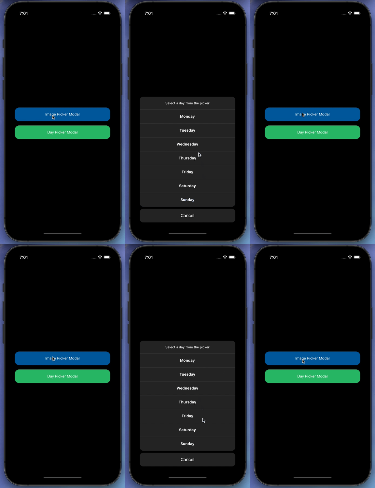
<PickerModal
  title="You can either take a picture or select one from your album."
  isVisible={isVisible}
  data={["Take a photo", "Select from album"]}
  onPress={(selectedItem: string, index: number) => {
    console.log({ selectedItem, index });
  }}
  onCancelPress={() => {
    setVisible(false);
  }}
  onBackdropPress={() => {
    setVisible(false);
  }}
/>
Example Project 😍
You can checkout the example project
Simply run
npm i
react-native run-ios/android
should work of the example project.
Configuration - Props
Fundamentals [Required]
| Property | Type | Default | Description |
|---|---|---|---|
| title | string | undefined | change the title |
| data | string[] | undefined | set the picker modal dataset as string array |
| isVisible | boolean | undefined | change the picker modal visibility |
| onPress | function | undefined | set your own logic for the button functionality when it is pressed |
| onCancelPress | function | undefined | set your own logic for the cancel button functionality when it is pressed |
Customization (Optionals)
| Property | Type | Default | Description |
|---|---|---|---|
| onBackdropPress | function | undefined | set your own logic for the backdrop of the modal functionality when it is pressed |
| TouchableComponent | TouchableHightlight |
default | set your own component instead of default react-native TouchableHightlight component |
| style | ViewStyle | default | set or override the style object for the main container |
| dividerStyle | ViewStyle | default | set or override the style object for the divider style |
| cancelButtonStyle | ViewStyle | default | set or override the style object for the cancel button style |
| titleTextContainer | ViewStyle | default | set or override the style object for the title text container |
| titleTextStyle | TextStyle | default | set or override the style object for the title text style |
| cancelButtonTextStyle | ViewStyle | default | set or override the style object for the cancel button text container |
| actionButtonStyle | ViewStyle | default | set or override the style object for the action button container |
| actionButtonTextStyle | ViewStyle | default | set or override the style object for the action button text |
| actionButtonUnderlayColor | string | rgba(0,0,0,0.3) | change the action button's underlay color |
| cancelButtonUnderlayColor | string | rgba(200,200,200,0.1) | change the cancel button's underlay color |
Future Plans
- [x]
LICENSE - [ ] Write an article about the lib on Medium
Author
FreakyCoder, kurayogun@gmail.com
License
React Native Picker Modal is available under the MIT license. See the LICENSE file for more info.


