
React Tree Select 

A simple, highly customizable tree component.
View Full Documentation
Installation
Install using the package manager of your choice.
npm i @attebyte/react-tree-select
yarn add @attebyte/react-tree-select
Getting Started
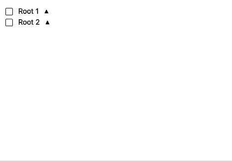
Simply pass your tree shaped data to TreeSelect along with the required properties.
import TreeSelect from '@attebyte/react-tree-select';
import '@attebyte/react-tree-select/dist/style.css';

function App() {
  return (
    <>
      <TreeSelect
        defaultData={ExampleData}
        labelProperty={'label'}
        valueProperty={'included'}
        childrenProperty={'children'}
        uniqueIDProperty={'value'}

        />
    </>
  )
}

export default App
const ExampleData: ExampleNode[] = [
  {
    label: 'Root 1',
    value: 1,
    children: [
      {
        label: 'Child 1',
        value: 2,
        children: [
          {
            label: 'Grandchild 1',
            value: 3,
          },
          {
            label: 'Grandchild 2',
            value: 4,
          }
        ]
      },
      {
        label: 'Child 2',
        value: 5,
      }
    ]
  },
  {
    label: 'Root 2',
    value: 6,
    children: [
      {
        label: 'Child 3',
        value: 7,
      },
      {
        label: 'Child 4',
        value: 8,
      }
    ]
  }
];
Props
Commonly required props for most use cases. To see a full list of available properties, see our full documentation.
| Property | Type | Required? | Description |
|---|---|---|---|
data |
T[] |
yes* | The data to be rendered, if controlled |
defaultData |
T[] |
yes* | The data to be rendered, if uncontrolled |
uniqueIDProperty |
keyof T |
yes | The property of your tree node that uniquely identifies the node |
labelProperty |
keyof T |
yes | The property of your node to display |
childrenProperty |
keyof T |
yes | The property of your node that holds the node's children |
valueProperty |
keyof T |
yes* | Required if you intend to use the tree to select nodes. If using for display purposes only, not required |
onChange |
(data: T[]) => void |
yes* | Required if you intend to use the the tree to select nodes. Called every time a node selection is changed with the updated tree |
Customization
This library is built with customization in mind and contains minimal default styles using tailwind. The library consists of 4 replacable parts:
-
TreeNode- The container for an individual node -
NodeLabel- The label displyed within each node -
NodeCheck- The checkbox used to select a node or indicate descendent's selections -
ExpandIcon- Icon to indicate if a node has children or is collapsed / expanded For additional information and examples of customization, please see our full documentation.
This is my first open source project and feedback is always appreciated. Twitter