react-native-autocomplete
MLPAutoCompleteTextField (iOS only) wrapper for React Native, supports React Native custom cells 🎨.
Installation
$ npm install react-native-autocomplete- Right click on Libraries, select Add files to "…" and select
node_modules/react-native-autocomplete/RCTAutoComplete.xcodeproj - Select your project and under Build Phases -> Link Binary With
Libraries, press the + and select
libRCTAutoComplete.a.
Usage
For example download Country list
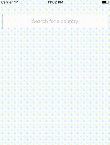
;; ;; const styles = StyleSheet; state = data: ; { superprops; thisonTyping = thisonTyping; } { const countries = Countries; this; } { AlertIOS; } { return <View style=stylescontainer> <AutoComplete style=stylesautocomplete suggestions=thisstatedata onTyping=thisonTyping onSelect=thisonSelect placeholder="Search for a country" clearButtonMode="always" returnKeyType="go" textAlign="center" clearTextOnFocus autoCompleteTableTopOffset=10 autoCompleteTableLeftOffset=20 autoCompleteTableSizeOffset=-40 autoCompleteTableBorderColor="lightblue" autoCompleteTableBackgroundColor="azure" autoCompleteTableCornerRadius=8 autoCompleteTableBorderWidth=1 autoCompleteFontSize=15 autoCompleteRegularFontName="Helvetica Neue" autoCompleteBoldFontName="Helvetica Bold" autoCompleteTableCellTextColor="dimgray" autoCompleteRowHeight=40 autoCompleteFetchRequestDelay=100 maximumNumberOfAutoCompleteRows=6 /> </View> ; } AppRegistry;Custom Cell
You can use a React Native component to render the cells.
;; ;; const flag = `https://raw.githubusercontent.com/hjnilsson/country-flags/master/png250px/.png`; const styles = StyleSheet; const CustomCell = <View style=stylescell> <Image source= uri: style=stylesimage /> <Text style=stylescellText>datacountry</Text> </View>; state = data: ; { superprops; thisonTyping = thisonTyping; } { const countries = Countries; this; } { AlertIOS; } { return <View style=stylescontainer> <AutoComplete style=stylesautocomplete cellComponent="CustomCell" suggestions=thisstatedata onTyping=thisonTyping onSelect=thisonSelect placeholder="Search for a country" clearButtonMode="always" returnKeyType="go" textAlign="center" clearTextOnFocus autoCompleteTableTopOffset=10 autoCompleteTableLeftOffset=20 autoCompleteTableSizeOffset=-40 autoCompleteTableBorderColor="lightblue" autoCompleteTableBackgroundColor="azure" autoCompleteTableCornerRadius=8 autoCompleteTableBorderWidth=1 autoCompleteRowHeight=40 autoCompleteFetchRequestDelay=100 maximumNumberOfAutoCompleteRows=6 /> </View> ; } AppRegistry;AppRegistry;Events
| event | Info |
|---|---|
| onTyping | Text is entered. The callback can be delayed with option autoCompleteFetchRequestDelay. |
| onSelect | A cell in the suggestions list is selected. |
| onFocus | Text input get focus. |
| onBlur | Text input lost focus. |
Other events from Text Input are avalaible.
Global options
| option | type | Info |
|---|---|---|
| cellComponent | string | Name of a React Native component used to render cells. If null, use the default rendering. |
| suggestions | array | If using default cell rendering specify an Array of string, otherwise any object. |
| autoCompleteFetchRequestDelay | number | Delay in milliseconds before retrieving suggestions. |
| maximumNumberOfAutoCompleteRows | number | Number of suggestions displayed. |
| showTextFieldDropShadowWhenAutoCompleteTableIsOpen | bool | Display a drop shadow around the text field. |
| autoCompleteTableViewHidden | bool | If true, the suggestions list will be hidden. |
| autoCompleteTableBorderColor | color | Set suggestions list border color. |
| autoCompleteTableBorderWidth | number | Set suggestions list border color. |
| autoCompleteTableBackgroundColor | color | Set suggestions list border size. |
| autoCompleteTableCornerRadius | number | Set suggestions list background color. |
| autoCompleteTableTopOffset | number | Set the distance between the text field and the suggestions list. |
| autoCompleteTableLeftOffset | number | Set the left offset between the container and the suggestions list. |
| autoCompleteTableSizeOffset | number | Set the offset of the suggestions list size. Combined with autoCompleteTableLeftOffset, you can reduce the width of the suggestions list and to center it. Exemple: autoCompleteTableLeftOffset=20 autoCompleteTableSizeOffset=40 |
| autoCompleteRowHeight | number | Height of cells in the suggestions list. |
Default cell rendering options
| option | type | Info |
|---|---|---|
| autoCompleteFontSize | number | Font Size used to display text. |
| autoCompleteRegularFontName | string | Font used to display text. |
| autoCompleteBoldFontName | string | Font used to display suggestion text. |
| autoCompleteTableCellTextColor | color | Text Color used to display text. |
| autoCompleteTableCellBackgroundColor | color | Background color of cells. |
| applyBoldEffectToAutoCompleteSuggestions | bool | If false, disable bold effect on suggestion text. |
| reverseAutoCompleteSuggestionsBoldEffect | bool | Reverse the bold effect. |
License
MIT © Nicolas Ulrich 2017