
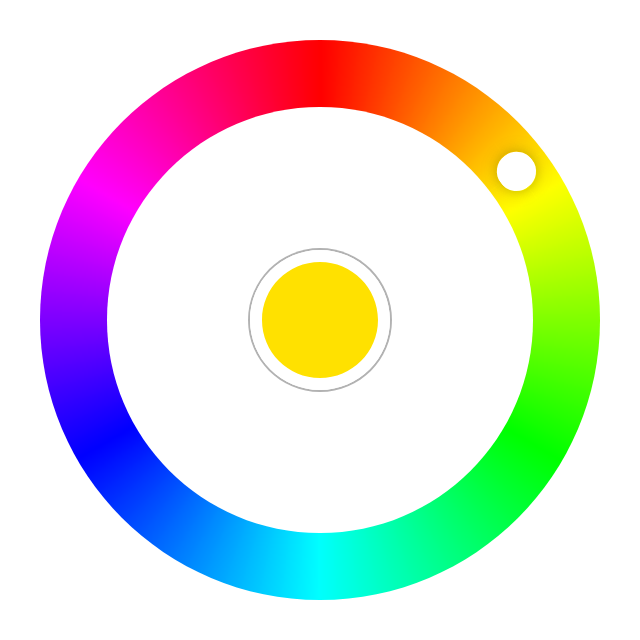
Angular Radial Color Picker
This project was generated with Angular CLI version 9.0.1.


Introduction
Great UX starts with two basic principles - ease of use and simplicity. Selecting a color should be as easy as moving a slider, clicking a checkbox or pressing a key just like other basic form elements behave.
This is a flexible and elegant material-ish design color picker. Developed with mobile devices in mind. Key features:
- Supports touch devices
- Angular animations
This component doesn't have feature parity with it's predecessor for Angular 1.x
The component is developed so it can be used with template-driven or reactive form, or as a simple component.
Quick Links
Usage
Color Picker on npm
npm install -S @radial-color-picker/angular-color-pickerIn your app module or any module that will hold the components that are using the radial color picker:
import { RadialColorPickerModule } from 'radial-color-picker';

@NgModule({
  declarations: [
    AppComponent
  ],
  imports: [
    BrowserModule,
    RadialColorPickerModule
  ],
  providers: [],
  bootstrap: [AppComponent]
})
export class AppModule { }
and in your component template
<rcp-radial-color-picker></rcp-radial-color-picker>more examples can be found in the app in this repository
Inputs
<rcp-radial-color-picker> component has several inputs, all of which are optional.
| Options | Type | Default/Description |
|---|---|---|
selectToChange |
Boolean | prevents propagation of on change on FormControl or NgModel on rotation. Defaults to false: false. |
collapsed |
Boolean | should the initial render be collapsed/open state of the color picker. Defaults to true: true. |
collapsible |
Boolean | Should color select trigger hiding of the color palette. Defaults to true: true. |
enterAnimation |
Boolean | flag to turn on/off intro animations. Defaults to true: true. |
exitAnimation |
Boolean | flag to turn on/off outro animations. Defaults to true: true. |
size |
String | pixel size of diameter. Defaults to 300: 300. |
colorType |
String | format of color to be emitted by the component. Defaults to hex: hex. |
color |
String | hex, rgb or hsl code of your color. Defaults to red: #FF0000. |
Outputs
<rcp-radial-color-picker> component has several outputs, all of which are optional.
| Options | Type | Default/Description |
|---|---|---|
selected |
Function | Callback which is triggered when a color is selected. |
colorChange |
Function | Callback which is triggered when color is changed (i.e. on rotation). |
lifecycle |
Function | Callback which is triggered when component state is changed. |
Lifecycle Events
Emitted by the lifecycle Output
| Name | Description |
|---|---|
show |
Fires when the color picker is about to show and before any animation is started. |
shown |
Fires when the color picker is shown and has finished animating. |
selected |
Fires when a color is selected via the middle selector. Event is fired right before hide. |
hide |
Fires when the color picker is about to hide and before any animation is started. |
hidden |
Fires when the color picker is hidden and has finished animating. |
Instance methods
| Name | Description |
|---|---|
open |
Programatically opens the color picker if it's not already opened. |
close |
Programatically closes the color picker if it's not already closed. |
First Asked Questions
Color picker uses hex. How can I use other formats like rgb() or hsl?
The color picker will recognize the format of the input, but will still work internally with hex value of the provided color. You can change the output format by setting the colorType property to hex, rgb or hsl
How to select other shades of the solid colors?
We suggest to add a custom slider for saturation and luminosity or use <input type="range">.
How can I change the active color of the picker after initialization?
rcp-radial-color-picker component uses OnChanges lifecycle hook to detect changes of the color binding. When using
<rcp-radial-color-picker [color]="color"></rcp-radial-color-picker>
Contribute
If you're interested in the project you can help out with feature requests, bugfixes, documentation improvements or any other helpful contributions. You can use the issue list of this repo for bug reports and feature requests and as well as for questions and support.
We are also particularly interested in projects you did with this plugin. If you have created something colorful and creative with the color picker and want to show it off send us a quick mail.
The project is using an adapted version of Angular's commit convention and commit messages should adhere to it.