Weel Keypad


移动端优先的虚拟键盘,开箱即用支持深度定制,按需可对所有 DOM 节点进行调整或重写,完全分离结构与样式,布局、展现方式及主题样式交由 CSS 实现。
安装
仅在浏览器环境使用的话采取第一种安装方式即可,因为没有覆盖测试所有的设备浏览器,可能会需要 babel-polyfills 来增加旧的浏览器对 ES5 的兼容支持。
- 切换至 master 分支 下载
dist/keypad.min.js(UMD)用于浏览器环境的打包 - NPM 下载
npm i weel-translate- 克隆 develop 分支到本地,按照 构建项目 部分打包文件
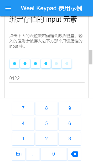
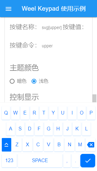
截图
计划特性
- 数字键盘布局
- 自定义键盘布局
- 通过钩子自定义 Dom 元素
- 明暗两色默认主题
- 分离布局(Layout)与主题样式(Theme)
- 基于选项的配置
- 添加定制化的工具条
- Flex 方式布局
- Float 布局选项(Legacy 兼容)
- 响应正常的 input 元素
- 按需叫出键盘
- 支持桌面端鼠标事件
- 支持 SVG 图片作为按键
- 支持键盘切换
- 支持 contenteditable 属性元素
- 支持插件机制,动态挂载需要的代码
使用说明
实例化所需的所有选项都是可选的,根据需求进行配置即可。 支持传入回调函数来修改默认配置,参数为对应的默认参数。
/** 使用 new 操作符进行实例化 */const kypd = options layouts maps // 对象字面量形式const object = show: true // options qwer: '...' // layouts upper: 'caps_lock' // maps // 回调函数形式const callback = { optionsshow = true return options } { layoutsqwer = '...' return layouts } { mapsupper = 'caps_lock' return maps }配置选项 options
const defaultOptions = // 可以响应 “focus|blur” 事件的 input 元素 // 支持 selector 字符串,使用 querySelectorAll 查找 DOMs el: null // {HTMLElement|NodeList|String} // 接受并存储按键内容的 “input” 元素,只支持单个 DOM 元素 input: null // {HTMLElement} // 默认 true 使用 Flex 布局,false 使用 Float 布局 flex: true // {Boolean} // 默认 true 使用 touch 相关事件,false 使用 mouse 相关事件 // 如果需要给多个实例统一修改的话,可以在引入后使用 'Keypad.isMobile=<Boolean>' mobile: true // {Boolean} // 按键按下时触发回调函数,数组参数: [text, value, code] onstart: null // {Function} // 按键放开时触发回调函数,参数同上 onend: null // {Function} // true 为载入后立即显示 show: false // {Boolean} // 点击键盘区域以外的页面部分时隐藏键盘,支持修改事件名, 默认为“touchstart|mouseup” hide: false // {Boolean|String} // 默认显示的键盘布局,默认数字键盘,可用值:number, qwer name: 'number' // {String} // 是否渲染多键盘,false 为只渲染 “name” 指定的键盘并且隐藏切换"@@"键盘按钮 multiple: true // {Boolean} // 替换程序的渲染方法, 参数:layouts render: null // {Function} // 个部分元素渲染时应用钩子,参数:target,this 为当前 Keypad 实例 // 定义 target 后必须 return target 以继续完整的渲染 reducer: // {Function} wrap: null container: null content: null row: null key: null // 替换 kypd-name 的自定义标签,会无效化所有的默认样式 tag: null // {Strimg} // 自定义主题名称,kypd-<flex|float>wrap[data-kypd-theme=""default] theme: 'default' // {String} // 暗色主题开关,kypd-<flex|float>wrap[data-kypd-dark=""false] dark: false // {Boolean} // 使用 appendChild 方法注入键盘的位置,默认 document.body body: documentbody // {HTMLElement?} // 值为 falsy 的话则只渲染不注入到页面中,之后手动调用 kypd.inject() inject: true自定义布局 layouts
键盘布局使用三维数组实现,可以很直观的创建自由度很高的布局。
说明
- 第一层为布局容器
- 第二层为每一行按键的容器
- 第三层为定义的按键
[text, [, value, code]]
使用 SVG
- 设置
text为形如<svg ...><path d="..."></path></svg>的 SVG 字符串 - 通过
svg[name]使用 内置的 SVGs
/** * 默认的两个布局示例 */ // 数字键盘const number = 7 8 9 4 5 6 1 2 3 'En' null '@@qwer' '.' 0 'svg[backspace]' null 'backspace' // 简略版的 QWER 键盘const qwer = 'q' 'w' 'e' 'r' 't' 'y' 'u' 'i' 'o' 'p' 'a' 's' 'd' 'f' 'g' 'h' 'j' 'k' 'l' 'svg[upper]' null 'upper' 'z' 'x' 'c' 'v' 'b' 'n' 'm' 'svg[backspace]' null 'backspace' '123' null '@@number' 'Space' ' ' ',' '.' 'svg[done]' null 'enter' // 单个普通按键 “0” '0' 0 null // 等价于,value 值不存在时默认使用 text 名称作为值'0' // 单个功能按键 'Ctrl' // 名称 null // 没有值的话使用 null 来忽略 'ctrl' // 自定义键码,程序内置了几个(见 maps 部分),也可自定义设置 // 切换到键盘// @@+键盘布局 name// 只有 @@ 的话则循环切换下一个'123' null '@@number' 自定义键映射 maps
// 内置默认的,后续会增加const defaultMaps = upper: 'upper' // 大写锁定 ctrl: 'ctrl' alt: 'alt' shift: 'shift'实例的方法 & 属性
/** 可调用的方法 */// 显示|隐藏|切换,参数 `name` 同选项 "name"kypdkypdkypd //手动将键盘注入到页面,参数 `target` 同选项 "inject"kypd // 手动监听 input 元素 focus|blur 事件,参数 `el` 同选项 "el"kypd // 从页面中移除由载 kypd.inject() 入的最后一个kypd // 更新深色主题,参数 expect 默认为 truthy,falsy 则关闭深色主题kypd kypd /** 可使用的属性 */kypdoptions // 合并后的选项kypdlayouts // 合并后的键盘布局kypdmaps // 合并后的按键映射kypdwrap // 包裹键盘内容的根元素kypdinput // 选项中的 "input" 或者监听后的触发focus 的 input 元素自定义插件
类似于
Keypad.isMobile = /Mobile/.test(navigator.userAgent),插件plugins也是挂在Keypad全局变量上的,下面是使用插件实现的移动端设备检测。
/** * plugin 推荐写法 */ { var isMobile = /Mobile/ // 返回的闭包函数中的 this 即已经完成用户配置初始化的 Keypad 对象 return { thisoptionsmobile = isMobile }} /* 有两种方式注册 & 执行插件 */ // 1. 如果需要应用到所有实例上的话,最好使用 plugins 来注册,// 插件按顺序依次执行Keypadplugins = // 实例化const kypd = // 2. 使用 kypd.use(),这种方法无法修改实例化后的代码,但是可以用来动态挂载一些仅在此实例中可用的// 工具方法或者属性,不过无法修改已经渲染过的配置需要的话可以设置选项 "inject = false" ,然后手动 kypd.inject()kypd构建项目
# 安装依赖,推荐使用 yarn yarn # 或者 npm install # 启动项目开发环境并监听源文件 npm start # 开发时打包 npm run bundle # 发布时打包 npm run build # 测试 npm test