
VuePress Plugin NetaBare Switch
Toggle switch for ネタバレ (NetaBare)
ネタバレ (NetaBare) means spoiler
Articles using this plugin toggle showing the NetaBare sentences.
This plugin is for VuePress v2
Recommendation
Styles in components are written by Tailwind CSS.
Adding Windi CSS is recommended.
If you use vuepress with Vite
npm install -D windicss vite-plugin-windicss// config.ts
import { defineUserConfig } from 'vuepress'
import { viteBundler } from 'vuepress'
import { defaultTheme } from 'vuepress'
import WindiCSS from 'vite-plugin-windicss'
import { netabareSwitchPlugin } from 'vuepress-plugin-netabare-switch'
export default defineUserConfig({
bundler: viteBundler({
viteOptions: {
plugins: [
WindiCSS(
scan: {
include: [
path.resolve(__dirname, './**/*.{vue,html,md}'),
path.resolve(__dirname, '../../node_modules/vuepress-plugin-netabare-switch/lib/**/*.{vue,html,md}'),
],
exclude: [
'node_modules/**/*',
'.git/**/*',
],
},
),
],
},
}),
plugins: [netabareSwitchPlugin()],
})Install
$ npm install -D vuepress-plugin-netabare-switch

or

$ yarn add -D vuepress-plugin-netabare-switch
Usage
Add vuepress-plugin-netabare-switch in your config file.
Since version 1.0.1 is for VuePress 2.0.0-beta.40 or later. Usage of plugins is changed.
// config.ts
import { defineUserConfig } from 'vuepress'
import { netabareSwitchPlugin } from 'vuepress-plugin-netabare-switch'

export default defineUserConfig({
  plugins: [
    netabareSwitchPlugin(), // add
  ],
})
in your article file (.md)
<NetaBareSwitch>Show spoiler</NetaBareSwitch>and writing like below:
## The culprit is <NetaBareSpan bare="Mr. Foo">◯◯</NetaBareSpan>

<NetaBareDiv>

Message that do not contain spoilers is here.
It is recommended that the first line be a blank line for markdown parser.
</NetaBareDiv>

<NetaBareDiv bare>

Message containing spoilers is here.
</NetaBareDiv>

<NetaBareDiv bare :isBare="false">

Message that do not contain spoilers is here.
`isBare` prop takes priority of `bare` attribute.
</NetaBareDiv>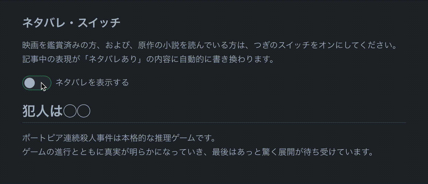
Options
plugins: [
  netabareSwitchPlugin({
    // Prefix of keys for LocalStorage
    // default: 'netabare'
    keyPrefix: 'nb',

    // Prefix of components name
    // default: 'NetaBare'
    componentPrefix: 'NB', // -> `<NBSwitch/>`
  }),
],
Component Slots, Props ,and Attributes
<NetaBareSwitch>: Toggle switch.
#default slot is message to toggle NetaBare
Default is in Japanese.
name?: string prop
using for <input type=checkbox class="toggle-checkbox"> id and storage key
CSS
<div :class="switchWrapperClass">
  <input type=checkbox class="toggle-checkbox" :class="buttonClass" />
  <label class="toggle-label" :class="switchBgClass" />
</div>
<label :class="labelClass">
  <slot name="default" />
</label>.toggle-checkbox {
background-color: var(--c-text);
}
.toggle-checkbox:checked {
right: 0;
background-color: var(--c-tip-bg);
}
.toggle-checkbox + .toggle-label {
box-sizing: border-box;
border: 1px solid var(--c-tip);
background-color: var(--c-tip-bg);
}
.toggle-checkbox:checked + .toggle-label {
background-color: var(--c-tip);
}
<NetaBareDiv>: Div of spoiler
#default slot is paragraph including/excluding spoiler.
isBare?: boolean prop
If true, messages in the default slot are including spoiler.
If false, without spoiler even if bare attribute exists.
bare attribute
If exists, messages in the default slot are including spoiler.
<NetaBareSpan>: Span of spoiler
#default slot is words excluding spoiler.
bare prop is words including spoiler.
Reference
License
MIT