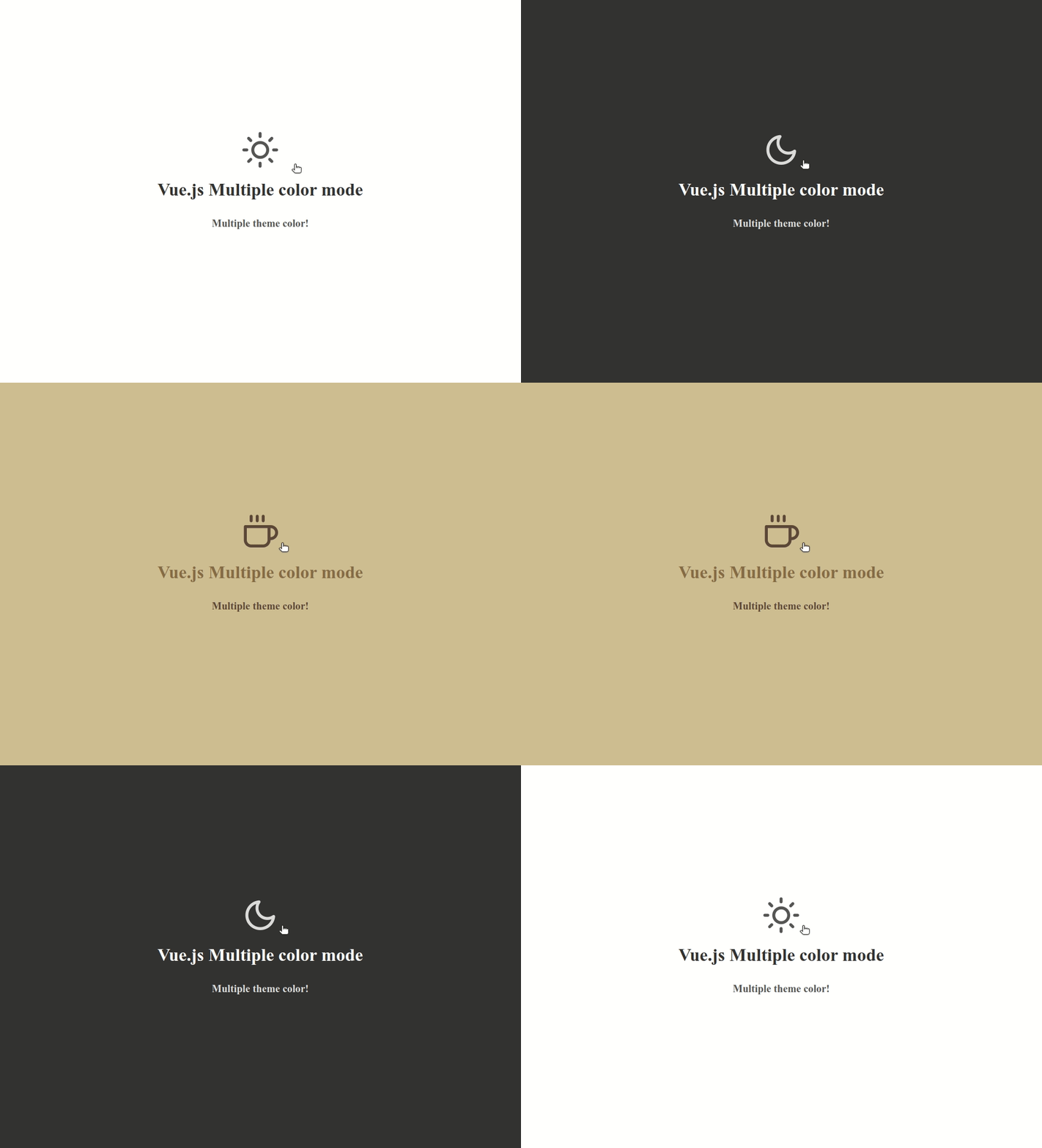
The Vue.js 2 Multiple Themes package allows you to implement multiple themes in your Vue.js application. It provides easy integration and customization options through CSS variables. This version exclusively uses SVG icons, eliminating the need for icon fonts.
You can install the package via npm or yarn:
-
npm
npm install vue-multiple-themes
-
Yarn
yarn add vue-multiple-themes
To use the VueMultipleThemes component effectively in a Vue.js application, you would follow these steps to incorporate it into your application, allowing dynamic theme changes based on user interaction. Here’s a simple guide on how to do so:
Step 1: Import the Component First, ensure that the VueMultipleThemes component is properly exported and then import it into the parent component or your main application file where you intend to use it.
Step 2: Register the Component Register VueMultipleThemes as a component in the parent component or in your Vue application globally.
Locally in a Component
import VueMultipleThemes from './VueMultipleThemes.vue'; // Adjust the path as necessary
    export default {
    name: 'App',
    components: {
    VueMultipleThemes
    }
};
Globally in Your Vue Application
import Vue from 'vue';
import VueMultipleThemes from './VueMultipleThemes.vue'; // Adjust the path as necessary

Vue.component('vue-multiple-themes', VueMultipleThemes);
Step 3: Use the Component in Your Template Insert the vue-multiple-themes component into your template. You can pass in the props as needed.
<template>
  <div>
    <vue-multiple-themes
        :defaultTheme="'light'"
        :themeColorList="['light', 'dark', 'sepia']"
        :changeThemeOff="true"
    ></vue-multiple-themes>
  </div>
</template>

<script>
  import VueMultipleThemes from "vue-multiple-themes";

  export default {
    components: {VueMultipleThemes}
  };
</script>
You can also customize the styles and color palette by overriding the CSS variables:
:root {
  --app-background-color: #ffffff;
  --app-title-color: #333333;
  --app-subtitle-color: #555555;
}

[theme="dark"] {
  --app-background-color: #333333;
  --app-title-color: #ffffff;
  --app-subtitle-color: #dddddd;
}

[theme="sepia"] {
  --app-background-color: #d0bc91;
  --app-title-color: #8a6c44;
  --app-subtitle-color: #5f4938;
}

.app-background {
  background-color: var(--app-background-color);
}

.app-title {
  color: var(--app-title-color);
}

.app-subtitle {
  color: var(--app-subtitle-color);
  padding-top: 10px;
}

.change-theme-box {
  cursor: pointer;
  color: var(--app-subtitle-color);
  font-size: 1em;
  font-weight: normal;
}
Step 4: Define Theme Icons (Optional) If you have specific SVG icons for each theme, you can pass them through the themeIcons prop. Ensure each icon object has a name, width, height, viewBox, path, stroke, and strokeWidth defined as shown in your component's default prop value.
Step 5: Styling (Optional) Ensure that the styles for changing the themes are correctly applied in your application. You might need to adjust the CSS based on your application's structure or styling requirements.
Step 6: Theme Persistence (Optional) Since the component already handles theme persistence using localStorage, no additional steps are required to maintain the user's theme choice across sessions. However, you might want to add or modify functionality based on specific requirements.
| Prop Name | Type | Default Value | Description |
|---|---|---|---|
defaultTheme |
String | "light" |
The initial theme to be applied when the component mounts. |
themeColorList |
Array | () => ["light", "dark", "sepia"] |
An array of strings representing the available themes. |
extraClass |
String | '' |
An additional CSS class that can be added to the component's root element. |
changeThemeOff |
Boolean | true |
Determines whether the theme change functionality is enabled or not. |
themeIcons |
Array | () => [{name, width, height, viewBox, path, stroke, strokeWidth}, ...] |
An array of objects where each object represents an SVG icon for a theme. |
| Attribute | Description | Type | Default |
|---|---|---|---|
| defaultTheme | Default theme color | String | 'light' |
| themeColorList | List of available theme colors | Array | ['light', 'dark', 'sepia'] |
| changeThemeOff | Show or hide the theme change button | Boolean | true |
| extraClass | Additional custom class for the icon wrapper | String | null |
| themeIcons | SVG icon array | Array | [{ name: "dark", width: "24px", height: "24px", viewBox: "0 0 24 24", path: "M13 6V3M18.5 12V7M14.5 4.5H11.5M21 9.5H16M15.5548 16.8151C16.7829 16.8151 17.9493 16.5506 19 16.0754C17.6867 18.9794 14.7642 21 11.3698 21C6.74731 21 3 17.2527 3 12.6302C3 9.23576 5.02061 6.31331 7.92462 5C7.44944 6.05072 7.18492 7.21708 7.18492 8.44523C7.18492 13.0678 10.9322 16.8151 15.5548 16.8151Z", stroke: "#ffffff", strokeWidth: "2" },{ name: "light", width: "24px", height: "24px", viewBox: "0 0 24 24", path: "M12 3V4M12 20V21M4 12H3M6.31412 6.31412L5.5 5.5M17.6859 6.31412L18.5 5.5M6.31412 17.69L5.5 18.5001M17.6859 17.69L18.5 18.5001M21 12H20M16 12C16 14.2091 14.2091 16 12 16C9.79086 16 8 14.2091 8 12C8 9.79086 9.79086 8 12 8C14.2091 8 16 9.79086 16 12Z", stroke: "#000000", strokeWidth: "2" },{ name: "sepia", width: "24px", height: "24px", viewBox: "0 0 24 24", path: "M4 20H10.9433M10.9433 20H11.0567M10.9433 20C10.9622 20.0002 10.9811 20.0002 11 20.0002C11.0189 20.0002 11.0378 20.0002 11.0567 20M10.9433 20C7.1034 19.9695 4 16.8468 4 12.9998V8.92285C4 8.41305 4.41305 8 4.92285 8H17.0767C17.5865 8 18 8.41305 18 8.92285V9M11.0567 20H18M11.0567 20C14.8966 19.9695 18 16.8468 18 12.9998M18 9H19.5C20.8807 9 22 10.1193 22 11.5C22 12.8807 20.8807 14 19.5 14H18V12.9998M18 9V12.9998M15 3L14 5M12 3L11 5M9 3L8 5", stroke: "#000000", strokeWidth: "2" }] |
