vue-input-dropdown


A simple to use, highly customizable input dropdown component for Vue
Table of contents
Installation
npm install --save vue-input-dropdown
Default import
Install all the components (theres just one for now):
Vue ** A css file is included when importing the package. You may have to setup your bundler to embed the css in your page.**
Distribution import
Install all the components:
Vue⚠️ You may have to setup your bundler to embed the css file in your page.
Browser
The plugin should be auto-installed. If not, you can install it manually with the instructions below.
Install all the components:
VueSource import
Install all the components:
VueUse specific components:
Vue⚠️ You need to configure your bundler to compile .vue files. More info in the official documentation.
Usage
props
| Prop | Default/Required | Example | Type/Description |
|---|---|---|---|
| items | None/REQUIRED | :items="['LA', 'NY']" | Array of strings - items in dropdown |
| picked | None/REQUIRED | :picked="itemPicked" | Callback function when item selected |
| selected | "" | :selected="myCity" | Currently selected state item |
| options | See Below | :options="{}" see below | Object containing full options |
options prop
This component was build to be customized. Almost fully. Pass option object to :option prop.
| Option | Default / Required | Description |
|---|---|---|
| height | REQUIRED | The height of the input container. Needed for offset |
| width | REQUIRED | The width of the input container. Needed for offset |
| maxHeight | auto | The max height of the dropdown. Auto uses scroll on overflow |
| outerContainerClass | .dropdown-container | Class to be used for the outermost container |
| inputClass | .input-box | Class to be used for the input element |
| dropdownClass | .dropdown-inner | Class to be used for the dropdown container |
| itemContainerClass | .item | Class to be used for the item wrappers inside the dropdown |
| activeItemClass | .active | Class to be used for the currently selected Item |
| nonActiveItemClass | .non-active | Class to be used for non-active items |
| transitionName | slide-fade | Name of the trasition to be used |
| outerContainerStyle | "" | Inline styling for outermost container |
| inputStyle | "" | Inline styling for input box |
| dropdownStyle | "" | Inline styling for dropdown container |
| itemContainerStyle | "" | Inline styling for item wrappers inside dropdown |
| activeItemStyle | "" | Inline styling for the currently selected item |
| nonActiveItemStyle | "" | Inline styling for non-active items |
Not Complete, WIP
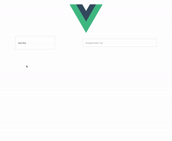
Example
Plugin Development (feel free to create pull requests and I'll look over them)
TODO: - CREATE PROPER DEV ENVIRONMENT TO TEST USAGE AND IMPORTS - EDIT ESLINT OR JUST REMOVE
Installation
The first time you create or clone your plugin, you need to install the default dependencies:
npm install
Watch and compile
This will run webpack in watching mode and output the compiled files in the dist folder.
npm run dev