
Lightweight Toast notifications for Vue3 composition API
vue-grille-pain is a light toast notification plugin for Vue3.
- Fully typed configuration
- Provides a custom hook for usage with the composition API
- Toasts can be individually customized
- Several animations to chose from
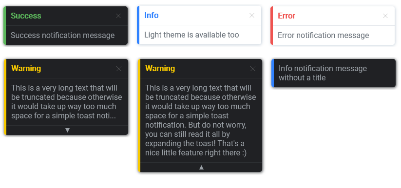
- Light and dark theme
- ...and more options
Check the demo here
npm install vue-grille-painyarn add vue-grille-pain<!-- Insert the Vue core before -->
<script src="https://unpkg.com/vue-grille-pain"></script>
<script>
createApp(App)
.use(GrillePain)
.mount("#app");
</script>Register the plugin wherever you create your Vue App:
import { createApp } from Vue;
import App from "./App.vue";
import GrillePain from "vue-grille-pain";

createApp(App)
  .use(GrillePain)
  .mount("#app");
You can also pass some options:
import { createApp } from Vue;
import App from "./App.vue";
import GrillePain, { GpOptions } from "vue-grille-pain";

const opts: GpOptions = {
  // your default configuration, see the options section for details
};

createApp(App)
  .use(GrillePain, opts)
  .mount("#app");
Then in any component you can now import the useGrillePain hook like so:
import { useGrillePain } from "vue-grille-pain";

const { toast } = useGrillePain();

// Generate a toast
toast({
  title: "Hello",
  message: "Very cool message!",
});
You can override most of your default configuration by passing some options:
import { useGrillePain, GpToast } from "vue-grille-pain";

const { toast } = useGrillePain();

const opts: GpToast = {
  title: "Hello",
  message: "Very cool message!",
  // rest of your toast config, see the options section for details
};

// Generate customized toast
toast(opts);These parameters can be passed when registering the plugin.
| Parameter | Type | Default | Description |
|---|---|---|---|
| position | GpPosition | GpPosition.BOTTOM_LEFT |
Position of the toasts container |
| order | GpOrder | GpOrder.ASC |
Toasts ordering (oldest / newest on top) |
| fullWidth | boolean | false |
Toasts take up the full screen width (useful for mobile) |
| animation | GpAnimation | GpAnimation.SLIDE_UP |
Toasts display animation |
| theme | GpTheme | GpTheme.LIGHT |
Toasts theme |
| fadeAfter | number | 5000 |
Time in ms before toasts fade (0 for never) |
| closeOnClick | boolean | false |
Whether toasts should be closable on mouse click (by default, toasts are closable via a close button) |
| maxMessageLength | number | undefined |
If set, texts of a greater length will be truncated and the toasts will be expandable |
| displayTimer | boolean | false |
Displays a pie timer showing time before toasts fade (must have fadeAfter > 0) |
position, order and fullWidth are global parameters, meaning they concern the toasts container and cannot be overridden on a single toast.
These parameters can be passed when generating a toast.
| Parameter | Type | Default | Description |
|---|---|---|---|
| title | string | undefined |
Displays a header with the title text |
| message | string | '' |
Toast message |
| type | GpToastType | GpToastType.INFO |
Type of toast (message, success, warning, error) |
| className | string | string[] | undefined |
Custom CSS classes |
| animation | GpAnimation | GpAnimation.SLIDE_UP |
Toast display animation |
| theme | GpTheme | GpTheme.LIGHT |
Toast theme |
| fadeAfter | number | 5000 |
Time in ms before toast fades (0 for never) |
| closeOnClick | boolean | false |
Whether toast should be closable on mouse click |
| maxMessageLength | number | undefined |
If set and the toast text length is greater, it will be truncated and the toast will be expandable |
| displayTimer | boolean | false |
Displays a pie timer showing time before toast fades (must have fadeAfter > 0) |
This is just a sandbox project to play around with the new Vue3 features. Feel free to contact me with requests or suggestions, or post pull requests and issues directly on GitHub.