
Vue Flare - notifications for Vue 3 and Nuxt 3
The goal was to create simple, easy to set up notifications for Vue 3 in a beautiful design that no app or website would be ashamed of.
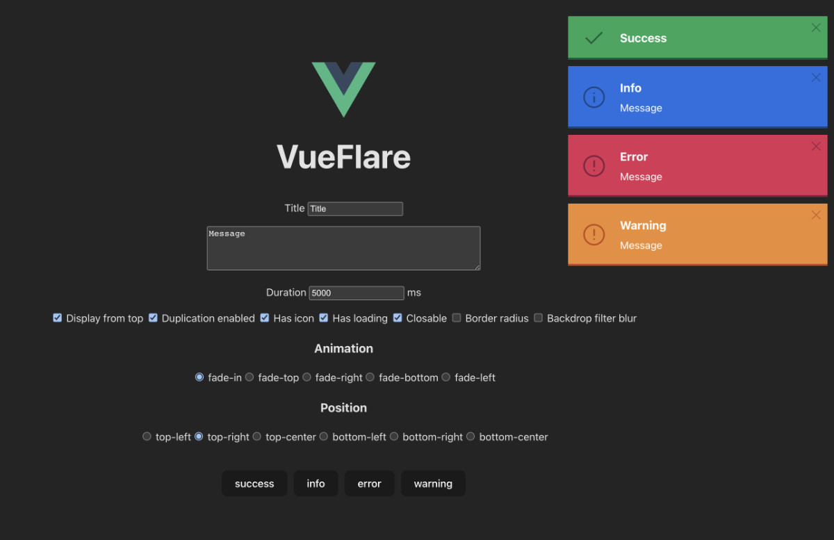
Check out the demo vue-flare.web.app
Installation
# npm
npm install --save vue-flare

# yarn
yarn add vue-flare
Setup with Vue 3
// main.ts

import "vue-flare/dist/style.css"
import VueFlare from "vue-flare"

createApp(App).use(VueFlare, {
  position: 'top-right',
  animation: 'fade-in',
  borderRadius: false,
  backdropFilterBlur: false,
  duration: 5000,
  maxWidth: '400px',
  displayFromTop: true,
  duplicationEnabled: true,
}).mount('#app')
Setup with Nuxt 3
// plugins/vue-flare.ts

import VueFlare from "vue-flare"

export default defineNuxtPlugin((nuxtApp) => {
  nuxtApp.vueApp.use(VueFlare)
})
// nuxt.config.ts
export default defineNuxtConfig({
css: ["~/node_modules/vue-flare/dist/style.css"]
})Usage
<!-- App.vue -->

<template>
    <div>
        {{ activeFlares }}
        {{ activeSettings }}
        <Flares />
        <div>
            <button @click='show'>show</button>
            <button @click='hide'>hide</button>
            <button @click='setNewSettings'>set new settings</button>
        </div>
    </div>
</template>
// App.vue
import { computed, inject } from "vue";
import { Flares, FlareInterface } from "vue-flare"
// Access to the plugin
const flare = inject('flare') as FlareInterface
const activeFlares = computed(() => flare.flares.value)
const activeSettings = computed(() => flare.settings.value)
function show () {
// Examples
flare.success({ title: "Success" })
flare.info({ title: "Info", message: "Message" })
flare.warning({ title: "Info", message: "Message", duration: 10000 })
flare.error({ id: '78dd0a2b', title: "Info", message: "Message" })
// All the settings
flare.info({
id: '78dd0a2c',
title: "Info",
message: "Message",
duration: 20000,
hasIcon: false,
hasLoading: false,
closable: false
})
}
function hide () {
flare.hide('78dd0a2b')
}
function setNewSettings () {
flare.setSettings({
position: 'bottom-right',
animation: 'fade-right',
borderRadius: true,
backdropFilterBlur: true,
duration: 3000,
maxWidth: '600px',
displayFromTop: false,
duplicationEnabled: false
})
}You can even use global property $flare
<button @click='$flare.success({
    id: "78dd0a2b",
    title: "Info",
    message: "Message"
  })'>
show
</button>
Customization
You can use custom component for notifications inside the <Flares /> component
<!-- App.vue -->

<template>
  <div>
    <Flares>
      <Flare
          v-for="{ id, type, title, message, duration, hasIcon, hasLoading, closable } of flare.flares.value"
          :key="`flare-${id}`"
          :type="type"
          :title="title"
          :message="message"
          :duration="duration"
          :has-icon="hasIcon"
          :has-loading="hasLoading"
          :closable="closable"
          animation="fade-in"
          border-radius
          backdrop-filter-blur
          @close="flare.hide(id)"
      />
    </Flares>
  </div>
</template>
Custom styles
// main.scss

.flares {
  &-top-left {}
  &-top-right {}
  &-top-center {}
  &-bottom-left {}
  &-bottom-right {}
  &-bottom-center {}
}

.flare {
  &-border-radius {}
  &-backdrop-filter-blur {}
  &-has-icon {}

  &-animation-fade-in {}
  &-animation-fade-top {}
  &-animation-fade-right {}
  &-animation-fade-bottom {}
  &-animation-fade-left {}

  &-loading {}
  &-icon {}
  &-title {}
  &-message {}
  &-close {
    &:hover {}
    svg {}
  }

  &-success {
    // light - #1fa55a
    // dark - #0e5f38
    &.flare-backdrop-filter-blur {}
    .flare-icon, .flare-close {}
    .flare-loading {}
  }

  &-info {
    // light - #1f6fe0
    // dark - #10488a
    &.flare-backdrop-filter-blur {}
    .flare-icon, .flare-close {}
    .flare-loading {}
  }

  &-warning {
    // light - #ee8d31
    // dark - #c34916
    &.flare-backdrop-filter-blur {}
    .flare-icon, .flare-close {}
    .flare-loading {}
  }

  &-error {
    // light - #dc3055
    // dark - #851d41
    &.flare-backdrop-filter-blur {}
    .flare-icon, .flare-close {}
    .flare-loading {}
  }
}
Props
<Flare />
<Flare
    type="success"
    title="Title"
    message="Message"
    animation="fade-in"
    border-radius="false"
    backdrop-filter-blur="false"
    has-icon
    has-loading
    closable
    :duration="5000"
/>| Name | Description | Type | Values | Default |
|---|---|---|---|---|
type* |
Type | String |
success info warning error
|
— |
title* |
Title | String | — | — |
animation |
Animation | String |
fade-in fade-top fade-right fade-bottom fade-left
|
fade-in |
message |
Message | String | — | '' |
duration* |
Duration of the flare | Number | — | — |
borderRadius |
Border radius on the flare | Boolean | — | false |
backdropFilterBlur |
Blurred background on the flare | Boolean | — | false |
hasIcon |
Visible icon | Boolean | — | true |
hasLoading |
Visible loading bar | Boolean | — | true |
closable |
Visible close icon | Boolean | — | true |
flare.setSettings({ ...options })
flare.setSettings({
    position: 'top-right',
    animation: 'fade-in',
    borderRadius: false,
    backdropFilterBlur: false,
    duration: 5000,
    maxWidth: '400px',
    displayFromTop: true,
    duplicationEnabled: true
})| Name | Description | Type | Values | Default |
|---|---|---|---|---|
position |
Position of the flares | String |
top-left top-right top-center bottom-left bottom-right bottom-center
|
top-right |
animation |
Animation | String |
fade-in fade-top fade-right fade-bottom fade-left
|
fade-in |
borderRadius |
Border radius on the flare | Boolean | — | false |
backdropFilterBlur |
Blurred background on the flare | Boolean | — | false |
duration |
Duration of the flares in miliseconds | Number | — | 5000 |
maxWidth |
Max width of flares in px or %
|
String | — | 400px |
displayFromTop |
Adds new notifications from the top, otherwise from the bottom | Boolean | — | true |
duplicationEnabled |
Allows you to have multiple notifications of the same type in the stack | Boolean | — | true |
Development
Make sure to install the dependencies and then run:
# yarn
yarn dev

# npm
npm run dev