Vue components for design elements with custom style guides
Installation
npm install --save vue-el-element
Import
Globalize all components
importVuefrom'vue'
importVueElElementsfrom'vue-el-element'
Vue.use(VueElElements)
Import selected components
import{ElButton,ElTooltip}from'vue-el-element'
Elements
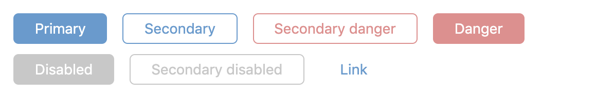
el-button
<el-button
:disabled="Boolean"
:secondary="Boolean"
:danger="Boolean"
:link="Boolean"
:margin-right="Boolean"
:margin-top="Boolean"
:tooltip="String"
@click="method"
>
Button label
</el-button>
Boolean props can also be activated as:
<el-button>
Primary action
</el-button>
<el-button secondary>
Secondary action
</el-button>
<el-button secondary danger>
Close
</el-button>
<el-button danger>
Delete
</el-button>
el-modal
<el-modal
v-if="isOpen"
@close="isOpen = false"
:pause-body-scroll="true"
:top="true"
close-button-align="right"
>
Content...
<!-- Optional: Footer example -->
<el-inline
slot="footer"
>
<el-button>Previous</el-button>
<el-button>Next</el-button>
</el-inline>
</el-modal>
el-dropdown
<el-dropdown
:options="[{
value: 'key1',
label: 'Item 1'
}, {
value: 'key2',
label: 'Item 2'
}]"
v-model="key1"
/>
el-checkbox
Note that the model is an array
<el-checkbox
:options="[{
value: 'key1',
label: 'Item 1'
}, {
value: 'key2',
label: 'Item 2'
}]"
v-model="[]"
/>
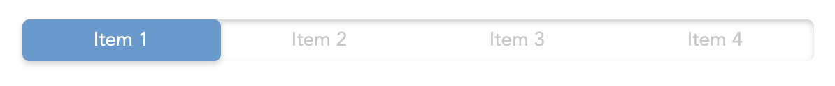
el-radio-button
<el-radio-button
:options="[{
value: 'key1',
label: 'Item 1'
}, {
value: 'key2',
label: 'Item 2'
}]"
v-model="key1"
/>
el-multi-switch
<el-multi-switch
:options="[{
value: 'key1',
label: 'Item 1'
}, {
value: 'key2',
label: 'Item 2'
}]"
v-model="key1"
/>
el-tooltip
Place the tooltip within the item you want to describe. It will place itself at the center of that element. Note that you need the parent element not to have static positioning.
<divstyle="{ position: relative }">
Content...
<el-tooltip :delay="Boolean">
Description
</el-content>
</div>
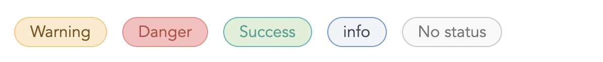
el-message
<el-message
:success="Boolean"
:info="Boolean"
:warning="Boolean"
:danger="Boolean"
:margin-right="Boolean"
:margin-top="Boolean"
>
Message content
</el-message>
el-input
<el-input
:success="Boolean"
:warning="Boolean"
v-model="value"
/>
el-textarea
<el-textarea
:success="Boolean"
:warning="Boolean"
v-model="value"
/>
el-tag
<el-tag
:success="Boolean"
:info="Boolean"
:warning="Boolean"
:danger="Boolean"
:margin-right="Boolean"
:margin-top="Boolean"
>
Tag content
</el-tag>
el-menu & el-menu-item
<el-menu
align="right"
>
<el-menu-itemtitle="Chapter 1">
Content for chapter 1...
</el-menu-item>
<el-menu-itemtitle="Chapter 2">
Content for chapter 2...
</el-menu-item>
<!-- Categorize with sections -->
<el-menu-sectiontitle="Section 1"/>
<!-- Clickable sections -->
<el-menu-sectiontitle="Section 2">
Content for section 2
</el-menu-section>
</el-menu>
el-tab & el-tab-item
Horisonal navigation
<el-tab>
<el-tab-itemtitle="Tab 1">
Content for tab 1...
</el-tab-item>
<el-tab-itemtitle="Tab 2">
Content for tab 2...
</el-tab-item>
</el-tab>
el-inline
<el-inline
:stretch="Boolean"
:space-between="Boolean"
:wrap="Boolean"
:margin-top="Boolean"
>
Content...
</el-inline>
el-column
<el-column>
<el-column-item
:grow="Number"
:wrap="Boolean"
>
Content for column 1...
</el-column-item>
<el-column-item
:grow="Number"
:wrap="Boolean"
>
Content for column 2...
</el-column-item>
</el-column>
el-loader
<el-loader
:margin-top="Boolean"
/>
el-sticky-header & el-sticky-footer
<el-sticky-header>
content...
</el-sticky-header>
<el-sticky-footer>
content...
</el-sticky-footer>
Change style guide
The elements' css classes follow the BEM naming scheematics.
 vue-el-element