1. vue-bootstrap4-table
Advanced table based on Vue 2 and Bootstrap 4
2. Features
- Multi column filtering (Optimized filtering)
- Single & Multi column sorting
- Pagination (True! It works out of the box intelligently)
- Pagination Information
- Checkbox selection for rows
- Highly customizable
3. Installation
3.1. Install via npm
$ npm i vue-bootstrap4-table --save
Currently this package will install only the vue-bootstrap4-table component, not their dependencies. So make sure to install the following dependencies.
3.1.1. Dependencies
- bootstrap 4 (js and css) You should include bootstrap before vue-bootstrap4-table plugin.
We are using lodash internally, so you don't need to install separately for this plugin.
3.2. Install via CDN
<link  rel="stylesheet"  href="https://maxcdn.bootstrapcdn.com/bootstrap/4.0.0/css/bootstrap.min.css"  crossorigin="anonymous">

...

<script  src="https://code.jquery.com/jquery-3.2.1.slim.min.js"  crossorigin="anonymous"></script>

<script  src="https://cdnjs.cloudflare.com/ajax/libs/popper.js/1.12.9/umd/popper.min.js"  crossorigin="anonymous"></script>

<script  src="https://maxcdn.bootstrapcdn.com/bootstrap/4.0.0/js/bootstrap.min.js"  crossorigin="anonymous"></script>

...

<script  src="https://unpkg.com/vue-bootstrap4-table@1.0.7/dist/vue-bootstrap4-table.min.js"  crossorigin="anonymous"></script>
Note: If you've included bootstrap & jQuery packages already in your project, then include only vue-bootstrap4-table.min.js script.
4. Basic Usage
It is easy to include vue-bootstrap4-table as a component in your application.
Import VueBootstrap4Table component in any of your vue component and start using it right away.
Note: If you included the library via CDN, then you don't need to import, you can use vue-bootstrap4-table component right away.
rows and columns props should be passed down to vue-bootstrap4-table component to work with the table.
<template>
    <div id="app">
        <vue-bootstrap4-table :rows="rows" :columns="columns" :config="config">
        </vue-bootstrap4-table>
    </div>
</template>

<script>
import VueBootstrap4Table from 'vue-bootstrap4-table'

export default {
    name: 'App',
    data: function() {
        return {
            rows: [{
                    "id": 1,
                    "name": {
                        "first_name": "Vladimir",
                        "last_name": "Nitzsche"
                    },
                    "address": {
                        "country": "Mayotte"
                    },
                    "email": "franecki.anastasia@gmail.com",
                },
                {
                    "id": 2,
                    "name": {
                        "first_name": "Irwin",
                        "last_name": "Bayer"
                    },
                    "age": 23,
                    "address": {
                        "country": "Guernsey"
                    },
                    "email": "rlittle@macejkovic.biz",
                },
                {
                    "id": 3,
                    "name": {
                        "first_name": "Don",
                        "last_name": "Herman"
                    },
                    "address": {
                        "country": "Papua New Guinea"
                    },
                    "email": "delia.becker@cormier.com",
                }],
            columns: [{
                    label: "id",
                    name: "id",
                    filter: {
                        type: "simple",
                        placeholder: "id"
                    },
                    sort: true,
                },
                {
                    label: "First Name",
                    name: "name.first_name",
                    filter: {
                        type: "simple",
                        placeholder: "Enter first name"
                    },
                    sort: true,
                },
                {
                    label: "Email",
                    name: "email",
                    sort: true,
                },
                {
                    label: "Country",
                    name: "address.country",
                    filter: {
                        type: "simple",
                        placeholder: "Enter country"
                    },
                }],
            config: {
                checkbox_rows: true,
                rows_selectable: true,
                card_title: "Vue Bootsrap 4 advanced table"
            }
        }
    },
    components: {
        VueBootstrap4Table
    }
}
</script>
5. Columns
5.1. Basic structure
For example, your "columns" object might look like this,
columns: [{
        label: "id",
        name: "id",
        filter: {
            type: "simple",
            placeholder: "Enter id"
        },
        sort: true,
    },
    {
        label: "First Name",
        name: "name.first_name", // access nested objects properties with "."
        filter: {
            type: "simple",
            placeholder: "Enter first name",
            case_sensitive: true, // "false" by default
        },
        sort: true, // "false" by default
        initial_sort: true, // "false" by default
        initial_sort_order: "desc" // "asc" by default
    },
    {
        label: "Email",
        name: "email",
        sort: true,
    },
    {
        label: "Country",
        name: "address.country", // access nested objects properties with "."
        filter: {
            type: "simple",
            placeholder: "Enter country"
        },
    }]
5.2. Attributes details
| Attributes | Description |
|---|---|
| label | Name for the column header |
| name | Name of the attribute that you would like to show from "rows" object. You can access nested objects properties with "." |
| filter | Configuration for the column filter. If you don't want to have filtering for specific columns, then just don't mention it :-) |
| filter.type | Type of filter you want to use for your column (currently "simple" filter only supported) |
| filter.placeholder | Placeholder is hint text for filter text box |
| filter.case_sensitive | Enable/Disable case sensitive filtering. Default value is false
|
| sort | Enable or disable sorting in column. Default value is false
|
| initial_sort | Sort the column at the first time loading. Default value is false. This only works if sort is true
|
| initial_sort_order | Sort the column at the first time loading based on given order. Default value is asc. This only works if initial_sort is true
|
5.3. Column slot
At some point, you might want to override or format the values in the column header. vue-bootstrap4-table allow you to achieve that with the help of vue slotting.
5.3.1. Example
...
<vue-bootstrap4-table :rows="rows" :columns="columns" :config="config">
    <template slot="column_email" slot-scope="props">
        <i>
            {{props.column.label}}
        </i>
    </template>
    <template slot="column_name_first_name" slot-scope="props">
        <b>
            {{props.column.label}}
        </b>
    </template>
</vue-bootstrap4-table>
...
<script>
...
columns: [{
            label: "First Name",
            name: "name.first_name", // access nested objects properties with "."
            sort: false,
        },
        {
            label: "Email",
            name: "email",
            sort: true,
        }],
...
</script>
Column slot name will be combination of column_ keyword with the name which you provided in the columns configuration. In the above example, slot="column_email" represents the "email" column header in the table.
5.3.2. Note
You might have some columns with nested objects names. In that case, the slot name will be column_ keyword + column name and dots(.) in the column name will be replaced by underscore(_).
You can see the above example, slot name for name.first_name column is column_name_first_name.
5.3.3. props
From slot-scope="props" you can access the following attributes.
| Attributes | Description |
|---|---|
| props.column | Current column config object |
6. Rows
You bind your list of items as array of objects to rows props to vue-bootstrap4-table component, then voilà.. you can start work with the table.
6.1. Basic structure
rows: [{
        "id": 1,
        "name": {
            "first_name": "Vladimir",
            "last_name": "Nitzsche"
        },
        "address": {
            "country": "Mayotte"
        },
        "email": "franecki.anastasia@gmail.com",
    },
    {
        "id": 2,
        "name": {
            "first_name": "Irwin",
            "last_name": "Bayer"
        },
        "age": 23,
        "address": {
            "country": "Guernsey"
        },
        "email": "rlittle@macejkovic.biz",
    },
    {
        "id": 3,
        "name": {
            "first_name": "Don",
            "last_name": "Herman"
        },
        "address": {
            "country": "Papua New Guinea"
        },
        "email": "delia.becker@cormier.com",
    }]
6.2. Row Slot
At some point, you might want to override or format the values in the row cells. vue-bootstrap4-table allow you to achieve that with the help of vue slotting.
6.2.1. Example
...
<vue-bootstrap4-table :rows="rows" :columns="columns" :config="config">
    <template slot="email" slot-scope="props">
        <i>
            {{props.cell_value}}
        </i>
    </template>
    <template slot="name_first_name" slot-scope="props">
        <b>
            {{props.cell_value}}
        </b>
    </template>
</vue-bootstrap4-table>
...
<script>
...
columns: [{
            label: "First Name",
            name: "name.first_name", // access nested objects properties with "."
            sort: false,
        },
        {
            label: "Email",
            name: "email",
            sort: true,
        }],
...
</script>
Slot name will be same as the name which you provided in the columns configuration. In the above example, slot="email" represents the "email" column in the table.
6.2.2. Note
You might have some columns getting the values from nested objects from rows. In that case, the slot name will be column name and dots(.) in the column name will be replaced by underscore(_).
You can see the above example, slot name for name.first_name column is name_first_name.
6.2.3. props
From slot-scope="props" you can access the following attributes.
| Attributes | Description |
|---|---|
| props.cell_value | Returns the actual value of the cell |
| props.row | Current row object |
| props.column | Current column config object |
7. Sorting
Sorting configuration is added along with the each column config.
7.1. Example
...
columns: [
    {
        label: "First Name",
        name: "name.first_name", // access nested objects properties with "."
        sort: true, // "false" by default
        initial_sort: true, // "false" by default
        initial_sort_order: "desc" // "asc" by default
    }
]
...
7.2. Attributes details
| Attributes | Description |
|---|---|
| sort | Enable or disable sorting in column. Default value is false
|
| initial_sort | Sort the column at the first time loading. Default value is false. This only works if sort is true
|
| initial_sort_order | Sort the column at the first time loading based on given order. Default value is asc. This only works if initial_sort is true
|
7.3. Single column sorting
By default single column sort mode is enabled.
7.4. Multi column sorting
If you would like to enable the multi column sorting, set multi_column_sort to true in table config props.
7.4.1. Example
<template>
    <div id="app">
        <vue-bootstrap4-table :rows="rows" :columns="columns" :config="config">
        </vue-bootstrap4-table>
    </div>
</template>

<script>
    import VueBootstrap4Table from 'vue-bootstrap4-table'

    export default {
        name: 'App',
        data: function() {
            return {
                rows: [
                ...
                ],
                columns: [
                ...
                ],
                config: {
                    ...
                    multi_column_sort: true, // default false
                    ...
                }
            }
        },
        components: {
            VueBootstrap4Table
        }
    }
</script>
8. Filtering
Filtering configuration is added along with the each column config.
8.1. Simple Filter
Filter the rows based on the given keyword. If you don't specify filter config then filter feature will be disabled for the specific column.
8.1.1. Example
...
columns: [
    {
        label: "First Name",
        name: "name.first_name", // access nested objects properties with "."
        filter: {
            type: "simple",
            placeholder: "Enter first name",
            case_sensitive: true, // "false" by default
        }
    }
]
...
8.1.2. Attributes details
| Attributes | Description | Default |
|---|---|---|
| filter.type | Defines the type of filter. Currently basic filter is supported. | Empty string |
| filter.placeholder | Placeholder is hint text for filter text box |
Empty string |
| filter.case_sensitive | Enable/Disable case sensitive filtering. | false |
9. Pagination & Info
Pagination component is built based on Bootstrap 4 pagination template. You can enable or disable pagination and pagination info details based on your choice.
9.1. Example
<template>
    <div id="app">
        <vue-bootstrap4-table :rows="rows" :columns="columns" :config="config">
        </vue-bootstrap4-table>
    </div>
</template>

<script>
    import VueBootstrap4Table from 'vue-bootstrap4-table'

    export default {
        name: 'App',
        data: function() {
            return {
                rows: [
                ...
                ],
                columns: [
                ...
                ],
                config: {
                    pagination: true, // default true
                    pagination_info: true, // default true
                    num_of_visibile_pagination_buttons: 7, // default 5
                    per_page: 5, // default 10
                }
            }
        },
        components: {
            VueBootstrap4Table
        }
    }
</script>
9.2. Attributes details
| Attributes | Description | type | Default |
|---|---|---|---|
| pagination | Enable/Disable pagination in the table | Boolean | true |
| pagination_info | Enable/Disable pagination info in the table | Boolean | true |
| num_of_visibile_pagination_buttons | Limit the number of visible pagination buttons in the pagination bar | Number | 5 |
| per_page | Number of rows to display per page | Number | 10 |
9.3. Slot
Currently you can override "Previous" & "Next" button icon/text.
9.3.1. Previous & Next button
...
<vue-bootstrap4-table :rows="rows" :columns="columns" :config="config">
    <template slot="paginataion-previous-button">
        Previous
    </template>
    <template slot="paginataion-next-button">
        Next
    </template>
</vue-bootstrap4-table>
...
After applying the above custom template to previous and next button, pagination component will look like this.
9.3.2. Pagination info
...
<vue-bootstrap4-table :rows="rows" :columns="columns" :config="config">
<template slot="pagination-info" slot-scope="props">
This page total is {{props.currentPageRowsLength}} |
Filterd results total is {{props.filteredRowsLength}} |
Original data total is {{props.originalRowsLength}}
</template>
</vue-bootstrap4-table>
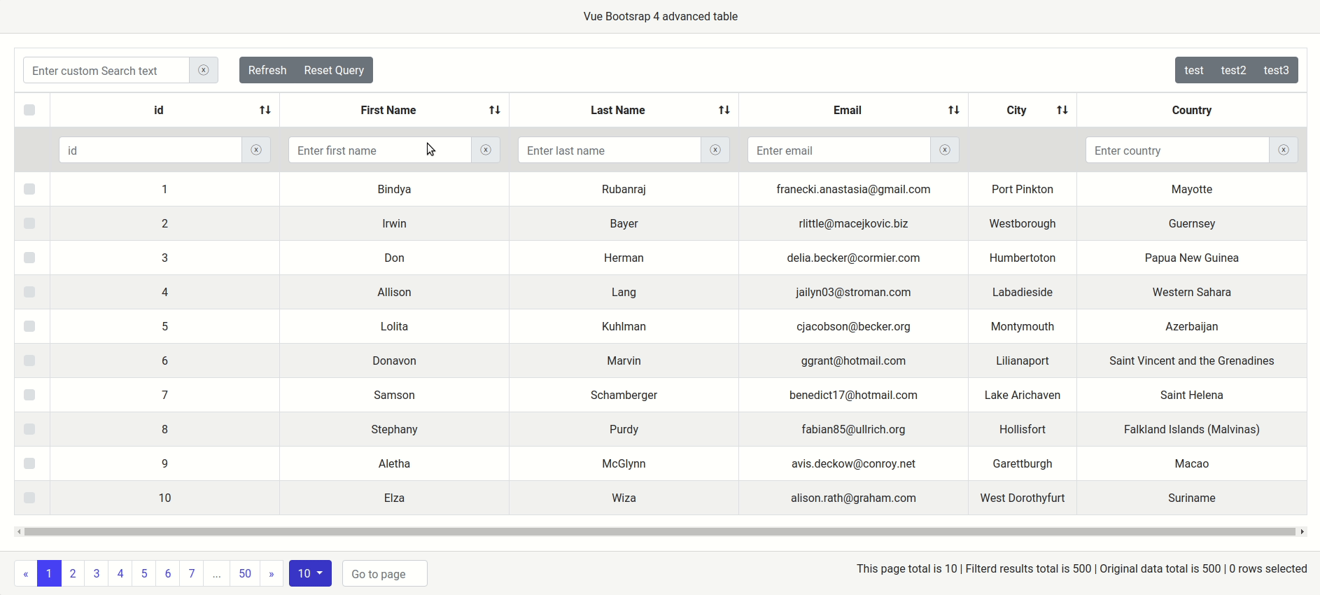
...After applying the above custom template to pagination info , pagination info component will look like this.
9.3.2.1. props
From slot-scope="props" you can access the following attributes.
| Attributes | Description |
|---|---|
| props.currentPageRowsLength | Number of rows currently showing in the page |
| props.filteredRowsLength | Total number of items in the result after filtering |
| props.originalRowsLength | Original number of items in the data |
10. Config
You can optionally pass config as a prop to vue-bootstrap4-table component to override the table configuration defaults.
10.1. Example
<template>
    <div id="app">
        <vue-bootstrap4-table :rows="rows" :columns="columns" :config="config">
        </vue-bootstrap4-table>
    </div>
</template>

<script>
    import VueBootstrap4Table from 'vue-bootstrap4-table'

    export default {
        name: 'App',
        data: function() {
            return {
                rows: [
                ...
                ],
                columns: [
                ...
                ],
                config: {
                    pagination: true, // default true
                    pagination_info: true, // default true
                    num_of_visibile_pagination_buttons: 7, // default 5
                    per_page: 5, // default 10
                    checkbox_rows: true, // default false
                    highlight_row_hover: true, // default true
                    rows_selectable: true, // default false
                    multi_column_sort: true, // default false
                    highlight_row_hover_color:"grey", // default "#d6d6d6"
                    card_title: "Vue Bootsrap 4 advanced table" // default ""
                }
            }
        },
        components: {
            VueBootstrap4Table
        }
    }
</script>
If you don't provide an attribute in the config, then default value will be assigned to that attribute.
10.2. Attributes details
| Attributes | Description | type | Default |
|---|---|---|---|
| pagination | Enable/Disable pagination in the table | Boolean | true |
| pagination_info | Enable/Disable pagination info in the table | Boolean | true |
| num_of_visibile_pagination_buttons | Limit the number of visible pagination buttons in the pagination bar | Number | 5 |
| per_page | Number of rows to display per page | Number | 10 |
| checkbox_rows | Enable/Disable checkbox in each rows | Boolean | false |
| highlight_row_hover | Enable/Disable highlighting row on hover | Boolean | true |
| rows_selectable | Enable/Disable selecting items on row click | Boolean | false |
| multi_column_sort | Enable/Disable multi column sorting | Boolean | false |
| highlight_row_hover_color | Change the row hover highlighting color | String | "#d6d6d6" |
| card_title | Sets the table title in the card header | String | "" (empty string) |
11. Build Setup
# install dependencies
npm install

# serve with hot reload at localhost:8080
npm run dev

# build for production with minification
npm run build

# build for production and view the bundle analyzer report
npm run build --report

# run unit tests
npm run unit

# run all tests
npm test