TH React Forms 

React Form Builder

A complete react form builder that interfaces with json data to load and save generated forms.
Basic Usage
import React from "react";import ReactDOM from "react-dom";import FormBuilder from "th-react-formbuilder"; const Example = <FormBuilder = = />;; ReactDOM;Props
const items = key: "Header" name: "Header Text" icon: "fa fa-header" key: "Paragraph" name: "Paragraph" icon: "fa fa-paragraph" key: "Dropdown" name: "Dropdown" icon: "fa fa-caret-square-o-down" ; const onSubmitFunc = // Submit Function; <FormBuilder = = /> Form Builder Params:
| Name | Type | Required | Description |
|---|---|---|---|
| onSubmit | function | Required | Invoked on Export Form, gets formData as the argument. |
| items | array | Optional | List of toolbar items, list of avaiable items can be found below. |
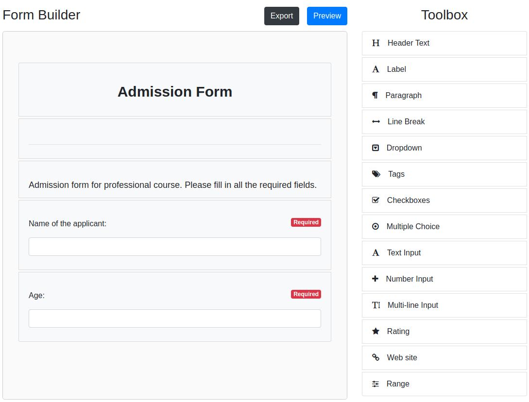
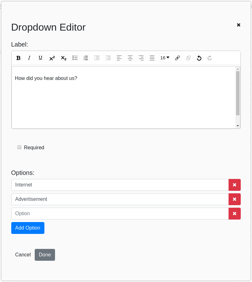
Editing Items:
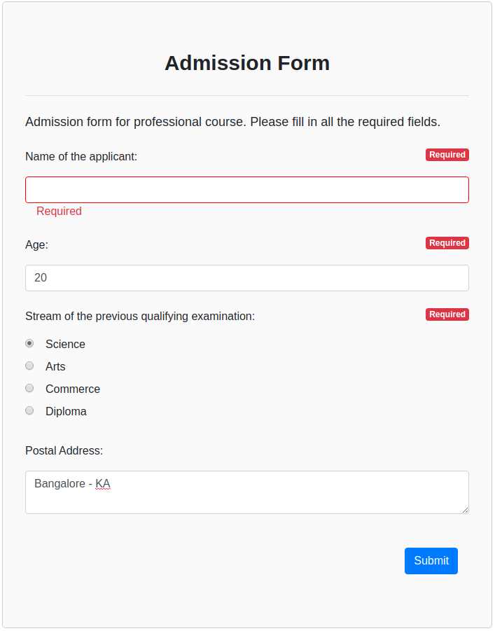
React Form Generator
Now that the form is built and saved, let's generate it from the saved json.
import React from "react";import ReactDOM from "react-dom";import FormGenerator from 'th-react-formbuilder'; const Example = <FormGenerator = = />; ReactDOM;Form Generator Params
| Name | Type | Required | Description |
|---|---|---|---|
| formData | array | Required | List of questions data retrieved from FormBuilder. |
| onSubmit | function | Required | Invoked on form submit, gets answers data as the argument. |
| readOnly | boolean | Optional | Show a read only version which has fields disabled and removed "Required" labels. |
| responseData | object | Optional | Answer data, only loads if loading a pre-existing form with values. |
Demo Form:
List of Toolbar items:
const items = key: "Header" name: "Header Text" icon: "fa fa-header" key: "Label" name: "Label" icon: "fa fa-font" key: "Paragraph" name: "Paragraph" icon: "fa fa-paragraph" key: "LineBreak" name: "Line Break" icon: "fa fa-arrows-h" key: "Dropdown" name: "Dropdown" icon: "fa fa-caret-square-o-down" key: "Tags" name: "Tags" icon: "fa fa-tags" key: "Checkboxes" name: "Checkboxes" icon: "fa fa-check-square-o" key: "RadioButtons" name: "Multiple Choice" icon: "fa fa-dot-circle-o" key: "TextInput" name: "Text Input" icon: "fa fa-font" key: "NumberInput" name: "Number Input" icon: "fa fa-plus" key: "TextArea" name: "Multi-line Input" icon: "fa fa-text-height" key: "Rating" name: "Rating" icon: "fa fa-star" key: "HyperLink" name: "Web site" icon: "fa fa-link" key: "Range" name: "Range" icon: "fa fa-sliders" key: "Email" name: "Email" icon: "fa fa-at" key: "Date" name: "Date" icon: "fa fa-calendar" key: "Signature" name: "Signature" icon: "fa fa-edit" ; // NOTE: You can edit the name and the icon (FontAwesome classes) fields but **do not** change the key.Read Only Form:

Dependencies
In order to make the Form Builder secure and pretty, there are a few dependencies other than React.
- redux-form
- draft-js
- react-draft-wysiwyg
- react-dnd
- react-star-ratings
- react-select
Develop
$ npm install$ npm startNavigate to localhost:8080/ in your browser and you should be able to see the Form Builder in action.