Notice
tcomb-form-native is looking for maintainers. If you're interested in helping, a great way to get started would just be to start weighing-in on GitHub issues, reviewing and testing some PRs.
Contents
- Setup
- Supported react-native versions
- Example
- API
- Types
- Rendering options
- Unions
- Lists
- Customizations
- Tests
- License
Setup
npm install tcomb-form-native
Supported react-native versions
| Version | React Native Support | Android Support | iOS Support |
|---|---|---|---|
| 0.5 - 0.6.1 | 0.25.0 - 0.35.0 | 7.1 | 10.0.2 |
| 0.4 | 0.20.0 - 0.24.0 | 7.1 | 10.0.2 |
| 0.3 | 0.1.0 - 0.13.0 | 7.1 | 10.0.2 |
Complies with react-native-version-support-table
Domain Driven Forms
The tcomb library provides a concise but expressive way to define domain models in JavaScript.
The tcomb-validation library builds on tcomb, providing validation functions for tcomb domain models.
This library builds on those two and the awesome react-native.
Benefits
With tcomb-form-native you simply call <Form type={Model} /> to generate a form based on that domain model. What does this get you?
- Write a lot less code
- Usability and accessibility for free (automatic labels, inline validation, etc)
- No need to update forms when domain model changes
JSON Schema support
JSON Schemas are also supported via the (tiny) tcomb-json-schema library.
Note. Please use tcomb-json-schema ^0.2.5.
Pluggable look and feel
The look and feel is customizable via react-native stylesheets and templates (see documentation).
Screencast
http://react.rocks/example/tcomb-form-native
Example App
https://github.com/bartonhammond/snowflake React-Native, Tcomb, Redux, Parse.com, Jest - 88% coverage
Example
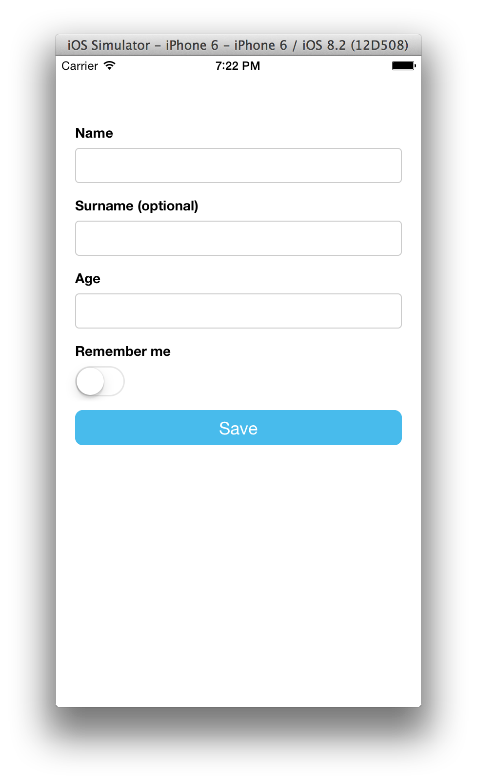
// index.ios.js 'use strict'; var React = ;var t = ;var AppRegistry StyleSheet Text View TouchableHighlight = React; var Form = tformForm; // here we are: define your domain modelvar Person = t; var options = {}; // optional rendering options (see documentation) var AwesomeProject = React; var styles = StyleSheet; AppRegistry;Output:
(Labels are automatically generated)
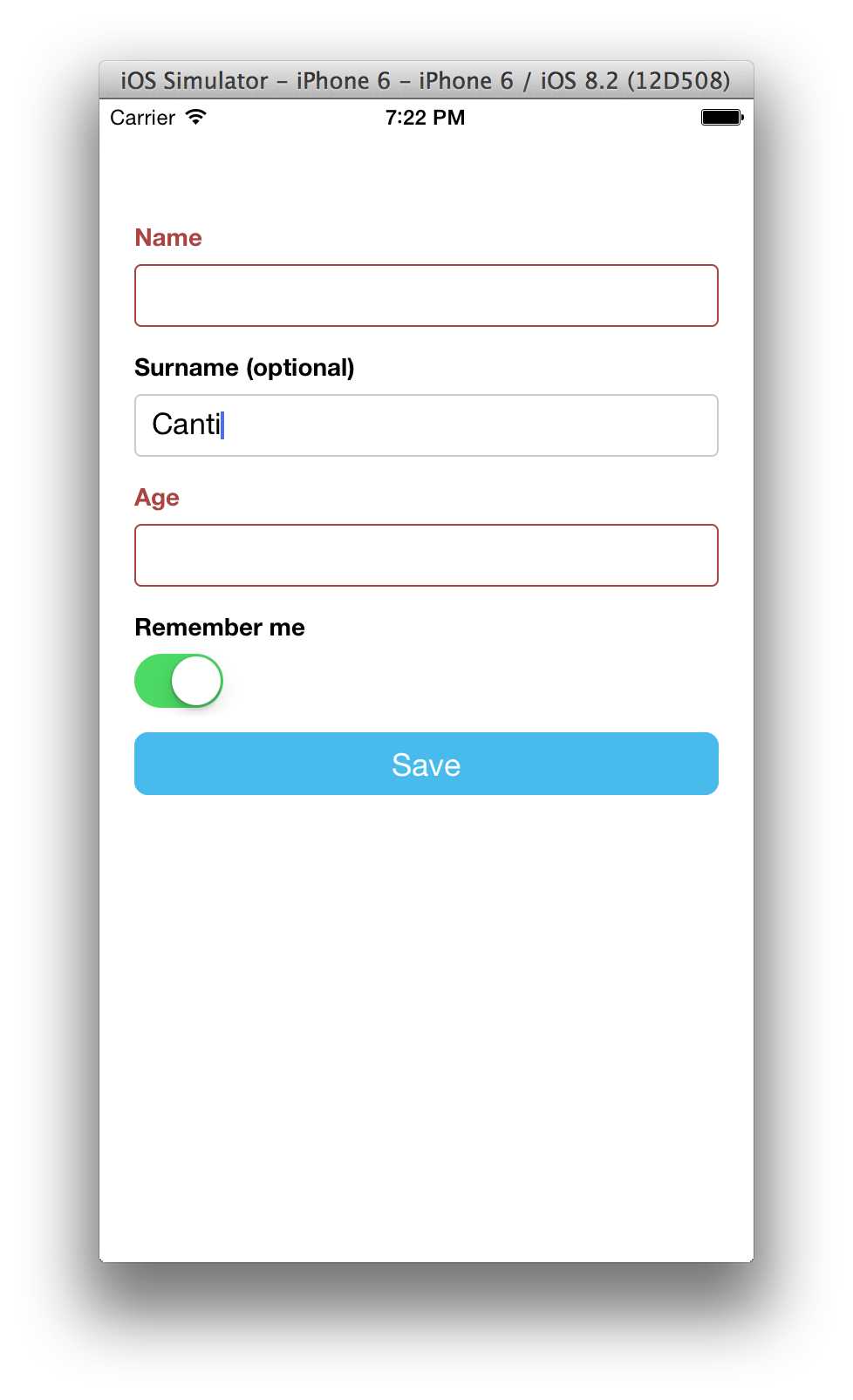
Ouput after a validation error:
API
getValue()
Returns null if the validation failed, an instance of your model otherwise.
Note. Calling
getValuewill cause the validation of all the fields of the form, including some side effects like highlighting the errors.
validate()
Returns a ValidationResult (see tcomb-validation for a reference documentation).
Adding a default value and listen to changes
The Form component behaves like a controlled component:
var Person = t; var AwesomeProject = React;The onChange handler has the following signature:
(raw: any, path: Array<string | number>) => void
where
rawcontains the current raw value of the form (can be an invalid value for your model)pathis the path to the field triggering the change
Warning. tcomb-form-native uses
shouldComponentUpdateaggressively. In order to ensure that tcomb-form-native detect any change totype,optionsorvalueprops you have to change references:
Disable a field based on another field's value
var Type = t; // see the "Rendering options" section in this guidevar options = fields: name: {} ; var AwesomeProject = React;How to get access to a field
You can get access to a field with the getComponent(path) API:
var Person = t; var AwesomeProject = React;How to clear form after submit
var Person = t; var AwesomeProject = React;Dynamic forms example: how to change a form based on selection
Say I have an iOS Picker, depending on which option is selected in this picker I want the next component to either be a checkbox or a textbox:
const Country = t; var AwesomeProject = React;Types
Required field
By default fields are required:
var Person = t;Optional field
In order to create an optional field, wrap the field type with the t.maybe combinator:
var Person = t;The postfix " (optional)" is automatically added to optional fields.
You can customise the postfix value or setting a postfix for required fields:
tformFormi18n = optional: '' required: ' (required)' // inverting the behaviour: adding a postfix to the required fields;Numbers
In order to create a numeric field, use the t.Number type:
var Person = t;tcomb-form-native will convert automatically numbers to / from strings.
Booleans
In order to create a boolean field, use the t.Boolean type:
var Person = t;Booleans are displayed as SwitchIOSs.
Dates
In order to create a date field, use the t.Date type:
var Person = t;Dates are displayed as DatePickerIOSs under iOS and DatePickerAndroid or TimePickerAndroid under Android, depending on the mode selected (date or time).
Under Android, use the fields option to configure which mode to display the Picker:
// see the "Rendering options" section in this guidevar options = fields: birthDate: mode: 'date' // display the Date field as a DatePickerAndroid ;iOS date config option
The bundled template will render an iOS UIDatePicker component, but collapsed into a touchable component in order to improve usability. A config object can be passed to customize it with the following parameters:
| Key | Value |
|---|---|
animation |
The animation to collapse the date picker. Defaults to Animated.timing. |
animationConfig |
The animation configuration object. Defaults to {duration: 200} for the default animation. |
format |
A (date) => String(date) kind of function to provide a custom date format parsing to display the value. Optional, defaults to (date) => String(date). |
defaultValueText |
An string to customize the default value of the null date value text. |
For the collapsible customization, look at the dateTouchable and dateValue keys in the stylesheet file.
Android date config option
When using a t.Date type in Android, it can be configured through a config option that take the following parameters:
| Key | Value |
|---|---|
background |
Determines the type of background drawable that's going to be used to display feedback. Optional, defaults to TouchableNativeFeedback.SelectableBackground. |
format |
A (date) => String(date) kind of function to provide a custom date format parsing to display the value. Optional, defaults to (date) => String(date). |
dialogMode |
Determines the type of datepicker mode for Android (default, spinner or calendar). |
defaultValueText |
An string to customize the default value of the null date value text. |
Enums
In order to create an enum field, use the t.enums combinator:
var Gender = t; var Person = t;Enums are displayed as Pickers.
iOS select config option
The bundled template will render an iOS UIPickerView component, but collapsed into a touchable component in order to improve usability. A config object can be passed to customize it with the following parameters:
| Key | Value |
|---|---|
animation |
The animation to collapse the date picker. Defaults to Animated.timing. |
animationConfig |
The animation configuration object. Defaults to {duration: 200} for the default animation. |
For the collapsible customization, look at the pickerContainer, pickerTouchable and pickerValue keys in the stylesheet file.
Refinements
A predicate is a function with the following signature:
(x: any) => boolean
You can refine a type with the t.refinement(type, predicate) combinator:
// a type representing positive numbersvar Positive = t; var Person = t;Subtypes allow you to express any custom validation with a simple predicate.
Rendering options
In order to customize the look and feel, use an options prop:
<Form type=Model options=options />Form component
Labels and placeholders
By default labels are automatically generated. You can turn off this behaviour or override the default labels on field basis.
var options = label: 'My struct label' // <= form legend, displayed before the fields; var options = fields: name: label: 'My name label' // <= label for the name field ;In order to automatically generate default placeholders, use the option auto: 'placeholders':
var options = auto: 'placeholders'; <Form type=Person options=options />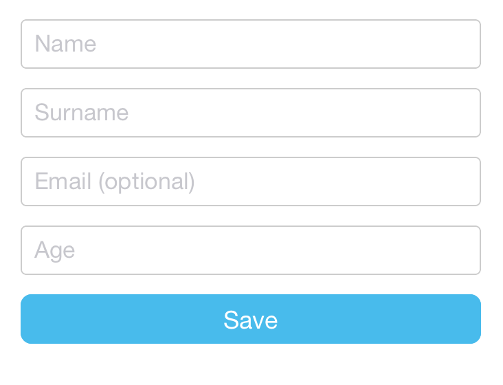
Set auto: 'none' if you don't want neither labels nor placeholders.
var options = auto: 'none';Fields order
You can sort the fields with the order option:
var options = order: 'name' 'surname' 'rememberMe' 'gender' 'age' 'email';Default values
You can set the default values passing a value prop to the Form component:
var value = name: 'Giulio' surname: 'Canti' age: 41 gender: 'M'; <Form type=Model value=value />Fields configuration
You can configure each field with the fields option:
var options = fields: name: // name field configuration here.. surname: // surname field configuration here.. ;Textbox component
Implementation: TextInput
Tech note. Values containing only white spaces are converted to null.
Placeholder
You can set the placeholder with the placeholder option:
var options = fields: name: placeholder: 'Your placeholder here' ;Label
You can set the label with the label option:
var options = fields: name: label: 'Insert your name' ;Help message
You can set a help message with the help option:
var options = fields: name: help: 'Your help message here' ;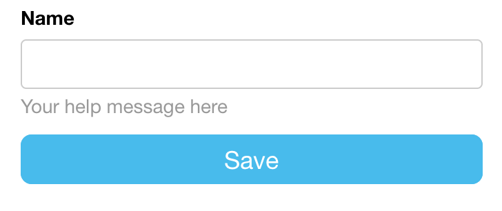
Error messages
You can add a custom error message with the error option:
var options = fields: email: // you can use strings or JSX error: 'Insert a valid email' ;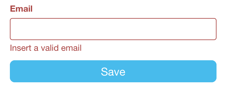
tcomb-form-native will display the error message when the field validation fails.
error can also be a function with the following signature:
(value, path, context) => ?(string | ReactElement)
where
valueis an object containing the current form value.pathis the path of the value being validatedcontextis the value of thecontextprop. Also it contains a reference to the component options.
The value returned by the function will be used as error message.
If you want to show the error message onload, add the hasError option:
var options = hasError: true error: <i>A custom error message</i>;Another way is to add a:
getValidationErrorMessage(value, path, context)
static function to a type, where:
valueis the (parsed) current value of the component.pathis the path of the value being validatedcontextis the value of thecontextprop. Also it contains a reference to the component options.
var Age = t; // if you define a getValidationErrorMessage function, it will be called on validation errorsAge { return 'bad age, locale: ' + contextlocale;}; var Schema = t; ... <tformForm ref="form" type=Schema context=locale: 'it-IT'/>You can even define getValidationErrorMessage on the supertype in order to be DRY:
tNumber { return 'bad number';}; Age { return 'bad age, locale: ' + contextlocale;};Other standard options
The following standard options are available (see http://facebook.github.io/react-native/docs/textinput.html):
allowFontScalingautoCapitalizeautoCorrectautoFocusbufferDelayclearButtonModeeditableenablesReturnKeyAutomaticallykeyboardTypemaxLengthmultilinenumberOfLinesonBluronEndEditingonFocusonSubmitEditingonContentSizeChangepasswordplaceholderTextColorreturnKeyTypeselectTextOnFocussecureTextEntryselectionStatetextAligntextAlignVerticaltextContentTypeunderlineColorAndroid
underlineColorAndroid is not supported now on tcomb-form-native due to random crashes on Android, especially on ScrollView. See more on:
https://github.com/facebook/react-native/issues/17530#issuecomment-416367184
Checkbox component
Implementation: SwitchIOS
The following options are similar to the Textbox component's ones:
labelhelperror
Other standard options
The following standard options are available (see http://facebook.github.io/react-native/docs/switchios.html):
disabledonTintColorthumbTintColortintColor
Select component
Implementation: PickerIOS
The following options are similar to the Textbox component's ones:
labelhelperror
nullOption option
You can customize the null option with the nullOption option:
var options = fields: gender: nullOption: value: '' text: 'Choose your gender' ;You can remove the null option setting the nullOption option to false.
Warning: when you set nullOption = false you must also set the Form's value prop for the select field.
Tech note. A value equal to nullOption.value (default '') is converted to null.
Options order
You can sort the options with the order option:
var options = fields: gender: order: 'asc' // or 'desc' ;Options isCollapsed
You can determinate if Select is collapsed:
var options = fields: gender: isCollapsed: false // default: true ;If option not set, default is true
Options onCollapseChange
You can set a callback, triggered, when collapse change:
var options = fields: gender: { console; } ;DatePicker component
Implementation: DatePickerIOS
Example
var Person = t;The following options are similar to the Textbox component's ones:
labelhelperror
Other standard options
The following standard options are available (see http://facebook.github.io/react-native/docs/datepickerios.html):
maximumDate,minimumDate,minuteInterval,mode,timeZoneOffsetInMinutes
Hidden Component
For any component, you can set the field with the hidden option:
var options = fields: name: hidden: true ;This will completely skip the rendering of the component, while the default value will be available for validation purposes.
Unions
Code Example
const AccountType = tenums const KnownAccount = t // UnknownAccount extends KnownAccount so it owns also the type fieldconst UnknownAccount = KnownAccount // the unionconst Account = t // the final form typeconst Type = t const options = item: // one options object for each concrete type of the union label: 'KnownAccount' label: 'UnknownAccount' Generally tcomb's unions require a dispatch implementation in order to select the suitable type constructor for a given value and this would be the key in this use case:
// if account type is 'other' return the UnknownAccount typeAccount value && valuetype === 'other' ? UnknownAccount : KnownAccountLists
You can handle a list with the t.list combinator:
const Person = t;Items configuration
To configure all the items in a list, set the item option:
const Person = t; const options = fields: // <= Person options tags: item: // <= options applied to each item in the list label: 'My tag' );Nested structures
You can nest lists and structs at an arbitrary level:
const Person = t; const Persons = t;If you want to provide options for your nested structures they must be nested following the type structure. Here is an example:
const Person = t; const options = fields: // <= Person options name: label: 'name label' position: fields: // Note that latitude is not directly nested in position, // but in the fields property latitude: label: 'My position label' );When dealing with t.list, make sure to declare the fields property inside the item property, as such:
const Documents = t const Person = t; const options = fields: name: /*...*/ documents: item: fields: type: // Documents t.struct 'type' options value: // Documents t.struct 'value' options Internationalization
You can override the default language (english) with the i18n option:
const options = i18n: optional: ' (optional)' required: '' add: 'Add' // add button remove: '✘' // remove button up: '↑' // move up button down: '↓' // move down button ;Buttons configuration
You can prevent operations on lists with the following options:
disableAdd: (defaultfalse) prevents adding new itemsdisableRemove: (defaultfalse) prevents removing existing itemsdisableOrder: (defaultfalse) prevents sorting existing items
const options = disableOrder: true;List with Dynamic Items (Different structs based on selected value)
Lists of different types are not supported. This is because a tcomb's list, by definition, contains only values of the same type. You can define a union though:
const AccountType = tenums const KnownAccount = t // UnknownAccount extends KnownAccount so it owns also the type fieldconst UnknownAccount = KnownAccount // the unionconst Account = t // the final form typeconst Type = tGenerally tcomb's unions require a dispatch implementation in order to select the suitable type constructor for a given value and this would be the key in this use case:
// if account type is 'other' return the UnknownAccount typeAccount value && valuetype === 'other' ? UnknownAccount : KnownAccountCustomizations
Stylesheets
See also Stylesheet guide.
tcomb-form-native comes with a default style. You can customize the look and feel by setting another stylesheet:
var t = ;var i18n = ;var templates = ; // define a stylesheet (see lib/stylesheets/bootstrap for an example)var stylesheet = ...; // override globally the default stylesheettformFormstylesheet = stylesheet;// set defaultstformFormtemplates = templates;tformFormi18n = i18n;You can also override the stylesheet locally for selected fields:
var Person = t; var options = fields: name: stylesheet: myCustomStylesheet ;Or per form:
var Person = t; var options = stylesheet: myCustomStylesheet;For a complete example see the default stylesheet https://github.com/gcanti/tcomb-form-native/blob/master/lib/stylesheets/bootstrap.js.
Templates
tcomb-form-native comes with a default layout, i.e. a bunch of templates, one for each component. When changing the stylesheet is not enough, you can customize the layout by setting custom templates:
var t = ;var i18n = ;var stylesheet = ; // define the templates (see lib/templates/bootstrap for an example)var templates = ...; // override globally the default layouttformFormtemplates = templates;// set defaultstformFormstylesheet = stylesheet;tformFormi18n = i18n;You can also override the template locally:
var Person = t; { var containerStyle = ...; var labelStyle = ...; var textboxStyle = ...; return <View style=containerStyle> <Text style=labelStyle>localslabel</Text> <TextInput style=textboxStyle /> </View> ;} var options = fields: name: template: myCustomTemplate ;A template is a function with the following signature:
(locals: Object) => ReactElement
where locals is an object contaning the "recipe" for rendering the input and it's built for you by tcomb-form-native.
Let's see an example: the locals object passed in the checkbox template:
type Message = string | ReactElement stylesheet: Object // the styles to be applied hasError: boolean // true if there is a validation error error: ?Message // the optional error message to be displayed label: Message // the label to be displayed help: ?Message // the optional help message to be displayed value: boolean // the current value of the checkbox onChange: Function // the event handler to be called when the value changes config: Object // an optional object to pass configuration options to the new template ...other input options here... For a complete example see the default template https://github.com/gcanti/tcomb-form-native/blob/master/lib/templates/bootstrap.
i18n
tcomb-form-native comes with a default internationalization (English). You can change it by setting another i18n object:
var t = ;var templates = ; // define an object containing your translations (see tcomb-form-native/lib/i18n/en for an example)var i18n = ...; // override globally the default i18ntformFormi18n = i18n;// set defaultstformFormtemplates = templates;tformFormstylesheet = stylesheet;Transformers
Say you want a search textbox which accepts a list of keywords separated by spaces:
var Search = t;tcomb-form by default will render the search field as a list. In order to render a textbox you have to override the default behaviour with the factory option:
var options = fields: search: factory: tformTextbox ;There is a problem though: a textbox handle only strings so we need a way to transform a list in a string and a string in a list: a Transformer deals with serialization / deserialization of data and has the following interface:
var Transformer = t;A basic transformer implementation for the search textbox:
var listTransformer = { return Array ? value : value; } { return str ? str : ; };Now you can handle lists using the transformer option:
// example of initial valuevar value = search: 'climbing' 'yosemite'; var options = fields: search: factory: tformTextbox // tell tcomb-react-native to use the same component for textboxes transformer: listTransformer help: 'Keywords are separated by spaces' ;Custom factories
You can pack together style, template (and transformers) in a custom component and then you can use it with the factory option:
var Component = tformComponent; // extend the base Component // this is the only required method to implement { // define here your custom template return { //return ... jsx ... }; } // you can optionally override the default getLocals method // it will provide the locals param to your template { // in locals you'll find the default locals: // - path // - error // - hasError // - label // - onChange // - stylesheet var locals = super; // add here your custom locals return locals; } // as example of transformer: this is the default transformer for textboxesMyComponenttransformer = Nil ? null : value tString && value === '' || Nil ? null : value; var Person = t; var options = fields: name: factory: MyComponent ;Tests
npm test
Note: If you are using Jest, you will encounter an error which can
be fixed w/ a small change to the package.json.
The error will look similiar to the following:
Error: Cannot find module './datepicker' from 'index.js' at
Resolver.resolveModule
A completely working example jest setup is shown below w/ the
http://facebook.github.io/jest/docs/api.html#modulefileextensions-array-string
fix added:
  "jest": {
    "setupEnvScriptFile": "./node_modules/react-native/jestSupport/env.js",
    "haste": {
      "defaultPlatform": "ios",
      "platforms": [
        "ios",
        "android"
      ],
      "providesModuleNodeModules": [
        "react-native"
      ]
    },
    "testPathIgnorePatterns": [
      "/node_modules/"
    ],
    "testFileExtensions": [
      "es6",
      "js"
    ],
    "moduleFileExtensions": [
      "js",
      "json",
      "es6",
      "ios.js"    <<<<<<<<<<<< this needs to be defined!
    ],
    "unmockedModulePathPatterns": [
      "react",
      "react-addons-test-utils",
      "react-native-router-flux",
      "promise",
      "source-map",
      "key-mirror",
      "immutable",
      "fetch",
      "redux",
      "redux-thunk",
      "fbjs"
    ],
    "collectCoverage": false,
    "verbose": true
    },


