🔴 Attention: This repository is not actively maintained or updated. This is a component created for the project 14 of the Open Classrooms Javascript-React Dev course : Faites passer une librairie jQuery vers React. Thank you for your understanding and support! 💻🙌.

This is a table component for react native.
The minimal requirement for this component are the data array, and a title object sharing keys with the data array.
npm install talec-table
for this whole readme file I will use a data array of super heroes to create lines.
const myData = [
  {FN:"Peter",LN:"Parker",AL:"SpiderMan",D1:"1962-08-01",CO:"Red",SY:"🕷",WE:76,UN:"Marvel"},
...];The Titles object defines the header line of the array. Keys must be the same as data Lines. It is independent from data, thus enabling titles to be responsively changed if the display language changes for instance.
const myTitles = {
FN: "1st Name",
LN: "Last Name",
AL: "Alias",
D1: "#1 Comic",
CO: "Color",
SY: "Symbol",
WE: "Weight",
UN: "Universe",
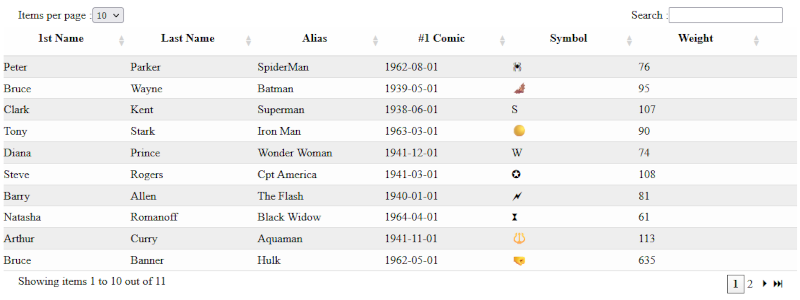
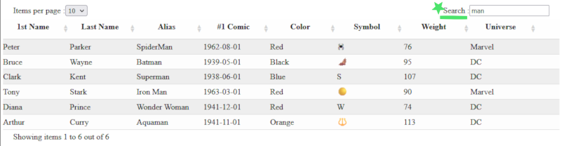
};With this minimal setting, you get the below example display, with sorting, search function and pagination.
USE:
import React from "react";
import {TalecTable} from "talec-table";

import myData from "path";

function myPage(){
  const myTitles = {
    FN: "1st Name", LN: "Last Name", AL: "Alias", D1: "#1 Comic",
    CO: "Color", SY: "Symbol", WE: "Weight",	UN: "Universe"};

  return(
    <div><TalecTable lines={myData} titles={myTitles}/><div>
  )
}
Minimal display with no custom style or action
You might want to hide a column without editing your data, the prop Hide has this purpose. Hide is an array of keys that will not be displayed
USE:
import React from "react";
import {TalecTable} from "talec-table";

import myData from "path";

function myPage(){
  const myTitles = {
    FN: "1st Name", LN: "Last Name", AL: "Alias", D1: "#1 Comic",
    CO: "Color", SY: "Symbol", WE: "Weight",	UN: "Universe"};
  const dataToHide =["CO","UN"]

  return(
    <div><TalecTable lines={myData} titles={myTitles} hide={dataToHide}/><div>
  )
}
Minimal display with hidden columns
A lot of customization is allowed through the custom prop, please see list and examples below
By passing a css object in the custom prop, you can change the display of the lines. The keys titleStyle, evenLineStyle and oddLineStyle are the targets.
const myCustom = {
	titleStyle: { backgroundColor: "orange" },
	evenLineStyle: { backgroundColor: "purple" },
	oddLineStyle: { backgroundColor: "yellow" },
};
USE:
import React from "react";
import {TalecTable} from "talec-table";

import myData from "path";
import myTitles from "path";

function myPage(){
 const myCustom = {
	titleStyle: { backgroundColor: "lightskyblue" },
	evenLineStyle: { backgroundColor: "lightblue" },
	oddLineStyle: { backgroundColor: "lightcyan" },
}

  return(
    <div><TalecTable lines={myData} titles={myTitles} custom={myCustom}/><div>
  )
}
Customized display with personalized style
You might want to change the order of the columns, and define a custom width for each. The prop custom.columns is here for you. Only the keys included in values will be displayed, therefor you can either choose to use the previous prop hide with the full list of keys, or just shorten the list here. Make sure your total width do not exceed 100%...
const myColumns = {
	columns: {
		values: ["UN", "D1", "LN", "FN", "AL", "SY", "CO"],
		width: ["10%", "", "15%", "15%", "15%", "8%", "6rem"],
	},
};
USE:
import React from "react";
import {TalecTable} from "talec-table";

import myData from "path";
import myTitles from "path";

function myPage(){
 const myColumns = {
	columns: {
		values: ["UN", "D1", "LN", "FN", "AL", "SY", "CO"],
		width: ["10%", "", "15%", "15%", "15%", "8%", "6rem"],
	},
};

  return(
    <div><TalecTable lines={myData} titles={myTitles} custom={myColumns}/><div>
  )
}
Customized display with personalized columns
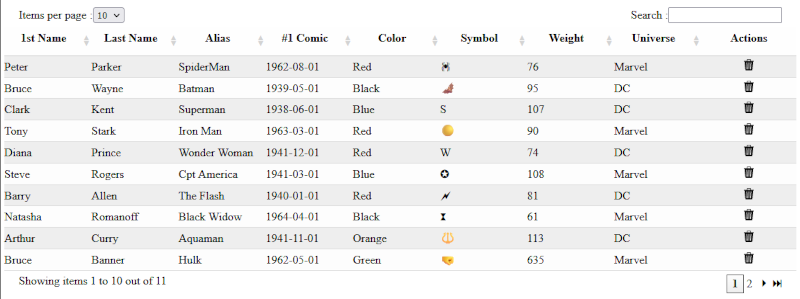
Need to add an extra column at the end of your table, that triggers a function in the parent component ? The prop custom.actionColumn serves this purpose. the name is the title of this column, label is shown on mouse over the icon. The function func() is called in parent component on click, passing the value of the target column. Actions is a list, therefor multiples icons might be displayed for multiples functions.
const customAction = {
	actionColumn: {
		name: "Actions",
		actions: [
			{
				icon: <BsTrash3Fill />,
				func: deleteItem,
				target: "AL",
				label: "delete",
			},
		],
	},
};
USE:
import React from "react";
import {TalecTable} from "talec-table";
import { BsTrash3Fill} from "react-icons/bs";

import myData from "path";
import myTitles from "path";

function myPage(){

const deleteItem =(item)=>{
  //your logic here
  console.log(item)}

 const customAction = {
	actionColumn: {
		name: "Actions",
		actions: [
			{
				icon: <BsTrash3Fill />,
				func: deleteItem,
				target: "AL",
				label: "delete",
			},
		],
	},
};

  return(
    <div><TalecTable lines={myData} titles={myTitles} custom={customAction}/><div>
  )
}
Customized display with personalized action column
You might want to change the displayed text for length selector, search input or pagination information. the custom.text prop is there for this purpose.
const customText = {
	text: {
		itemPerPage: "How many Heros per page ? ",
		search: "Seeking help ?",
		showingItems: ["Digging Hero #", "to", "out of"],
	},
};
USE:
import React from "react";
import {TalecTable} from "talec-table";

import myData from "path";
import myTitles from "path";

function myPage(){
  const customText = {
	text: {
		itemPerPage: "How many Heros per page ? ",
		search: "Seeking help ?",
		showingItems: ["Digging Hero #", "to", "out of"],
	},
};

  return(
    <div><TalecTable lines={myData} titles={myTitles} custom={customText}/><div>
  )
}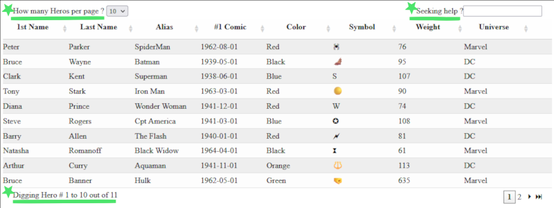
Display with custom text
The default page length let user choose between 10,20 or 50 items per page. You might want to change that, using the prop custom.lengthChoice.
const customLength = { lengthChoice: [6, 12, 25, 60] };USE:
import React from "react";
import {TalecTable} from "talec-table";

import myData from "path";
import myTitles from "path";

function myPage(){
  const customLength = { lengthChoice: [6, 12, 25, 60] };

  return(
    <div><TalecTable lines={myData} titles={myTitles} custom={customLength}/><div>
  )
}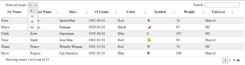
Display with custom length selection
The default search tool includes every column in the search, and starts filtering after 2 characters typed. If you want to narrow the results to fewer columns, use the custom.searchCol prop.
const customSearch = { searchCol: ["AL", "CO"] };USE:
import React from "react";
import {TalecTable} from "talec-table";

import myData from "path";
import myTitles from "path";

function myPage(){
  const customSearch = { searchCol: ["AL", "CO"] };

  return(
    <div><TalecTable lines={myData} titles={myTitles} custom={customSearch}/><div>
  )
}
The search will be narrowed to selected columns
| Prop | Type | Description | Default |
|---|---|---|---|
| lines | Array | Users data | null |
| titles | Object | Table header names | null |
| hide | Object | Table data to hide. | null |
| custom.search | Array | Columns to search into | titles |
| custom.length | Array | Selection of page display length | [10,20,50] |
| custom.labels | Object | Text for labels around Table | {itemPerPage: "Items per Page :", search: "Search :", showingItems: ["Showing items", "to", "out of"] } |
| custom.actions | Object | Actions functions and icons in last column | null |
| custom.columns | Object | Order and width of columns | null |
| custom.titleStyle | Style | CSS object to define Title style | {backgroundColor: "#fefefe",borderBottom: "1px solid #cccccc",lineHeight: "2rem",fontWeight: "600",textAlign: "center"} |
| custom.evenLineStyle | Style | CSS object to define Even Lines style | {backgroundColor: "#eeeeee",borderBottom: "1px solid #dddddd",lineHeight:"1.8rem"} |
| custom.oddLineStyle | Style | CSS object to define Odd Lines style | {backgroundColor: "#fdfdfd",borderBottom: "1px solid #dddddd",lineHeight:"1.8rem"} |