

svrollbar
svrollbar is the custom scrollbar made by svelte.
- how to install
- examples
- how to use
- components spec
- how to customize transition
- how to customize style
- how to customize scrollbar visibility
how to install
npm install svrollbarexamples
example website is here
example svelte REPL is here.
how to use
svrollbar has two components; Svrollbar.svelte and Svroller.svelte.
svrollbar is supposed to use with svelte,
but if you want, you can use svrollbar without svelte.
replace window scrollbar
if you would like to customize your window scrollbar,
you simply write down Svrollbar.svelte with empty properties,
<Svrollbar />this is equivalent to:
<Svrollbar viewport={document.scrollingElement} contents={document.body} />yes, you can see the customized scrollbar on the right side of your browser window. please watch out example website to see the live example.
make scrollable area
if you try to make scrollable area within a part of your web site,
you may prefer to use Svroller.svelte.
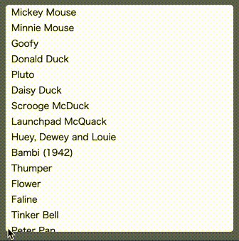
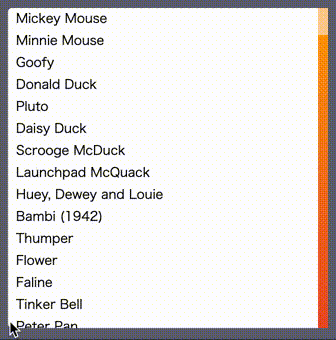
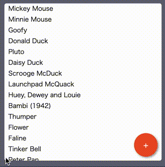
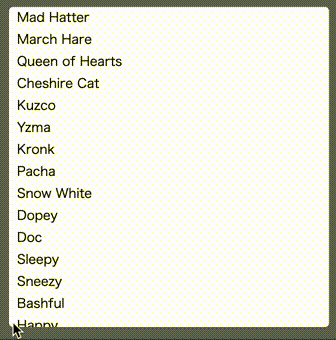
the below example shows you the list which has 50 rows
in a 10rem x 10rem square scrollable area with the custom scrollbar.
<script lang="ts">
  import { Svroller } from 'svrollbar'

  const items = Array.from({ length: 50 }).map((_, i) => `item ${i}`)
</script>

<Svroller width="10rem" height="10rem">
  {#each items as item (item)}
    <div>{item}</div>
  {/each}
</Svroller>
replace overflow-based scrollbar
on the other hand, it is better to use Svrollbar.svelte
if you already have a kind of scrollable viewport or contents.
<script lang="ts">
  import { Svrollbar } from 'svrollbar'

  const items = Array.from({ length: 50 }).map((_, i) => `item ${i}`)

  export let viewport: Element
  export let contents: Element
</script>

<div class="wrapper">
  <div bind:this={viewport} class="viewport">
    <div bind:this={contents} class="contents">
      {#each items as item (item)}
        <div>{item}</div>
      {/each}
    </div>
  </div>
  <Svrollbar {viewport} {contents} />
</div>

<style>
  .wrapper {
    position: relative;
    width: 10rem;
  }

  .viewport {
    position: relative;
    width: 10rem;
    height: 10rem;
    overflow: scroll;
    border: 1px solid gray;
    box-sizing: border-box;

    /* hide scrollbar */
    -ms-overflow-style: none;
    scrollbar-width: none;
  }

  .viewport::-webkit-scrollbar {
    /* hide scrollbar */
    display: none;
  }
</style>
notice, you do not need to specify fixed value to width or height of viewport. you can set min-*, max-*, and any dynamic and reactive value because svrollbar observes both viewport size and its content size by ResizeObserver.
integrate 3rd party libraries
if you would like to integrate svrollbar into some kind of virtual list implemenation such as svelte-virtual-list or svelte-tiny-virtual-list, you can do that in the following way.
<script lang="ts">
  import { onMount } from 'svelte'
  import VirtualList from 'svelte-tiny-virtual-list'
  import { Svrollbar } from 'svrollbar'

  const items = Array.from({ length: 50 }).map((_, i) => `item ${i}`)

  let viewport: Element
  let contents: Element

  onMount(() => {
    viewport = document.querySelector('.virtual-list-wrapper')
    contents = document.querySelector('.virtual-list-inner')
  })
</script>

<div class="wrapper">
  <Svrollbar {viewport} {contents} />
  <VirtualList width="10rem" height={160} itemCount={items.length} itemSize={16}>
    <div slot="item" let:index let:style {style}>
      {items[index]}
    </div>
  </VirtualList>
</div>

<style>
  :global(.virtual-list-wrapper) {
    /* hide scrollbar */
    -ms-overflow-style: none !important;
    scrollbar-width: none !important;
  }

  :global(.virtual-list-wrapper::-webkit-scrollbar) {
    /* hide scrollbar */
    display: none !important;
  }

  .wrapper {
    position: relative;
    width: 10rem;
  }
</style>
components spec
see here.
how to customize transition
since the simple fade animation is really a bore, you can replace the default fade (show/hide) animation with your one. the transition function is compatible with the svelte transition.
<script>
  import { fly } from 'svelte/transition'
  import { Svroller } from 'svrollbar'

  const items = Array.from({ length: 50 }).map((_, i) => `item ${i}`)
  const flyLeft = (node) => fly(node, { x: -160 })
  const flyRight = (node) => fly(node, { x: 30 })
</script>

<Svroller
  width="10rem"
  height="10rem"
  vTrackIn={flyLeft}
  vTrackOut={flyLeft}
  vThumbIn={flyRight}
  vThumbOut={flyRight}>
  {#each items as item (item)}
    <div>{item}</div>
  {/each}
</Svroller>
how to customize style
you can customize svrollbar style with css variables.
| variable | default |
|---|---|
| --svrollbar-track-width | 10px |
| --svrollbar-track-background | initial |
| --svrollbar-track-radius | initial |
| --svrollbar-track-opacity | 1 |
| --svrollbar-track-shadow | initial |
| --svrollbar-thumb-width | 6px |
| --svrollbar-thumb-background | gray |
| --svrollbar-thumb-radius | 0.25rem |
| --svrollbar-thumb-opacity | 0.5 |
| --svrollbar-thumb-shadow | initial |
<script lang="ts">
  import { Svroller } from 'svrollbar'

  const items = Array.from({ length: 50 }).map((_, i) => `item ${i}`)
</script>

<div class="container">
  <Svroller width="10rem" height="10rem">
    {#each items as item (item)}
      <div>{item}</div>
    {/each}
  </Svroller>
</div>

<style>
  .container {
    border: 3px solid #5d7150;
    width: 10rem;

    --svrollbar-track-width: 20px;
    --svrollbar-track-background: #85b4b9;
    --svrollbar-track-opacity: 1;

    --svrollbar-thumb-width: 10px;
    --svrollbar-thumb-background: #d9ab55;
    --svrollbar-thumb-opacity: 1;
  }
</style>
how to customize scrollbar visibility
you can customize scrollbar visibility with alwaysVisible and initiallyVisible properties.
| property | default | description |
|---|---|---|
| alwaysVisible | false | scrollbar is always visible |
| initiallyVisible | false | scrollbar is visible until scrolling |