SVG-progress-circle
An addon for ember-cli that adds a component to show a sizable circle made with a SVG. This component is part of the rewrite of the frontend-app for my job at easyPEP.
- easyPEP (german name): homepage
- Staffomatic (english name): homepage
- easyPEP github
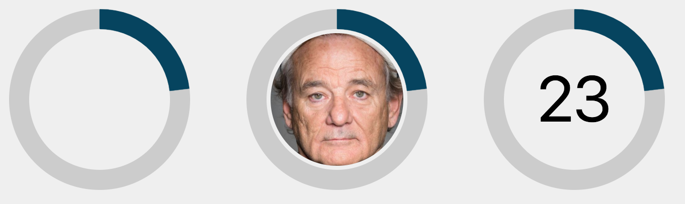
Screenshot
DEMO
Installation
ember install ember-cli-sassember install svg-progress-circle
Usage
// blockless:{{progress-circle size="40" strokeWidth="3" percentage=model.somePercentage}} // as a block{{#progress-circle size="40" strokeWidth="3" percentage=model.somePercentage}} {{!-- inner content --}}{{/svg-progress-circle}} // with inner text{{#progress-circle size="200" strokeWidth="10" percentage=percentage}} {{#progress-circle/text font-size="2rem" font-family="inherit" }} {{percentage}} {{/progress-circle/text}} {{/progress-circle}} // with inner image{{#progress-circle size="200" strokeWidth="10" percentage=percentage as |strokeWidth|}} {{progress-circle/image imageUrl="assets/bill.jpg" strokeWidth=strokeWidth imageGap="2" }} {{/progress-circle}}Options
progress-circle
sizedefault90-> the SVG viewportstrokeWidthdefault10-> the width of the borderpercentagedefault0-> a value between1and100
progress-circle/text
font-sizedefaultinitialfont-familydfeaultarial
progress-circle/image
imageUrl-> a standard URL to the imagestrokeWidth-> an integer number to control the width of the image borderimageGapdefault0-> an integer number to control the gap between the circle and the image
CSS
The addon provides the following classes to style the file-picker:
.progress-circle.progress-circle__svg.progress-circle__circle.progress-circle__indicator(--empty|--filled|--invalid)
or you can import the default styles:
** NOTE: After wrecking the gh-pages and messing with the repository, I had to rollback everything and properly learn how to handle this github stuff. I hope all is now properly documented, pushed and published. But also there have been Features as well. Read below.
Changelog
1.1.4
- [UPDATE] Updated ember-cli-sass to 7.2.0
1.1.3
- [FEATURE] Added a an SVG image component.
- [FEATURE] Added a an SVG text component.
- [ENHANCEMENT] Proper responsiveness provided. (Use sizes like "3em" or percentages)
0.0.9
- [BUGFIX] Added the missing viewBox attribute
- [ENHANCEMENT] Added tests
0.0.8
- [ENHANCEMENT] Added a demo
0.0.7
- [BUGFIX] Fixed check for 0 percentage
0.0.6
- [FEATURE] Added animation for the progress indicator
- [ENHANCEMENT] Optimized the check for valid values
- [FEATURE] Added more state class names for the indicator (empty, filled, invalid)
Linting
npm run lint:jsnpm run lint:js -- --fix
Running tests
ember test– Runs the test suite on the current Ember versionember test --server– Runs the test suite in "watch mode"npm test– Runsember try:eachto test your addon against multiple Ember versions