This plugin adds list of new custom fields in strapi to make the content editing more comfortable
💡 Note:
If you simply runnpm install strapi-plugin-superfields, it will install the version for Strapi v5 by default.
To use this plugin with Strapi v4, make sure to install version^4explicitly.
| ⚙️ Strapi Version | 📦 Plugin Version | 🧪 npm Command | 🧪 yarn Command |
|---|---|---|---|
| ✅ Strapi v5 | strapi-plugin-superfields |
npm install strapi-plugin-superfields |
yarn add strapi-plugin-superfields |
strapi-plugin-superfields@^4 |
npm install strapi-plugin-superfields@^4 |
yarn add strapi-plugin-superfields@^4 |
- Comment Field
- Tooltip Input Field
- Tooltip Number Input Field
- Boolean Field
- Tooltip Enum Field
- Tooltip Multi Select Field
- Tooltip Date Time Picker Field
- Tooltip Color Picker Field
Comment Field
✔️ Used to leave a comment in admin to inform about something
- Name -- name of field
- Comment -- Content of the comment
- Color variant -- The color schema of the comment. Can be green (success), yellow (warn), red (error)
Tooltip Input Field
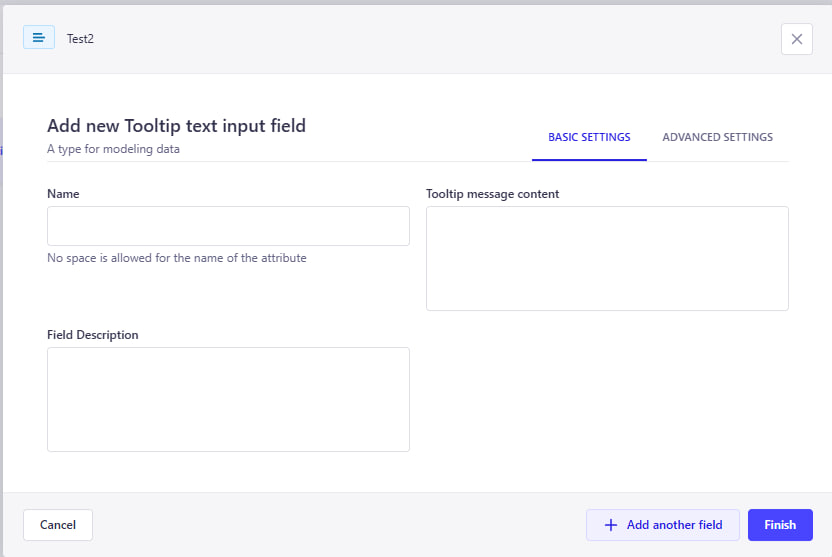
✔️ This custom field allows you to display tooltips on input fields directly in the Content Manager.
🎯 Tooltips help explain the purpose of a field, providing inline documentation and improving content editor usability.
📌 Especially useful for onboarding editors or when fields require clarification about how values are used.
Tooltip Input Field comes with multiple settings to customize how the help text appears:
- Name – The visible label for the field
- Description – Optional small text under the input
- Tooltip message – The message shown in the tooltip (appears on hover)
Below is an example of how a tooltip field appears in the Content Editor:
As you can see:
- The input field has a clear label and description
- A tooltip icon (
ⓘ) shows contextual help when hovered - This improves the clarity and usability of your Strapi admin panel
Tooltip Input Field let you:
- Guide editors without taking too much space
- Clarify business rules or formatting
- Improve content accuracy and consistency
- Reduce confusion for complex or optional fields
Tooltip Number Input Field
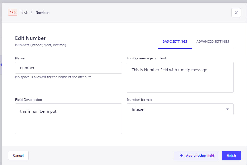
✔️ This custom field allows you to display tooltips on number input fields directly in the Content Manager.
🎯 It helps explain the purpose of a numeric field, providing inline guidance and improving the user experience for content editors.
📌 Especially useful when fields require specific formats or clarification.
Tooltip Number Input Field provides flexible configuration options:
- Name – The name of the field (no spaces allowed)
- Tooltip message content – The message shown in the tooltip when hovering the (ℹ️) icon
- Field Description – Optional description shown under the input field
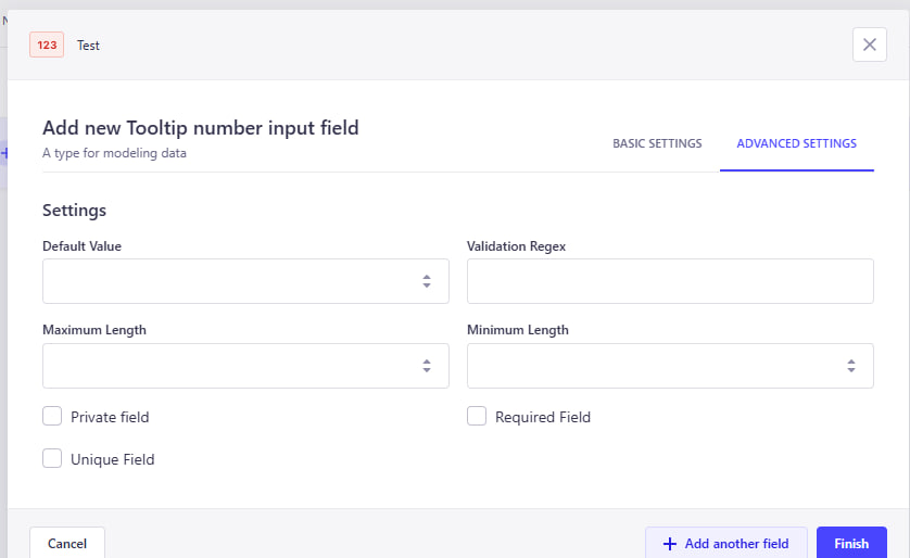
Advanced options allow further validation and customization:
- Default Value – Predefined number to be used as the default input
- Validation Regex – Regular expression to validate specific numeric patterns
- Maximum Length – Maximum allowed character length for the input
- Minimum Length – Minimum character length required
- Private Field – Field is hidden from API responses and only visible in the admin panel
- Required Field – Field must be filled before submitting the form
- Unique Field – Ensures the value is unique across all entries
Here is how the Tooltip Number Input Field appears in the Content Editor:
As shown above:
- The field is clearly labeled and displays a helpful tooltip
- A tooltip icon (
ⓘ) shows contextual help on hover - An optional description is displayed below the input box
- Default value can be pre-filled
Using this field can improve your content editing experience by:
- Providing contextual help for complex numeric fields
- Reducing errors and confusion for content editors
- Supporting validations to enforce rules
- Enhancing usability through better documentation directly in the form
Boolean Field
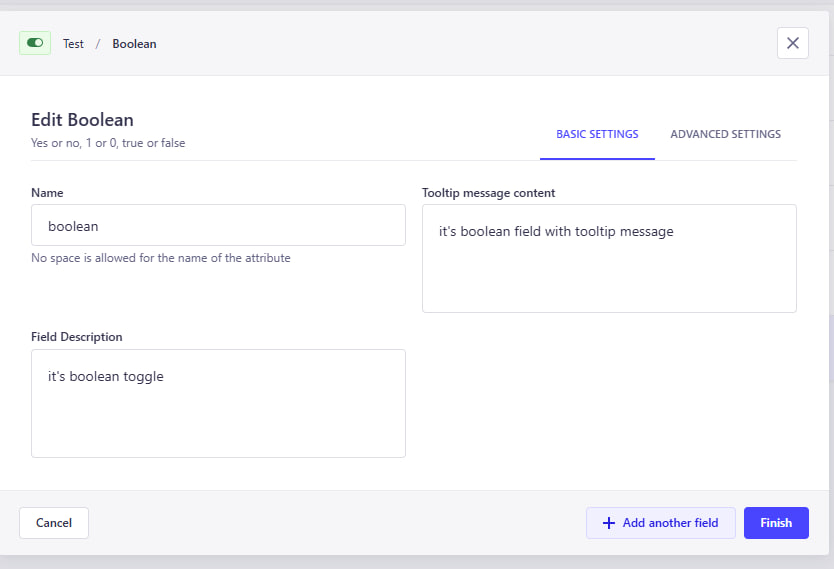
✔️ This custom field allows you to add a boolean toggle (yes/no) switch to your content type.
🎯 It’s useful for binary decisions like enabling/disabling features, flags, or simple true/false statuses.
📌 Easily integrates into your content editing workflow without writing custom logic.
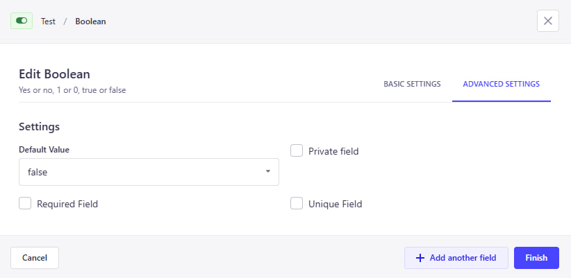
Boolean Field includes simple yet effective settings:
- Name – The name of the field (used in the API)
- Label – Display label in the admin panel
- Description – Optional explanation under the toggle
-
Default Value – Set
trueorfalseas default state
Fine-tune your boolean field with advanced options:
-
Default Setting – Set
trueorfalseornullas default state - Private Field – Hidden from API responses
- Required Field – Must be explicitly selected
- Unique Field – Ensure only one entry can have a specific value
Here's how the Boolean Field appears in the Content Editor:
- The toggle appears as a simple switch
- Editors can enable or disable with one click
- Help text and default values improve UX
Boolean Fields help you:
- Add clear yes/no options for editors
- Control feature toggles or flags easily
- Improve editor clarity with description + default value
- Simplify conditional logic in content workflows
Tooltip Enum Field
✔️ This custom field allows you to define enum values with tooltip support directly in the Content Manager.
🎯 Useful for selecting predefined options while providing inline guidance to editors.
📌 Tooltips explain the purpose of the field and its options.
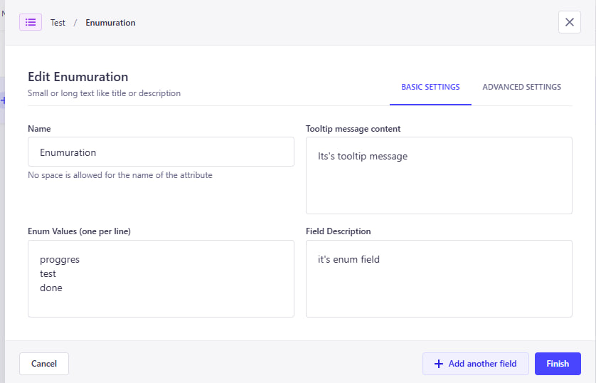
The Tooltip Enum Field provides flexible configuration options:
- Name – The name of the field (used in the API)
-
Enum Values – List of values, one per line (e.g.
Draft,Published,Archived) - Tooltip message content – Message shown in the tooltip (ℹ️ icon)
- Field Description – Optional text displayed below the input
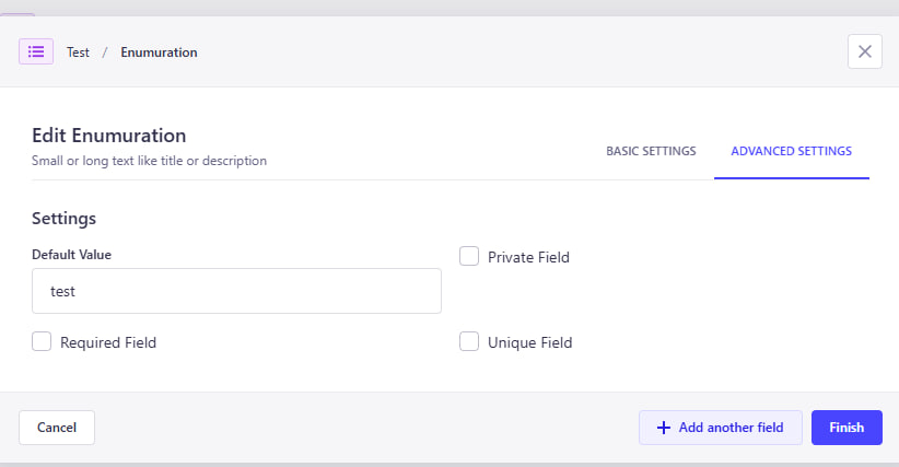
- Default Value – Select one of the enum values to use as default
Additional options are available for validation and API behavior:
- Private Field – Field will be hidden in API responses
- Required Field – Field must be filled in before submitting the form
- Unique Field – Ensures the value is unique across all entries
Here’s how the Tooltip Enum Field appears in the Content Editor:
As shown above:
- The field has a clear label and optional description
- Tooltip icon (
ⓘ) displays contextual help on hover - Editors can select from predefined enum values
Tooltip Enum Fields are great for:
- Making selection fields more informative
- Ensuring consistent value usage
- Helping editors understand field purpose at a glance
- Improving UX with tooltips and defaults
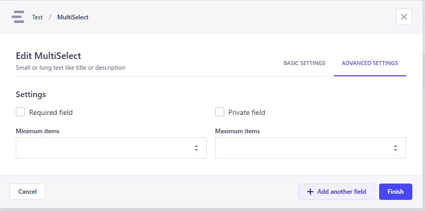
Tooltip Multi Select Field
✔️ This powerful custom field combines tooltip support with various selection modes, giving editors a flexible and guided way to choose values.
🎯 Depending on the selected mode, the field can behave as a Multi Select, Single Select, Combobox, or Nested Multi Select.
📌 Especially useful when editors need structured selections while being guided with tooltips.
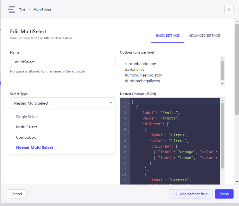
The Tooltip Multi Select Field includes highly customizable options:
- Name – The name of the field (used in the API)
-
Select Type – Defines how the input behaves. Options:
multi-selectsingle-selectcomboboxnested-multi-select
- Options List – The values to choose from (simple list or nested tree, depending on the mode)
- Tooltip Message – Help text shown via tooltip (ℹ️ icon)
- Field Description – Optional description displayed under the input
- Default Value – One or more preselected values (based on mode)
Take control over validation and visibility:
- Private Field – Field will be hidden in API responses
- Required Field – Must be filled before submission
- Unique Field – Ensures the selection is unique across all entries
Each select type adapts its UI accordingly in the Content Manager:
-
Multi Select– Allows selecting multiple values -
Single Select– Dropdown with only one selectable value -
Combobox– Combines search + selection -
Nested Multi Select– Enables hierarchical selection from parent/child nodes
As shown:
- The field label, description, and tooltip make it editor-friendly
- Flexible input styles suit a variety of use cases
This field is perfect for scenarios where editors:
- Need guided input with contextual help
- Must select from complex, structured options
- Require flexibility between single and multiple selection types
- Benefit from improved clarity via tooltips and inline documentation
Tooltip Date Time Picker Field
✔️ This custom field allows editors to select date and time with the help of tooltips and descriptions.
🎯 Useful for scheduling content, setting deadlines, or storing event times — all while guiding users with contextual help.
📌 Combines Strapi-friendly UX with rich configuration options.
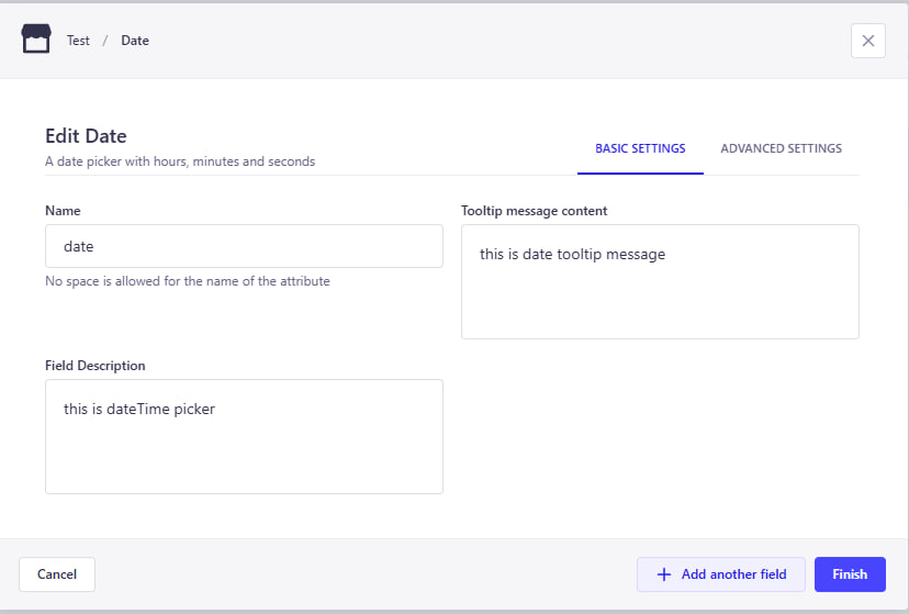
The Tooltip Date Time Picker includes intuitive configuration options:
- Name – Field label shown in the admin panel
- Tooltip Message – Contextual help shown via tooltip icon (ℹ️)
- Field Description – Optional small text displayed under the input
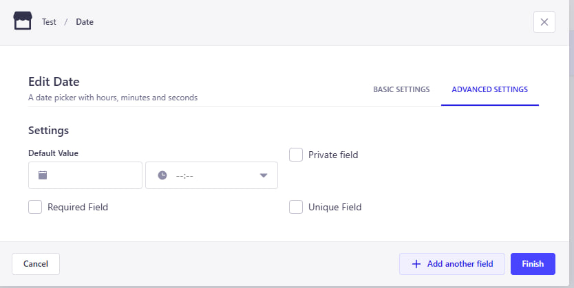
- Default Value – Optional default date/time value
You can enhance field behavior and validation with these advanced options:
- Private Field – Will be hidden from API responses
- Required Field – Must be filled before submitting the form
- Unique Field – Ensures no duplicates across entries
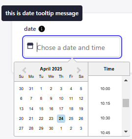
Here’s how the Tooltip Date Time Picker appears in the Content Editor:
As you can see:
- The field includes a clear label and optional description
- A tooltip icon (
ℹ️) shows helpful info when hovered - A calendar + clock picker provides intuitive date/time selection
- Default values and clearable input improve UX
This field is ideal when editors need to:
- Set future publish dates or deadlines
- Choose times for scheduled events or reminders
- Understand the meaning of the timestamp via tooltips
- Improve accuracy with a calendar-based UI
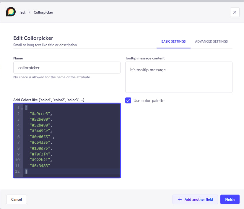
Tooltip Color Picker Field
✔️ This custom field allows editors to select a color from a predefined list or a color picker — with tooltip and description support.
🎯 Perfect for selecting visual attributes like theme colors, status indicators, or branding elements.
📌 It provides both a color name (e.g. Primary) and visual color swatch, improving clarity and usability for editors.
The Tooltip Color Picker supports flexible setup:
- Name – Field label displayed in admin panel
- Tooltip Message – Contextual help shown via tooltip (ℹ️)
- Field Description – Optional short text under the input
-
Color List – JSON-style list of
{ name, hex }entries - Default Value – Optional default color (can be name or hex)
- Enable Color Picker – Toggle to allow manual hex color picking
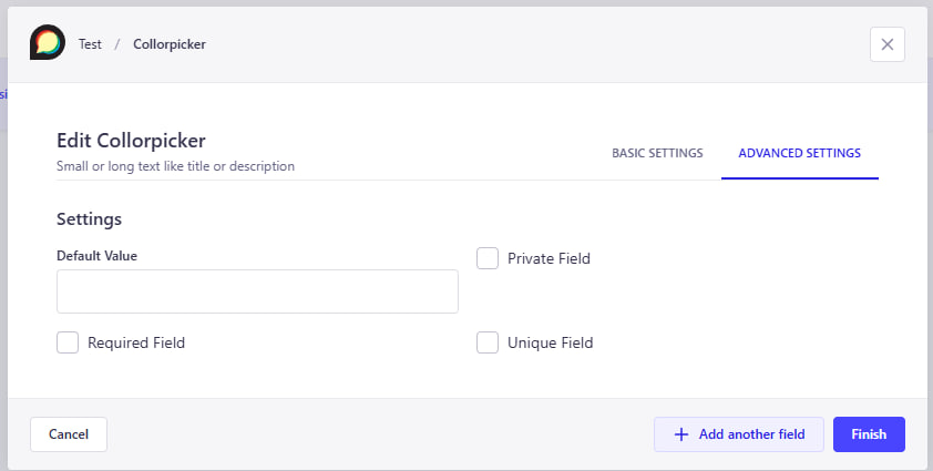
Additional settings for validation and behavior:
- Private Field – Will not be returned in the API
- Required Field – Must be selected before saving
- Unique Field – Ensures uniqueness across all entries
Here’s how the field appears inside the Content Manager:
Features include:
- Tooltip help via icon
- Predefined colors with visual swatch and name
- Optional hex input via color picker
- Default color pre-selected (if configured)
This field is a great fit for:
- Selecting theme or status colors consistently
- Reducing input errors by limiting color choices
- Letting editors quickly recognize colors visually
- Offering flexibility via optional hex picker
- ⚪ Tooltiped primitive fields (text, number, boolean) -- To add the description and the
- ⚪ Responsive values -- Allow adding 3 or 5 values for the same input field (base, md, lg) or (base, sm, md, lg, xl). Intended to be used in UI to define the response values.
- ⚪ Color input -- Allow selecting the color from the given list of named color -> hex code enum. Displays the color itself in input in content-editor. Can work in 2 modes: With pre-defined colors list, or with color picker
Feel free to open issues in github to suggest new custom fields
All general issues should be submitted through the [Github issue system] Security issues should be reported using the [security tab]


