stimulus-toggle-util

0.4.1 • Public • Published

stimulus-toggle-util

An on/off toggle utility for Stimulus.

View a demo.

Table of Contents

Installation

$ yarn add stimulus-toggle-util

Register the Controller

// ./packs/application.js
import { Application } from 'stimulus';
// import Toggle
import Toggle from 'stimulus-toggle-util';
 
import { definitionsFromContext } from 'stimulus/webpack-helpers';
const application = Application.start();
const context = require.context('../controllers', true, /\.js$/);
application.load(definitionsFromContext(context));
 
// Manually register `stimulus-toggle-util` as a stimulus controller
application.register('toggle', Toggle);

Usage

  1. Attach the controller to an element. Recommended to attach to a top-level container, like <body> or <main> so it can be used anywhere.
    • Example:
    <main data-controller="toggle">...</main>
  2. Attach an action and a toggle target to an element that should perform the toggling.
    • Example:
    <button data-action="toggle#toggle" data-toggle-target="sidebar-1">Toggle</button>
    • data-action="toggle#toggle": toggle is the ToggleController, #toggle is the action that is performed when this element is clicked.
  3. Attach a toggle name to an element that should be toggled.
    • Example:
    <aside data-toggle-name="sidebar-1">...</aside>

Toggle a single element

<main data-controller="toggle">
  <button data-action="toggle#toggle" data-toggle-target="sidebar-1">
    Toggle Sidebar 1
  </button>
      
  <aside class="is-hidden" data-toggle-name="sidebar-1">
    <p>Here's "Sidebar 1".</p>
  </aside>
</main>

1

Toggle multiple elements

<main data-controller="toggle">
  <button data-action="toggle#toggle" data-toggle-target="sidebar-1">
    Toggle Sidebar 1
  </button>
  <button
    data-action="toggle#toggle"
    data-toggle-target="sidebar-1,sidebar-2"
  >
    Toggle Sidebar 1 & 2
  </button>
 
  <aside class="is-hidden" data-toggle-name="sidebar-1">
    <p>Here's "Sidebar 1".</p>
  </aside>
  <aside class="is-hidden" data-toggle-name="sidebar-2">
    <p>Here's "Sidebar 2".</p>
  </aside>
</main>

2

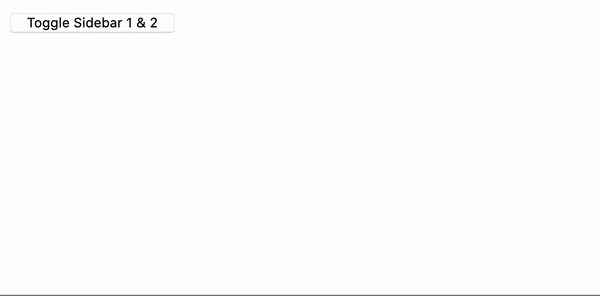
Customize the CSS class

<main data-controller="toggle" data-hidden-class="custom-hidden-class">
  <button data-action="toggle#toggle" data-toggle-target="sidebar-1">
    Toggle Sidebar 1
  </button>
      
  <aside data-toggle-name="sidebar-1">
    <p>Here's "Sidebar 1".</p>
  </aside>
</main>

Options

Option Type Required Default Description
data-hidden-class String 🚫 is-hidden The CSS class to toggle on/off. It's up to you to apply styles to the to this class to hide/show the element.

License

This project is licensed under the MIT License.

Package Sidebar

Install

npm i stimulus-toggle-util

Weekly Downloads

2

Version

0.4.1

License

MIT

Unpacked Size

6.4 kB

Total Files

7

Last publish

Collaborators

  • damon.bauer