| Name |
Image |
Desciption |
| Button |
 |
a reusable UI element that provides a customizable button with various styling options. It supports different variants, sizes, and event handling, making it flexible for different use cases. |
| Calendar |
 |
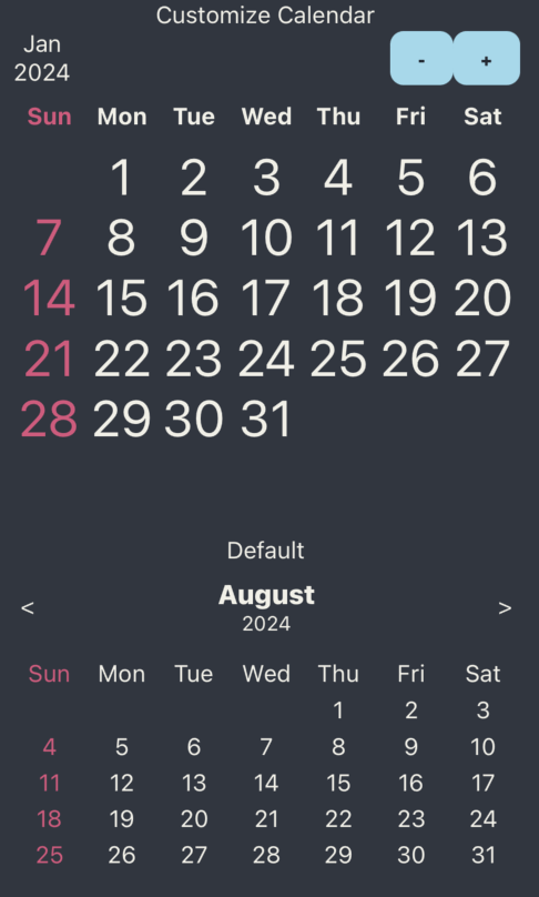
component provides an interactive date selection interface. It allows users to pick a date, navigate between months, and customize the appearance. It is designed to be lightweight, flexible, and easily integrated into different parts of an application. |
| Carousel |
 |
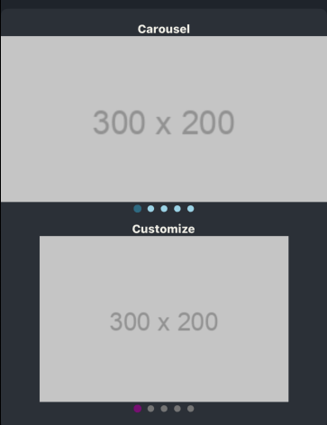
a horizontally scrollable component that displays multiple items, one at a time or in a loop. It supports smooth animations, auto-scrolling, and gesture-based swiping. This component is useful for displaying images, product cards, testimonials, or any other content in a visually appealing manner. |
| CheckBox |
 |
a simple UI element that allows users to toggle between checked and unchecked states. It is commonly used in forms, settings, and multi-select lists. This component supports custom styling, labels, and controlled/uncontrolled states. |
| DonutChart |
 |
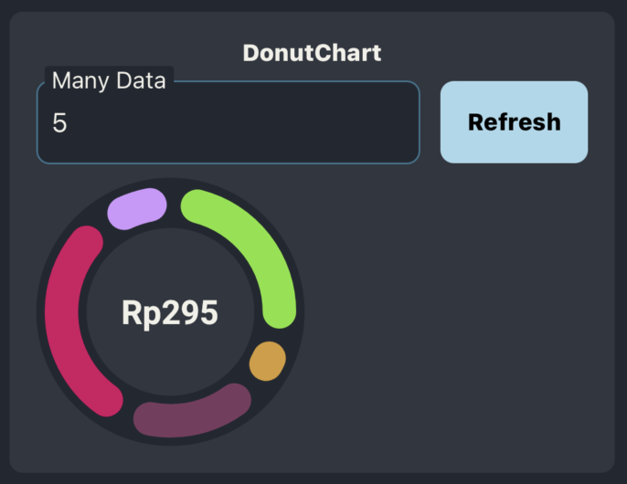
a circular chart that represents data as proportional slices of a donut. It is commonly used to visualize percentages, spending breakdowns, or progress indicators. This component supports custom colors, animations, labels, and dynamic data updates. |
| DonutChart |
 |
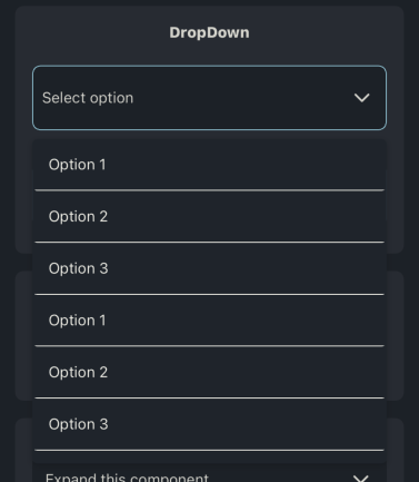
a UI component that allows users to select an option from a list and calendar. When clicked or tapped, it expands to show multiple choices and collapses after a selection is made. |
| DynamicScrollView |
 |
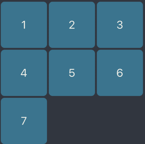
this component can help you to wrap the content inside |
| Expandable View |
 |
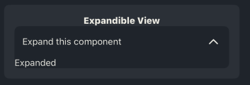
an component that can expand, to show more data to display |
| Header |
 |
an component that used for show back and title of the page or screen |
| RadioButton |
 
|
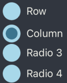
this component that allows users to select one option from a predefined set of choices. |
| Rating |
 |
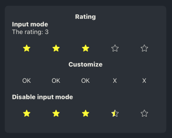
this have 2 mode, input mode that user can do input rating, and display mode to display the rating, and you can customize the icon |
| Skeleton Loader |
 |
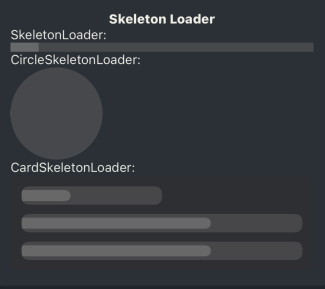
a UI placeholder that mimics the layout of actual content while it's loading |
| SnackBar |
 |
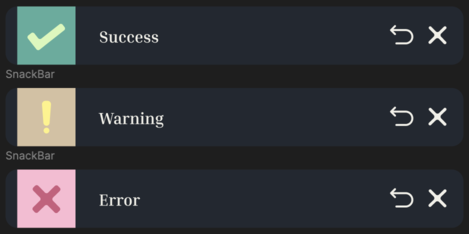
You can run the snackbar using trigger, customize using setSnackBarType and setSnackBarTitle from useTrigger()
|
| Switch |
 |
you can add icon using icon command |
| TextInputFiled |
 |
|
| TextInputSingleBox |
 |
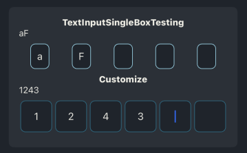
An text input that used for input character 1 by 1 each box |
| Typograph |
|
a text component that can follow the theme |


