The array which contains column information. It contains array of objects of columns.Object represents the information of each row.Object properties
metaData
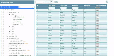
Object
metaData object contains information form representation of 'simple-react-data. It is an object
metaData
metadata Properties
dataType
Description
headerConfig
Array
It is an array of objects of each column representation information.Objects contains multiple properties listed below
label
String
It represents the label of a particular column header.
key
String
It represents the key of that particular column which is used for mapping row data.
type
String
It represents the type of data to be present in that column. It should be 'string' or 'Number'.
emptyCells
String
It represents the empty cell value. If data is not available in that particular cell of the column, the default value given for emptyCells will be pre-populated.
disableFilter
Boolean
Used to disable the filter for a particular column.
excludeFromExport
Boolean
Will decide if a particular column should be removed from csv or not.
topDrawer
Object
This object represents the information of which feature will present in the top drawer.
bottomDrawer
Object
This object represents the information of which feature will present in the bottom drawer.topDrawer and bottomDrawer contains some properties listed below
enableRowSelection
Boolean
It represents the column header will contain all checked button or not.
enableAllRowSelection
Boolean
It represents the checkbox column present or not.
recordsPerPage
Boolean
It represents the number of records per page.
includeAllInGlobalFilter
Boolean
It represents the column header will contain all checked button or not.
includeGlobalFilter
Boolean
It represents the grid contained global filter or not.
exportFileName
String
It will give the name to CVS download file.
loaderColor
String
It will represent the color of all check loader.
getSelectedRow
function
It is call back function which is given to grid and this return the selected/checked row data.
Options for top & bottom drawer
dataType
Description
pagination
Boolean
It should be boolean & represent pagination is enabled or disabled.
globalSearch
Boolean
It should be boolean & represent globalSearch is enabled or disabled.
clearButton
Boolean
It should be boolean & represent clearButton is enabled or disabled.
exportButton
Boolean
It should be boolean and its functionality is to export the grid data into CSV file, represent exportButton is enabled or disabled.
totalRecords
Boolean
It should be boolean & represent totalRecords is enabled or disabled.