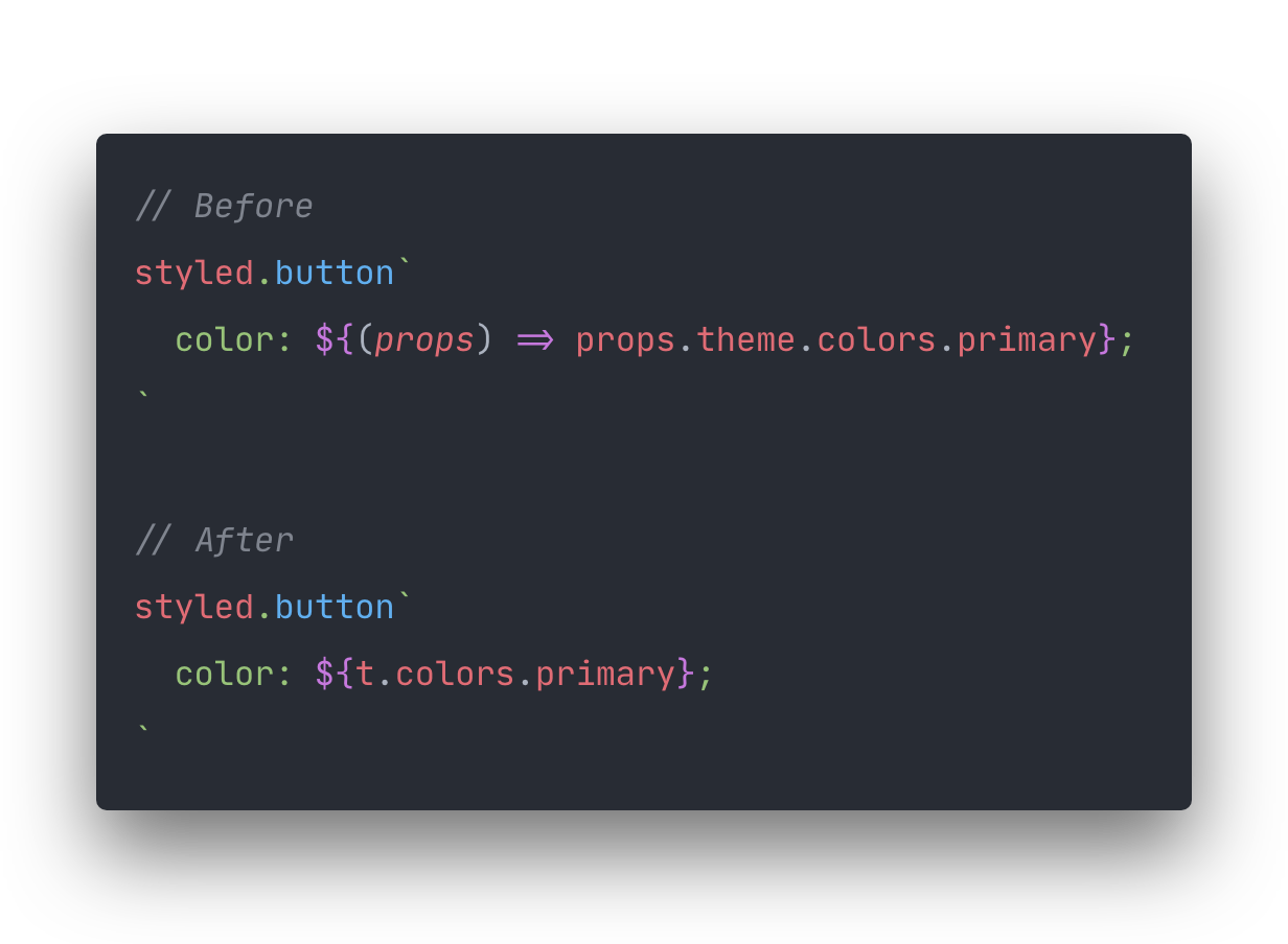
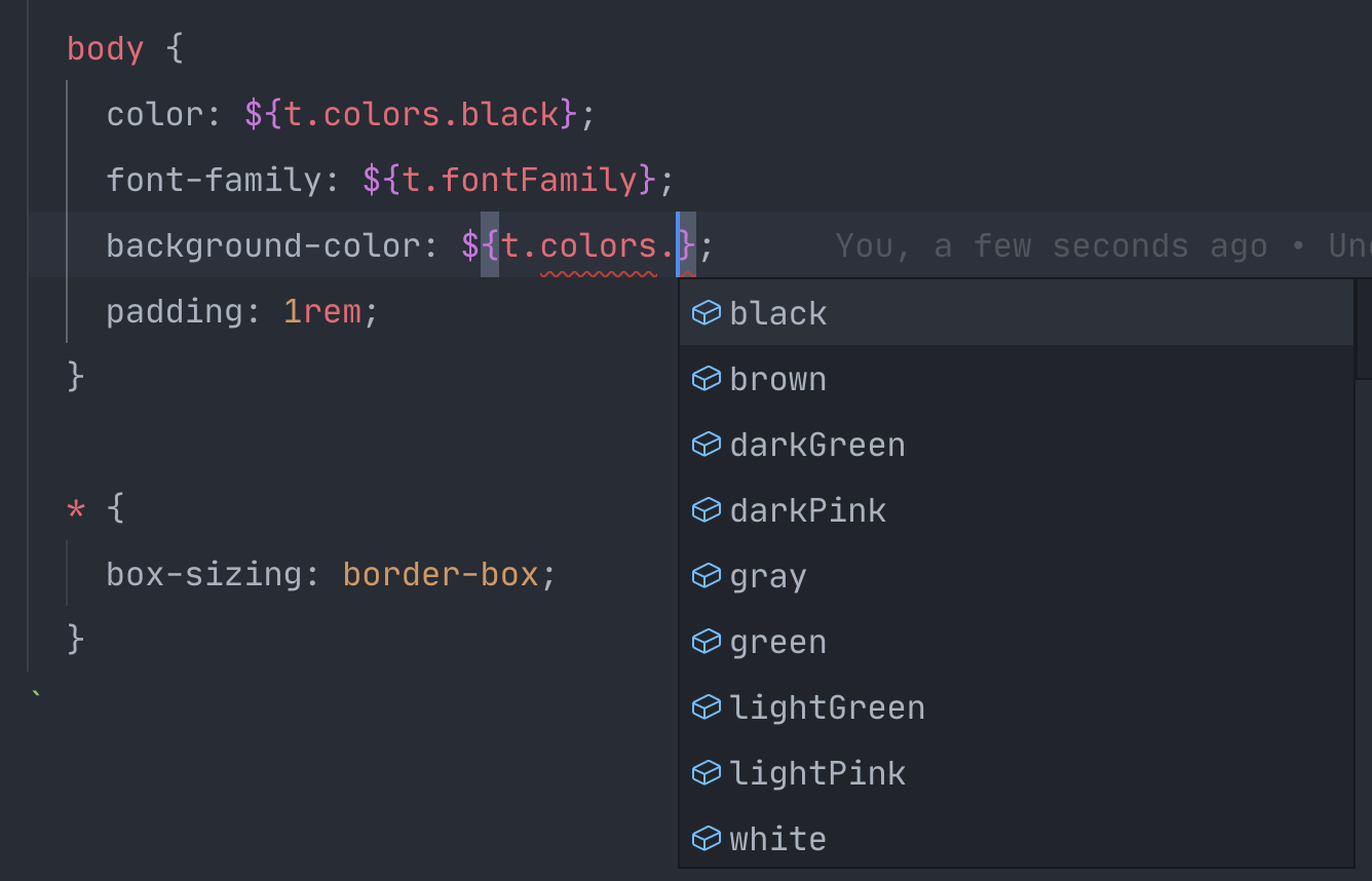
- Zero dependencies.
- TypeScript support.
- Write less characters.
- Tests with 100% coverage.
npm i shorted-themeimport styled from 'styled-components'
import shorted from 'shorted-theme'
const theme = {
colors: {
primary: 'red',
secondary: 'blue'
},
fontFamily: '"Roboto", sans-serif',
fontSizes: {
small: 12,
regular: 14,
large: 18
}
}
const t = shorted(theme) // 👈 short your theme then use everywhere.
const Button = styled.button`
color: ${t.colors.primary};
color: ${t.colors.primary};
font-family: ${t.fontFamily};
font-size: ${t.fontSizes.regular};
`shorted-theme use all your typings.
You can destructure the shorted theme object. That way you can reference direct children properties instead of a root object.
const { colors, fontFamily, fontSizes } = shorted(theme)

const Button = styled.button`
  color: ${colors.primary};
  color: ${colors.primary};
  font-family: ${fontFamily};
  font-size: ${fontSizes.regular};
`shorted-theme is useful for writing less when referencing theme values. However, it can't be used in expressions. For example:
// THIS WILL NOT WORK
const Button = styled.button`
  padding: ${t.padding.default * 10};
`
Instead you should use the function expression:
const Button = styled.button`
  padding: ${(props) => props.theme.padding.default * 10};
`- Clone this repository.
- Install dependencies:
npm i. - Run it locally:
npm startor./src/bin.js
npm run testReleases are triggered by npm version and handled by GitHub Actions.
Made with ♥ by @rmariuzzo


