semantic-ui-canjs
CanJS wrapper around SemanticUI modules
A can.view.attr wrapper around SemanticUI modules. With can.view.attr you can add custom behavior to elements that contain a specified html attribute. Since SemanticUI is a set of jQuery plugins, can.view.attr is a natural way to invoke them in a CanJS or DoneJS application.
This wrapper allows you to use SemanticUI modules like popup or accordion with just html, no need to run jQuery plugin yourself.
SemanticUI's CSS should be imported separately. You can use semantic-ui-less package as in this demo.
Settings of an individual module can be defined as "semantic"-prefixed attributes. E.g. to define position for the popup module as bottom left you can add semantic-position="bottom left" attribute (see Usage section).
If you need to use SemanticUI Popup callbacks then you are probably a jQuery-style guy and you don't need this wrapper :)
Note: don't forget to install SemanticIO individual modules if you don't import the whole SemanticUI framework.
Demo
See the included demo /demo/demo.html (run npm install, then http-server in the project root and browse /demo/demo.html).
Installation
Install the wrapper and the desired SemanticUI modules (if you don't load the whole SemanticUI JavaScript)
$ npm install semantic-ui-canjs --save

$ npm install semantic-ui-popup semantic-ui-transition semantic-ui-accordion --save
If you import individual SemanticUI modules don't forget that some modules might require others (e.g. Popup requires Transition, etc).
Usage
<can-import from="semantic-ui-canjs" />
<can-import from="semantic-ui-popup/popup" />
<can-import from="semantic-ui-transition/transition" />
<can-import from="semantic-ui-accordion/accordion" />
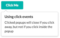
Popup module with default settings:
<div class="ui icon button" semantic-module="popup" data-content="Add users to your feed">Add</div>
Popup with custom settings:
<a class="browse" semantic-module="popup"
semantic-inline="true"
semantic-on="click"
semantic-position="bottom left">Button</a>
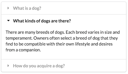
Accordion module:
<div class="ui styled accordion" semantic-module="accordion">...</div>
API
Attributes:
semantic-module="<module name>"- main attribute to invoke the wrapper.semantic-*- use any of module's settings with this prefix. E.g. popup'ssemantic-position="bottom left"orsemantic-hoverable="true".
Contributing
Pull requests are welcome.