
searchkit-datefilter
A calendar-style date filter component for Searchkit
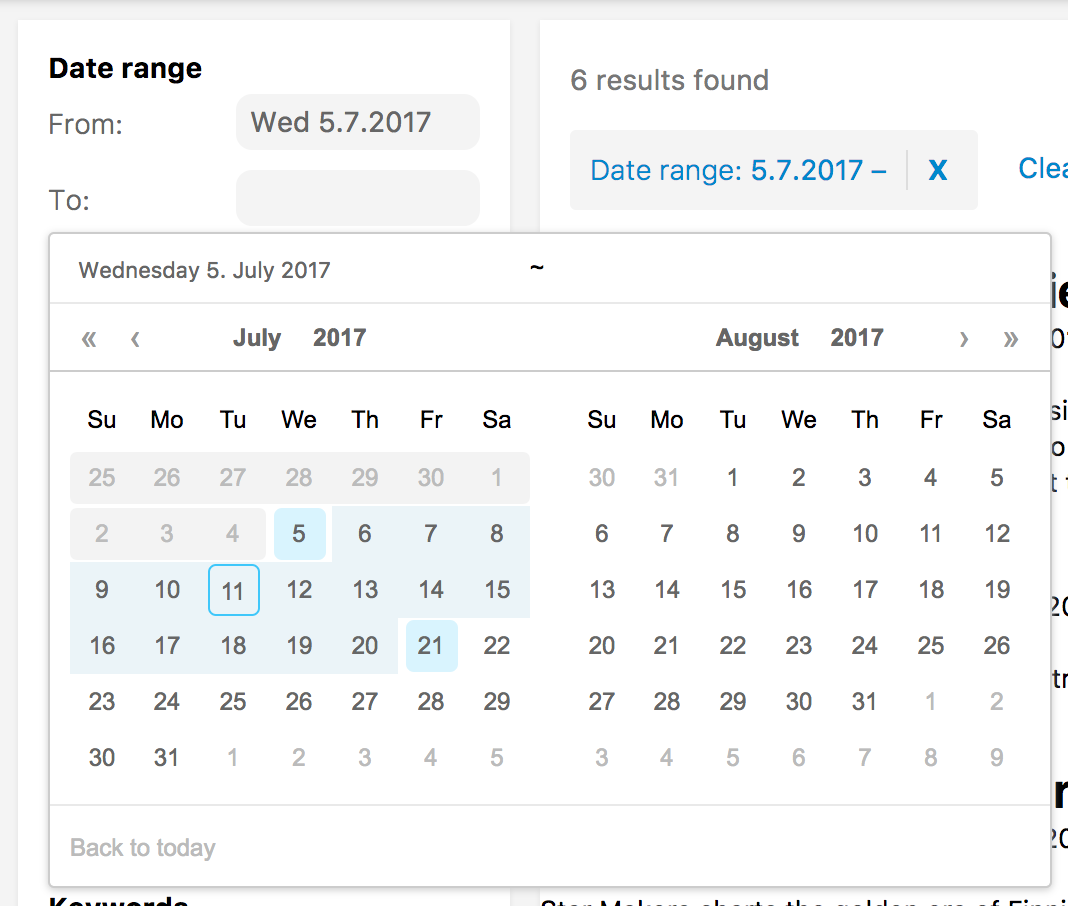
This Searchkit filter lets users filter start-end date ranges based on a chosen start time and an optional end time.
See demo directory for a working example.
Example component
import SearchkitComponent from "searchkit";import DateRangeFilter DateRangeCalendar from "searchkit-datefilter" { <div> <DateRangeFilter ="event_date" ="Date range" ="event_date.from" ="event_date.to" = = /> </div> }Loading CSS from the module
If you're using Searchkit CSS, this module should match that pretty well.
;;Note that this is an illustrative example; in actual use you probably want to set up a resolve alias for your node_modules dir or use ~ if your loader supports it.
Not seeing those styles...
A quick fix is to add the parameter url=false to your CSS loader, but note that this will break imports that use url().
test: /\.css$/ loader: 'style!css?importLoaders=1&url=false!postcss'A better solution is to set up css-raw-loader.
Props
fromDateField(ESField): Required. An elasticsearch date field to use as the beginning.toDateField(ESField): Required. An elasticsearch date field to use as the end.id(string): Required. id of component. Must be unique. Used as key for url serialisationtitle(string): Required. Title used for component and for selected filters componentcalendarComponent(ReactComponent): Calendar component to use when rendering- Compatible with
DateRangeCalendar - Defaults to
DateRangeFilterInputwhich just shows two date math input fields
- Compatible with
fieldOptions({type:"embedded|nested|children", options:Object}) Configures the type field that is stored in ElasticSearch, can beembeddedornestedorchildrentype:nestedrequiresoptions.pathprovidedtype:childrenrequiresoptions.childTypeprovided- see Field Options in Searchkit documentation
rangeFormatter((count:number)=> string|number) A formatter function used to convert numbers into more readable display values. E.g. long number formatting or prefixing currencies.`
Troubleshooting
Errors
Warning: Failed context type: Invalid context 'searchkit' of type 'SearchkitManager' supplied to 'DateRangeFilter', expected instance of 'SearchkitManager'
Webpack is bundling searchkit twice. See webpack/webpack#2134.
To resolve this in your project, you will need to add something like this to webpack.config.js:
resolve: {
  alias: {
    'searchkit': path.resolve(path.join(process.cwd(), 'node_modules', 'searchkit'))
  }
}