Scott's Component Library
Version 1.1
This is a Storybook component library. It features:
- Buttons:
- With different sizes and states
- Forms:
- With Text input, Select input, and Checkbox
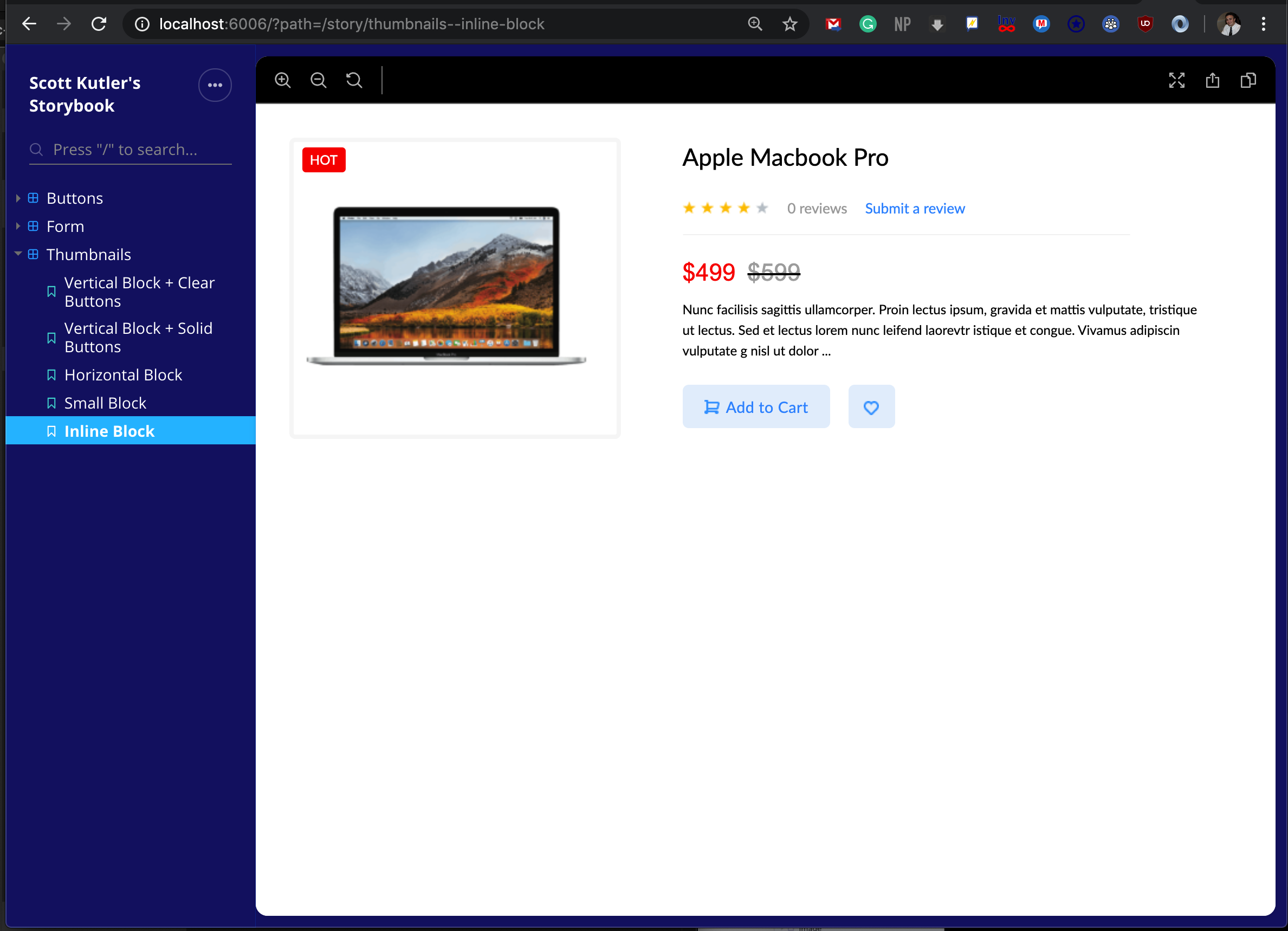
- Product Thumbnails:
- With different sizes and states
Properties of the components can be edited in the individual *.stories.js files
Technologies Used
This library utilizes HTML, CSS, React, and the Storybook Framework. AdobeXD was utilized to view a premade mockup that this library is based on.
How to run locally
- Fork & Clone Repo
- CD into this repo's directory
- Enter command "npm run storybook"
- Open http://localhost:6006/ in your browser (if local).
How to access on the internet
Built With
Library Screenshot
Authors
License
This project is licensed under the MIT License - see the LICENSE.md file for details