SassDesk
SassDesk is a SCSS library thought to fasten the UI develoing process providing a set of modular styles. All styles are mobile first.
SassDesk is a project currently being developed and so we encourage our users to download and check all the flexible styles we provide.
Download
npm i sassdesk
Buttons
SassDesk provides a set of classes to style buttons. The base class is: "button", this class is necessay in order to apply secondary button styles. Here's a list of all the classes
| Class | Styling | HTML | Comments |
|---|---|---|---|
.button |
 |
<button class="button">Button</button> |
Coloring Classes
Coloring classes are made going through an object in the secondary-variables file. The variable name is $color-pairs, where the nam (the string in the object) is then saved as the color name in the class; the first color is the button background, and the second is the contrast for the font color.
| Class | Styling | HTML | Comments |
|---|---|---|---|
.scheme |
 |
<button class="button scheme">Scheme</button> |
For this class to work on a button the class .button must be added before. |
.fail |
 |
<button class="button fail">Fail</button> |
|
.empty |
 |
<button class="button scheme empty">Emptyness</button> |
For this class to work a coloring class must be added first. |
.fail-inverted |
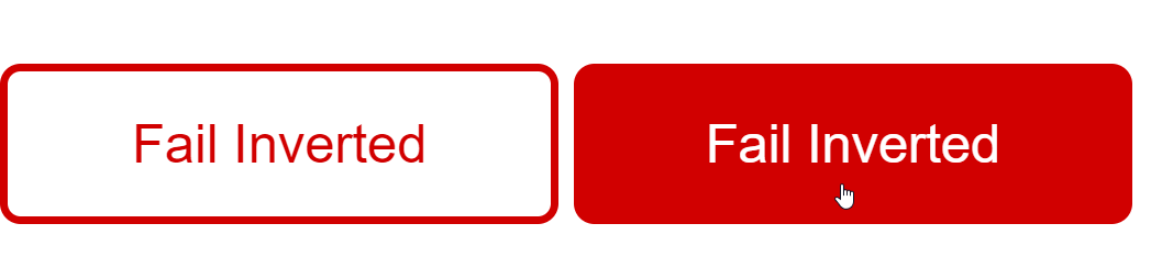 |
<button class="button fail-inverted">Fail inverted</button> |
For this class to work a valid color prefix must be added before inverted. |
Button types
Button types are though to work as a standar in animaitions and coloring through the application.
| Class | Styling | HTML | Comments |
|---|---|---|---|
.primary-type |
 |
<button class="button primary-type">Primary</button> |
|
.secondary-type |
 |
<button class="button secondary-type">Secondary</button> |
|
.tertiary-type |
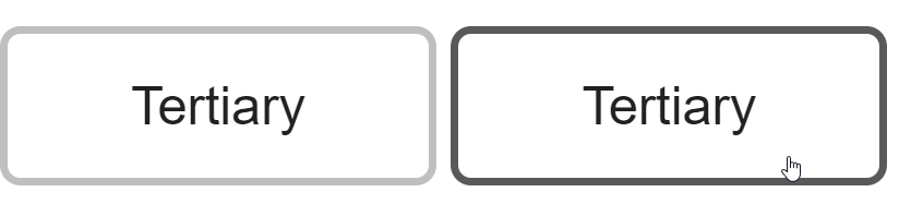 |
<button class="button tertiary-type">Tertiary</button> |
The primary-type button has a background-color equal to $scheme-secondary variable value.
Color values for all the 3 types may be changed by overwriting the variables:
- For the primary type
$primary-type-colors: where the first value is the background, and the second the font color. - For secondary and tertiary
$secondary-type-colors: where values are as follows initial color, background when hover, color when hover, border-color.
Sizing
Buttons also has classes that modify their size:
| Class | HTML | Size Modified |
|---|---|---|
.full-width |
<button class="button full-width">Full</button> |
Width |
.big |
<button class="button big">Big</button> |
Font size |
.medium |
<button class="button medium">Medium</button> |
Font size |
.small |
<button class="button small">Small</button> |
Font size |
Others
SassDesk also provides basic styling, for example our responsive grid.
| Screen Size | Number of columns | Classes |
|---|---|---|
| Mobile | 8 |
col-sm-x where x = number of columns the element encompasses : col-sm-1,col-sm-2... col-sm-8. |
| Tablet | 10 |
col-md-x where x = number of columns the element encompasses : col-md-1,col-md-2... col-md-10. |
| Desktop | 12 |
col-x where x = number of columns the element encompasses : col-1,col-2... col-12. |