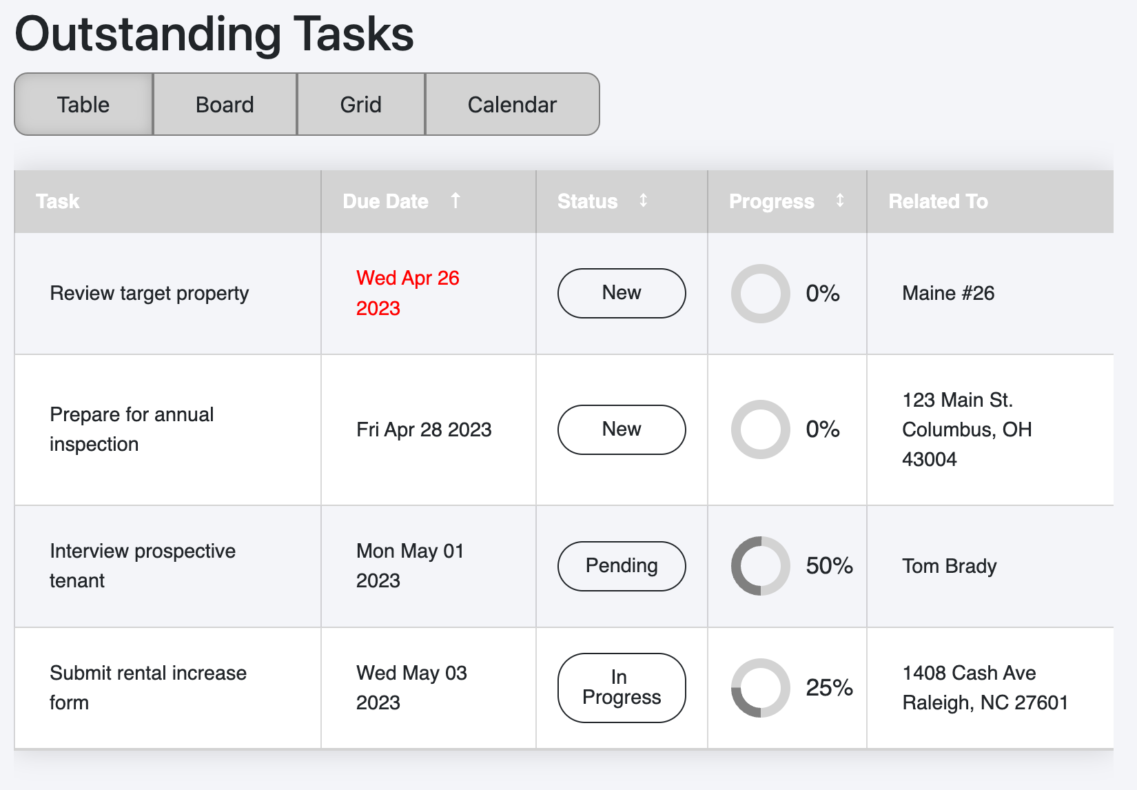
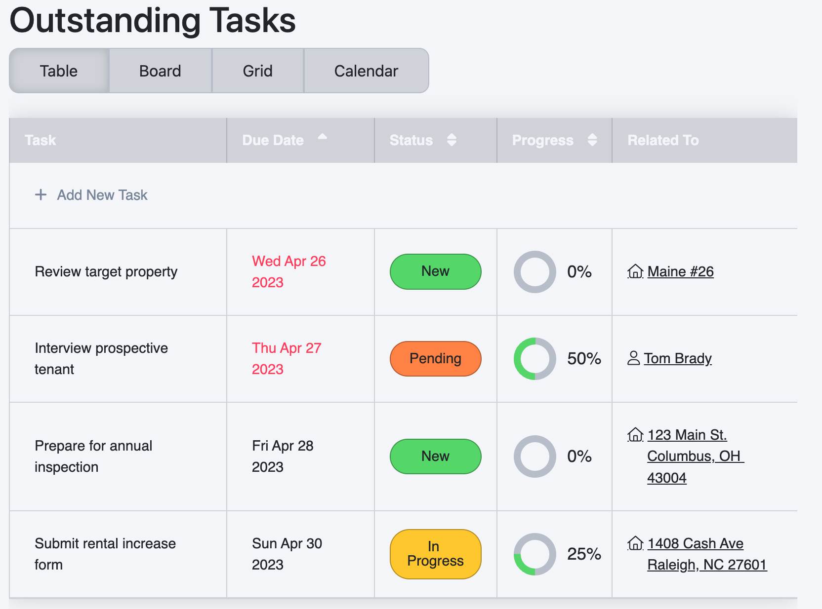
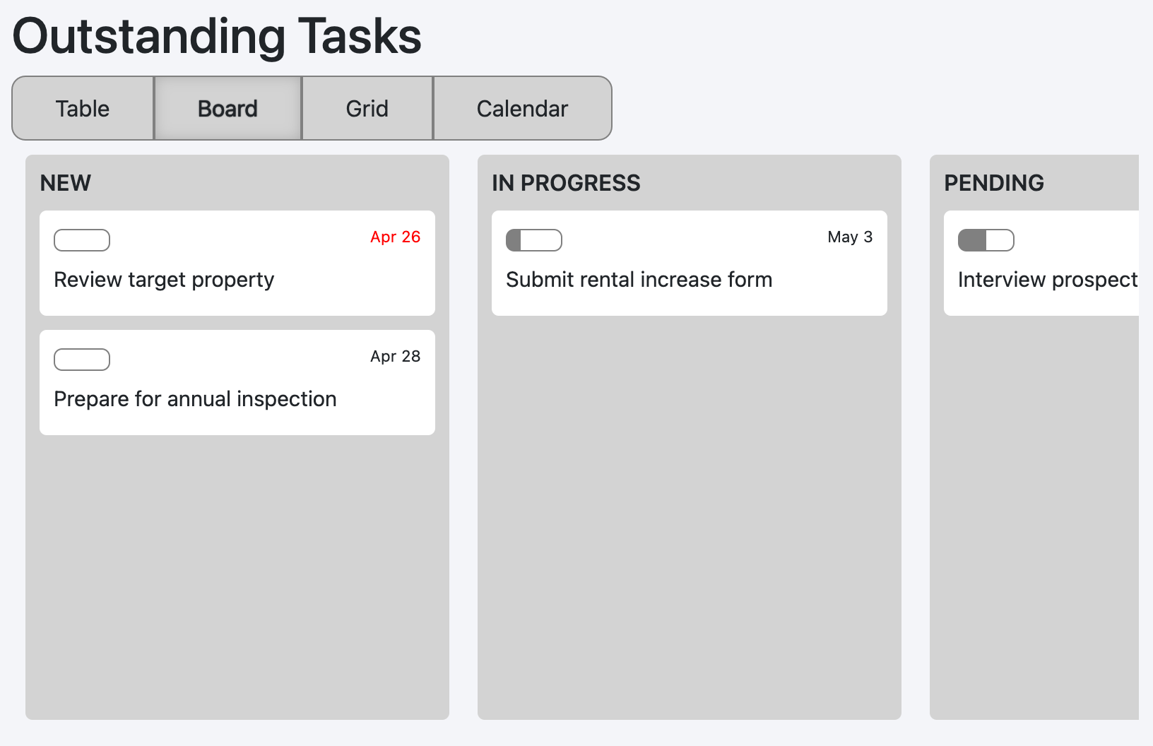
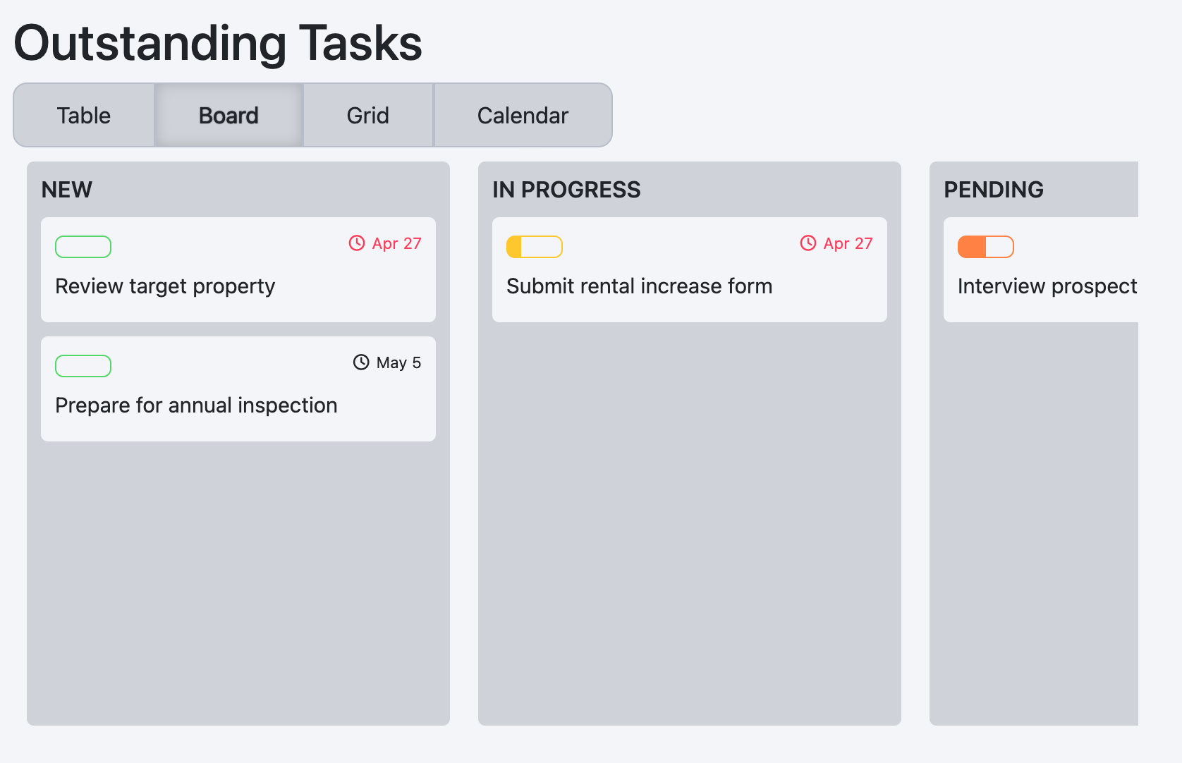
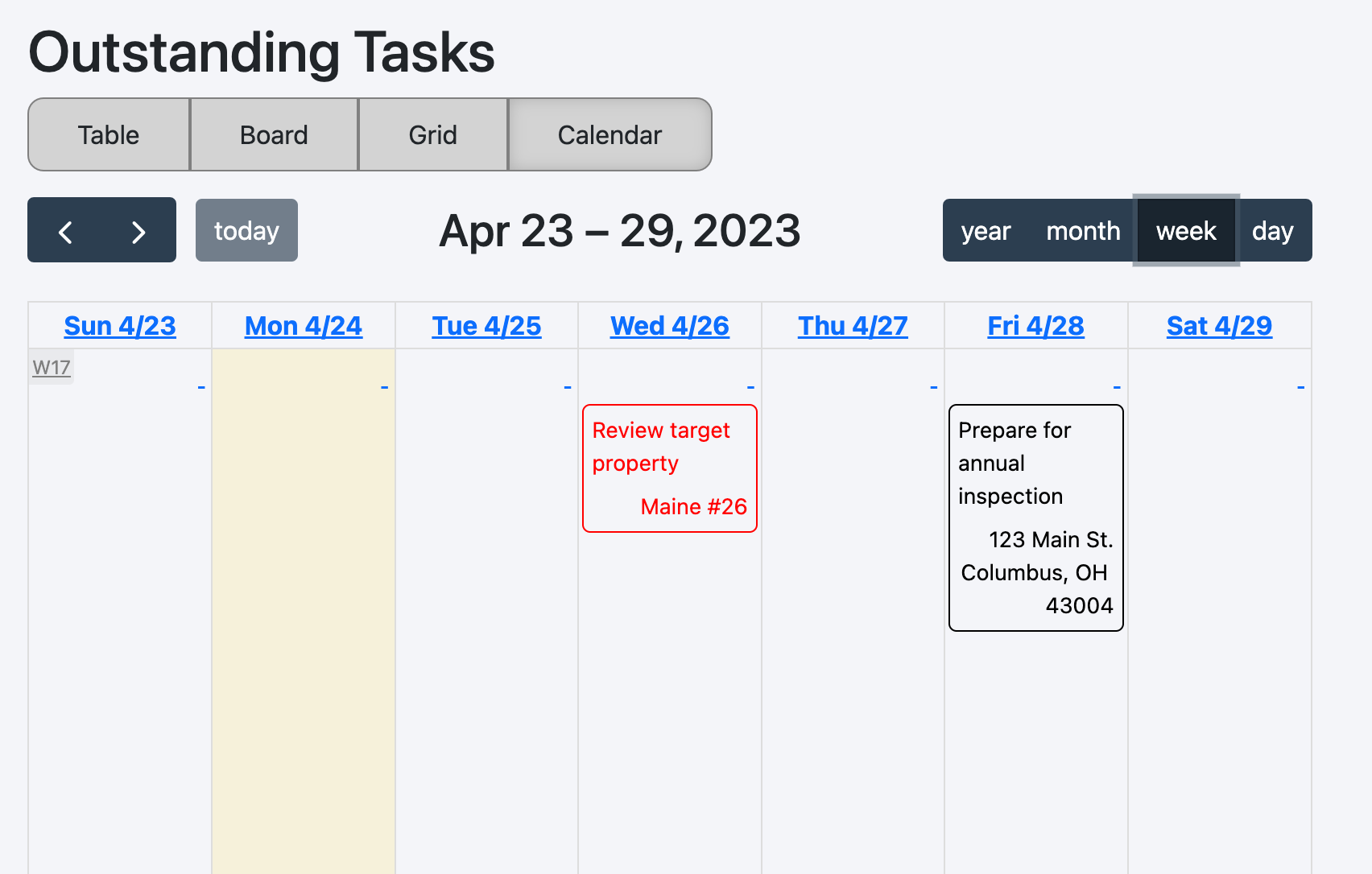
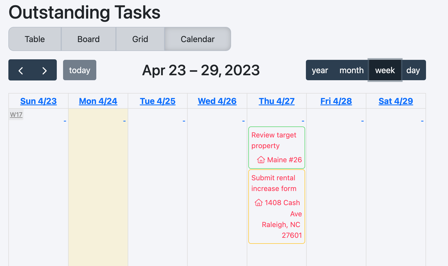
This package creates a React-rendering of a list of items. The original concept was to create a task list, aka action list, but the underlying components can be used to render a wide range of objects.
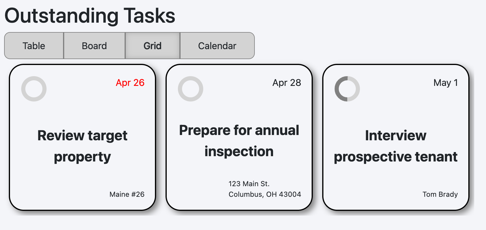
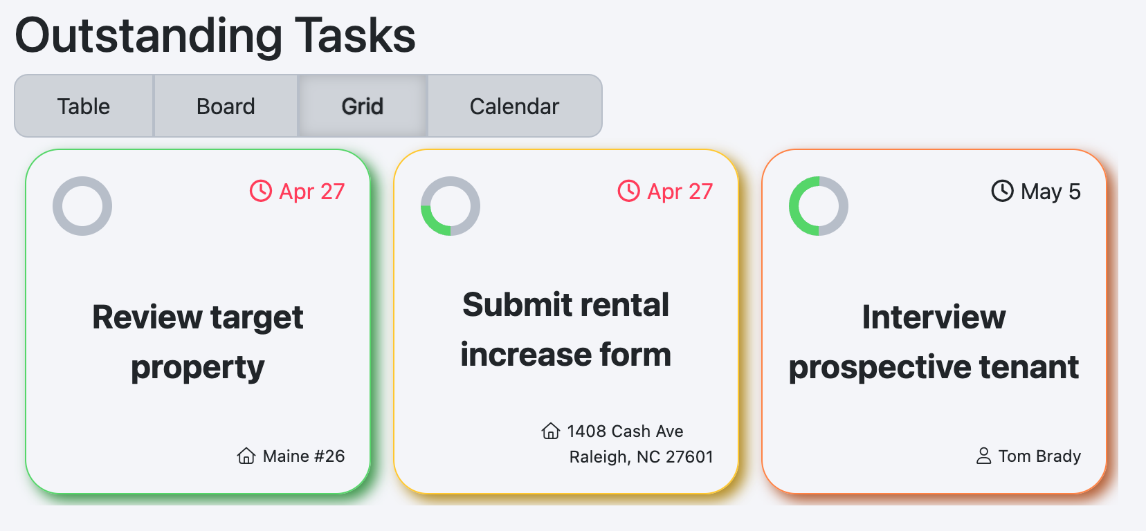
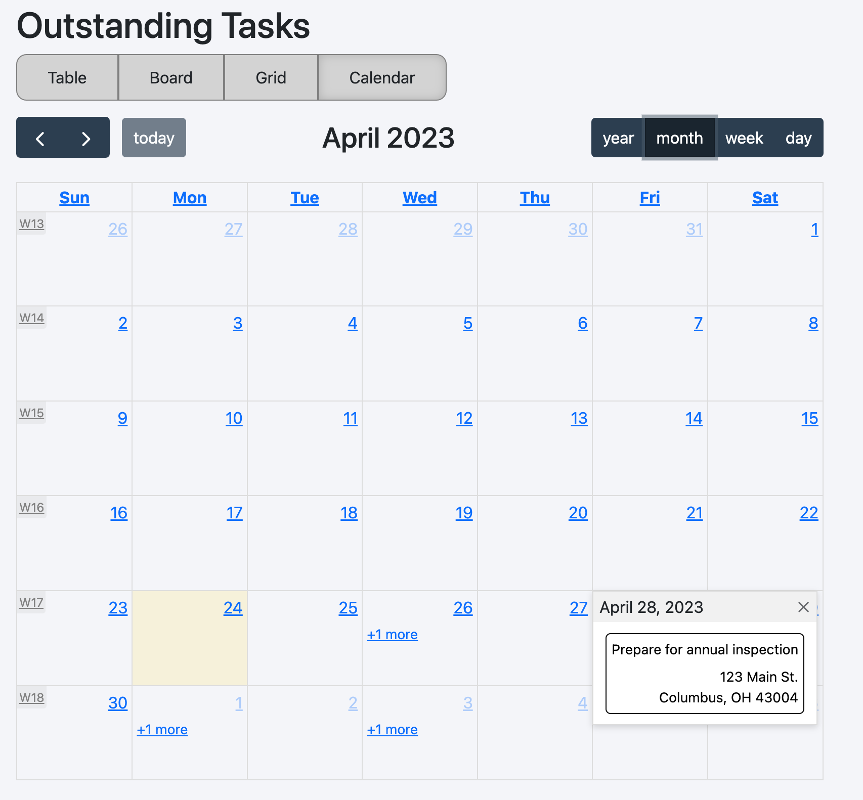
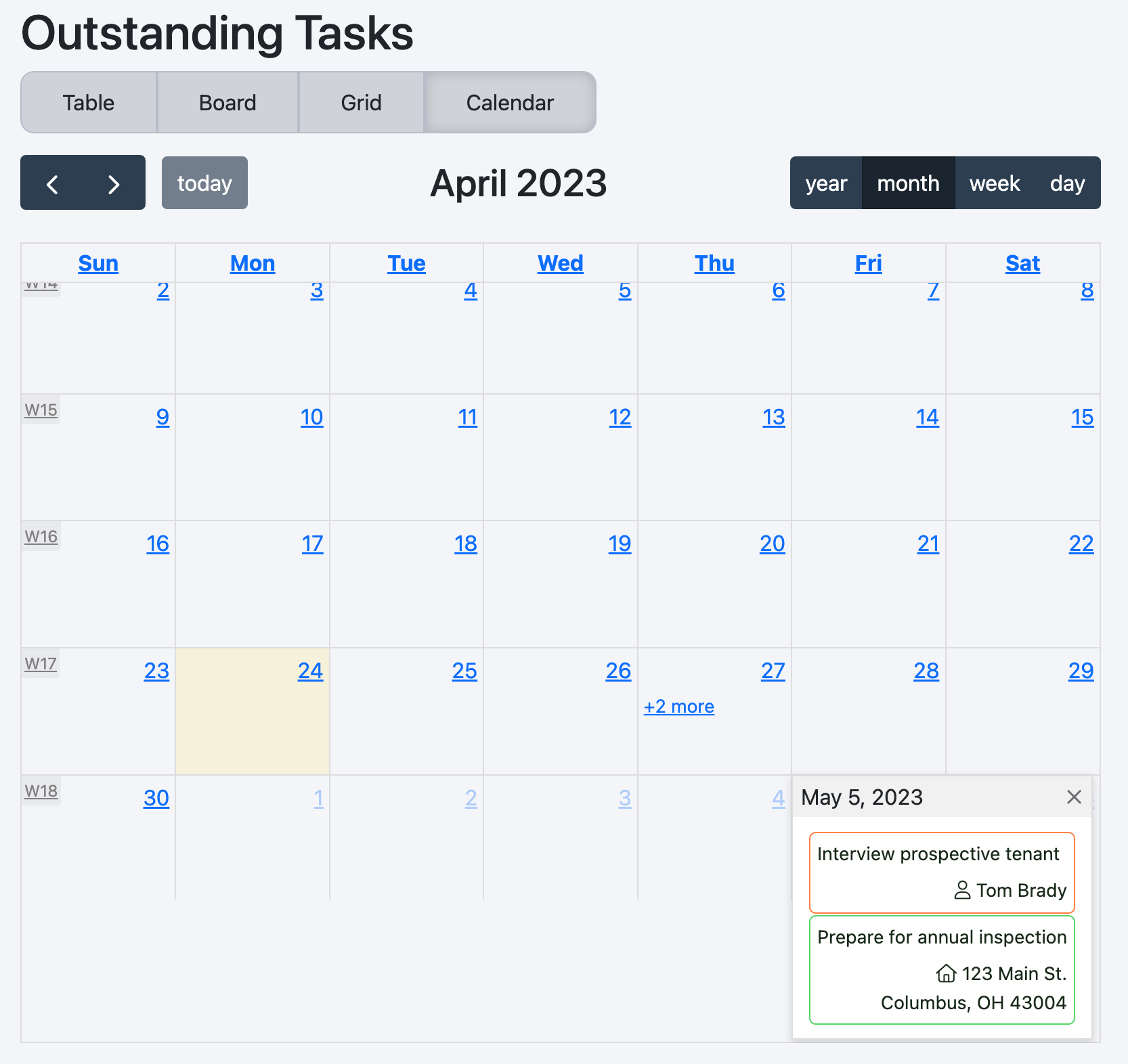
For the purposes of this Readme, we'll use a task list to show examples. Below you will see a screenshot of each layout. The first shows the "out of the box" styling; the second shows what can be done with some simple customization. (The data is rendered semi-randomly, so the dates on each task will be different between the two - forgive the inconsistency.)
To save myself some writing, it will be best if you review the contents of the ActionListContext.ts file for a complete understanding of the available configurations and assorted data types.
These settings are manifold, and well documented in the source file (though I may add more detailed documentation here in future). You will also find an object (ActionListClasses) containing all classes applied to each element. (TODO: Document where/how these classes are applied.)
One concept that is not documented in source is "templated strings". These are strings (which are noted in source documentation) that allow the developer to use contextual details to create dynamic content. For example, link type data fields have a ref property. This is a templated string. As such, the developer might use a string that looks like
let column.ref = "/{related_to__type}/{related_to__id}";When the table is being rendered, this string will be injected with data from each object in the list. Double underscores (__) are used to separate between object generations. During rendering, the above example equates to
// assume the object from the list being rendered is called `item`
let relatedToType = item["related_to"]["type"];
let relatedToId = item["related_to"]["id"];
tablecellLink.href = `/${relatedToType}/${relatedToId}`;Here is a sample implementation. More thorough documentation is a TODO.
type TaskListData = {
    activeLayout: ActionListLayouts;
    title: string;
    statuses: TaskListStatus[];
    fields: TaskListField[];
    list: TaskListObject[];
    [key:string]: any;
};

function renderTaskList(data: TaskListData) {
    let settings = new ActionListSettings();
    settings.effects = [
        () => {
            utils.enableTooltips(); // helper function that creates
                                    // bootstrap tooltips.
        }
    ];
    let refactoredData:ActionListData = {
        list:data.list
    };
    settings.defaultLayout = data.activeLayout;
    settings.components.modal = TaskListItemModal; // See below
    settings.collections = data.statuses;
    settings.title = data.title;
    settings.columns = data.fields;

    settings.tableActions = [NewTaskTableAction]; // See below

    renderActionList('tasklist-container', refactoredData, settings);
}

function TaskListItemModal(props: ActionListModalProps) {
    return (
        <ReactBootstrap.Modal
            show={props.show}
            onHide={props.onClose}
        >
            <ReactBootstrap.Modal.Header closeButton>
                <ReactBootstrap.Modal.Title>
                    {props.item['name']}
                </ReactBootstrap.Modal.Title>
            </ReactBootstrap.Modal.Header>
            <ReactBootstrap.Modal.Body>
                <div>
                    <h2>Description</h2>
                    <p>{props.item['content']}</p>
                    <h2>Status</h2>
                    <p>
                        {props.item['icon']}{" "}
                        {props.item['status']}
                    </p>
                </div>
            </ReactBootstrap.Modal.Body>
            <ReactBootstrap.Modal.Footer>
                <ReactBootstrap.Button variant="primary" onClick={props.onClose}>
                    Close
                </ReactBootstrap.Button>
            </ReactBootstrap.Modal.Footer>
        </ReactBootstrap.Modal>
    );
};


const NewTaskTableAction = () => {
    return (
        <p className={`add-new-task`}
            data-toggle="tooltip"
            title="This would pop out a New Task screen."
        >
            <i className="fas fa-plus"></i>
            Add New Task
        </p>
    );
}
I'll omit much of the customized styling (there are a few hundred lines of SCSS), but I do want to call out how the statuses were colored. The status column was defined as a pill type which adds the column's value to the class list in the status column of the Table, and is the default settings.collectionField value which adds the property's value to the loading bars of the cards in the Board, to the tiles in the Grid, and to the loading bars of events in the Calendar (as well as to the event and card themselves).
Furthermore, the progress field is defined as a ring type, which shows a loading ring in the Table and Grid, a loading bar in the Board, and a loading column in the Calendar.
From there, I was able to specify each status in the CSS as follows (I'm sure there is a more concise way to do this)
// Style the background and border of the Board's loading bars
// Note, the variable `--progress` is defined on the element when rendered
.action-list-bar {

    &.new {
        border-color: $new;
        background: linear-gradient(90deg, $new var(--progress), $white-color var(--progress));
    }

    &.inprogress {
        border-color: $inprogress;
        background: linear-gradient(90deg, $inprogress var(--progress), $white-color var(--progress));
    }

    &.pending {
        border-color: $pending;
        background: linear-gradient(90deg, $pending var(--progress), $white-color var(--progress));
    }

    &.done,
    &.complete {
        border-color: $done;
        background: linear-gradient(90deg, $done var(--progress), $white-color var(--progress));
    }
}

// Style the event's loading bar background and table's cell background and border
.action-list-event-ring,
.pill {

    &.new {
        background-color: $new;
        border-color: mix($new, #000, 70%);
    }

    &.inprogress {
        background-color: $inprogress;
        border-color: mix($inprogress, #000, 70%);
    }

    &.pending {
        background-color: $pending;
        border-color: mix($pending, #000, 70%);
    }

    &.done,
    &.complete {
        background-color: $done;
        border-color: mix($done, #000, 70%);
    }
}

// Style the event and event's loading column border
.action-list-event-ring,
.action-list-event-contents {
    &.new {
        border-color: $new;
        background-color: inherit;
    }

    &.inprogress {
        border-color: $inprogress;
        background-color: inherit;
    }

    &.pending {
        border-color: $pending;
        background-color: inherit;
    }

    &.done,
    &.complete {
        border-color: $done;
        background-color: inherit;
    }
}
You can handle updates, trigged by board drag/drop, event drag/drop, or event create, using settings hooks. An example was shown

