rn-responsive-styles
Create responsive styles for react-native and react-native-web with minimal re-renders
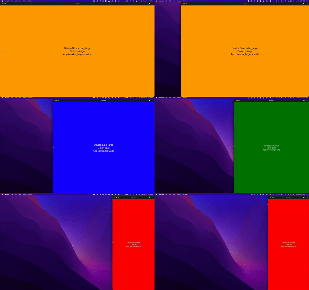
This library adds support for dynamic styling based on device size, it was built to replace inline dynamic styles for individual components.
This library builds a single stylesheet from the provided styles and conditionally returns them based on device size. It
uses a custom version of React Native's useWindowDimensions so that it only re-renders when the device size passes
over one of the breakpoints, instead of re-rendering on every pixel change.
yarn add rn-responsive-styles
or
npm install rn-responsive-styles --save
import { Text, View } from 'react-native'
import { CreateResponsiveStyle, DEVICE_SIZES, useDeviceSize } from 'rn-responsive-styles'

export default function App() {
  const styles = useStyles()
  const deviceSize = useDeviceSize()

  return (
    <View style={styles.container}>
      <Text style={styles.text}>Device Size: {deviceSize}</Text>
    </View>
  )
}

const useStyles = CreateResponsiveStyle(
  {
    container: {
      flex: 1,
      backgroundColor: '#fff',
      alignItems: 'center',
      justifyContent: 'center',
    },
    text: {
      fontSize: 30,
      color: 'white',
    },
  },
  {
    [DEVICE_SIZES.XL]: {
      container: {
        backgroundColor: 'blue',
      },
    },
    [DEVICE_SIZES.SM]: {
      container: {
        backgroundColor: 'red',
      },
      text: {
        fontSize: 20,
      },
    },
  }
)To specify styles that apply to multiple device sizes you can use the built in minSize() and maxSize() functions.
These allow you to specify styles similar to CSS media queries min-width and max-width.
import { CreateResponsiveStyle, DEVICE_SIZES, minSize, maxSize } from 'rn-responsive-styles'

const useStyles = CreateResponsiveStyle(
  { ... },
  {
    // Will apply the size 30 font to large and extra large devices
    [minSize(DEVICE_SIZES.LG)]: {
      text: {
        fontSize: 30,
      },
    },
    // Will apply the size 20 to medium, small and extra-small devices
    [maxSize(DEVICE_SIZES.MD)]: {
      text: {
        fontSize: 20,
      },
    },
  },
)useSizeRender is a custom hook provided to facilitate conditional rendering based on the device size. It returns three
helper functions: isSmallerThan, isLargerThan, and isSize, which can be used to determine if the current device size is
smaller than, larger than, or equal to a specified size. This allows you to add performant conditional rendering that will
only trigger a re-render when the device size changes.
import React from 'react'
import { Text, View } from 'react-native'
import { useSizeRender, DEVICE_SIZES } from 'rn-responsive-styles'

export default function Sample() {
  const styles = useStyles()
  const { isLargerThan, isSmallerThan, isSize } = useSizeRender()

  return (
    <View style={styles.container}>
      <Text style={styles.text}>Device Size: {useDeviceSize()}</Text>
      {isLargerThan(DEVICE_SIZES.MD) && <Text>Only rendered for devices larger than medium</Text>}
      {isSize(DEVICE_SIZES.MD) && <Text>Only rendered for medium devices</Text>}
      {isSmallerThan(DEVICE_SIZES.MD) && <Text>Only rendered for devices smaller than medium</Text>}
    </View>
  )
}The currently configured breakpoints are:
| Size | Value | Shorthand | Breakpoints |
|---|---|---|---|
| extra small | DEVICE_SIZES.EXTRA_SMALL_DEVICE |
DEVICE_SIZES.XS |
width <= 540 |
| small | DEVICE_SIZES.SMALL_DEVICE |
DEVICE_SIZES.SM |
540 < width <= 768 |
| medium | DEVICE_SIZES.MEDIUM_DEVICE |
DEVICE_SIZES.MD |
768 < width <= 992 |
| large | DEVICE_SIZES.LARGE_DEVICE |
DEVICE_SIZES.LG |
992 < width <= 1200 |
| extra large | DEVICE_SIZES.EXTRA_LARGE_DEVICE |
DEVICE_SIZES.XL |
1200 < width |
If you would like to change the breakpoints you can wrap your entire app in the BreakpointsProvider this will allow
you to specify exactly when styles will come into effect. This is optional and only required for finer control over
styling different device sizes.
import { BreakpointsProvider } from 'rn-responsive-styles'

export default function App() {
  return (
    <BreakpointsProvider breakpoints={[1200, 992, 768, 540]}>
      <Component />
    </BreakpointsProvider>
  )
}NextJS provides server-side-rendering (SSR) for react-native-web projects. This library supports that by delaying
rendering until it has reached the client, this is a similar approach used by many other packages, as there is no way to
know the device size in the server, so responsive styles are meaningless. In order to support SSR you must add this
provider to your component that imports any component relying on rn-responsive-styles. The best way to do this is in
your App.tsx or index.tsx file add the SSRProvider
import { ActivityIndicator } from 'react-native'
import { SSRProvider } from 'rn-responsive-styles'

export default function App() {
  return (
    <SSRProvider placeholder={<ActivityIndicator />}>
      <Component />
    </SSRProvider>
  )
}- You can see the full example in the nexpo-example directory


