rn-radio-button
Simple Radio Button Component for React Native - iOS and Android

rn-radio-button
simple and useful radio button component for React Native
Installation
npm i rn-radio-button --saveGetting Started
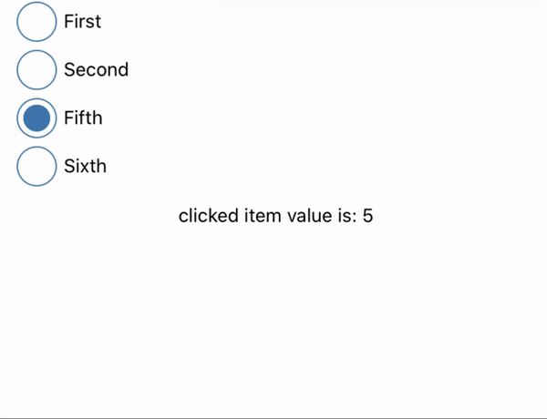
;;; const App = { console; const val setVal = ; { ; } return <> <SafeAreaView style= backgroundColor: "#085b7c" flex: 0 /> <SafeAreaView style= flex: 1 marginHorizontal: 10 > <RadioButton outerWidth=30 innerWidth=20 borderWidth=1 data=listData color="steelblue" onPress=pressCircle wrapperStyle= padding: 3 /> <View style= marginHorizontal: 10 marginVertical: 10 alignItems: "center" > <Text>"clicked item value is: " + val</Text> </View> </SafeAreaView> </> ;}; const listData = label: "First" value: 1 label: "Second" value: 2 label: "Fifth" value: 5 label: "Sixth" value: 6 ; ;Basic Usage of rn-radio-button
<RadioButton data=listData color="steelblue" onPress= console wrapperStyle= padding: 3 />Advanced Usage of rn-radio-button
<RadioButton data=listData outerWidth=30 innerWidth=20 borderWidth=1 color="steelblue" onPress= console wrapperStyle= padding: 3 />Parameters of rn-radio-button
| Property | Type | Default | Description |
|---|---|---|---|
data |
array of objects | [] | Required |
outerWidth |
integer | 20 | define width of outer Circle ( optional ) |
innerWidth |
integer | 10 | defined Width of inner Circle ( optional) |
borderWidth |
integer | 1 | define borderWidth of outer Circle |
color |
string |
'steelblue' | Define primary color for inner and outer Circle |
onPress |
function |
- | Define function for get value of selected radio button |
wrapperStyle |
Object style |
- | Styling for wrap outer side of Radio Button |
horizontal |
boolean | false | make list of radio Button wrap Horizontally |
Demo
- cd ExampleApp/ && npm install
- cd ios && pod install
- cd .. && react-native run-ios