rn-modal-view
Inspired by react-native-modal.
This module is base on View component rather than Modal, Modal component still has many issue in current react native version.
Fix Native Modal Issue
- Can't show multiple modals one after another.
- Can't show multiple modals at the same time.
- Can't show react-native-loading-spinner-overlay at the same time.
- The StatusBar style changes (or not changes) when the modal shows up.
- Screen changes when modal visible, component will remain some android device, that cause UI can't be touched.
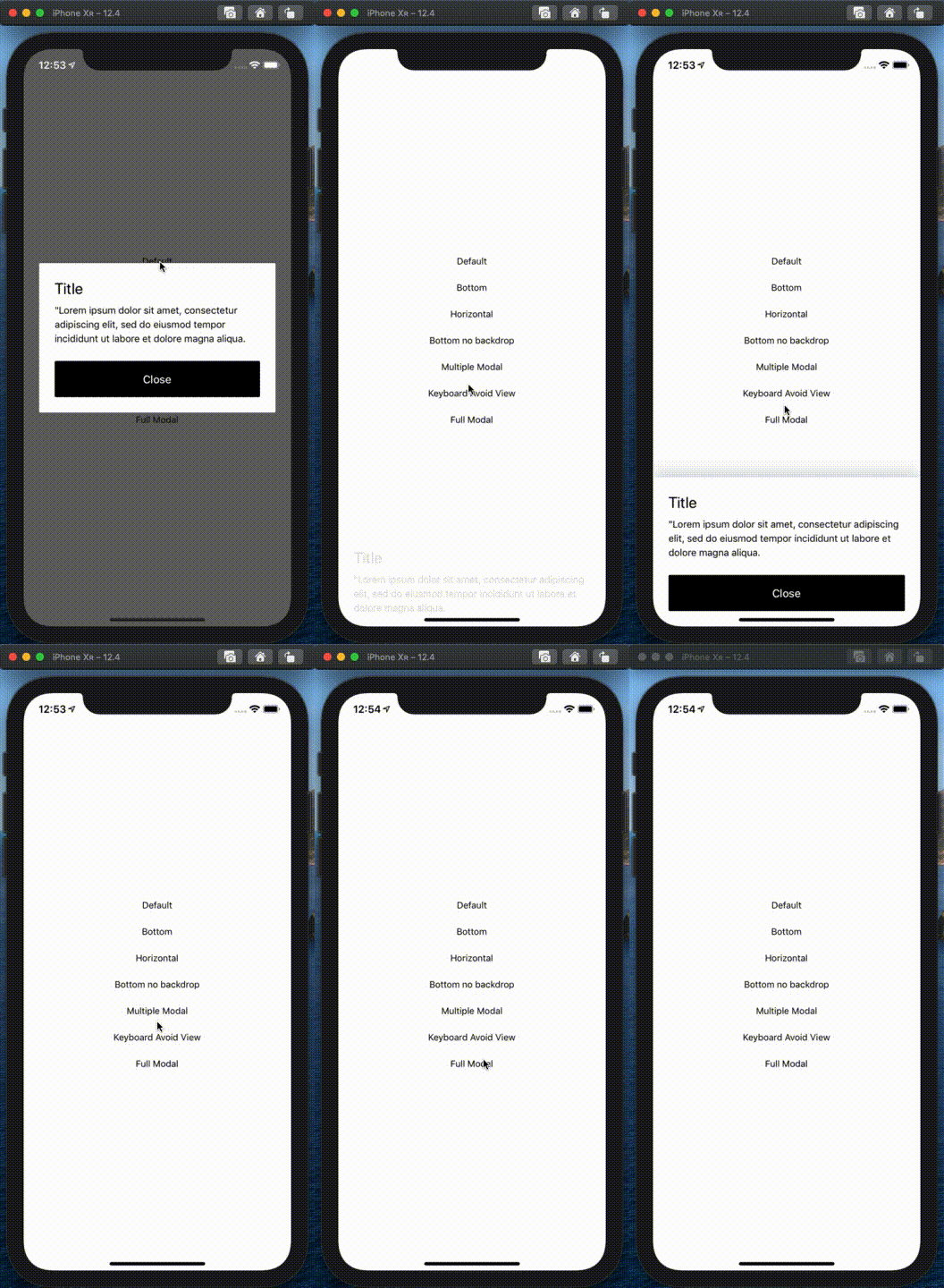
Demo
Setup
# Using npm:
$ npm install rn-modal-view

# Using yarn:
$ yarn add rn-modal-view
Usage
- Import rn-modal-view
import Modal from 'rn-modal-view'- Create a modal and nest its content inside of it:
return (
  <Modal isVisible={isVisible}>
    <View style={{ backgroundColor: 'white' }}>
      <Text>I am the modal content!</Text>
    </View>
  </Modal>
)
The isVisible prop is the only prop you'll really need to make the modal work: you should control this prop value by saving it in your wrapper component state and setting it to true or false when needed.
- A complete example
function App() {
  const [isVisible, setIsVisible] = useState(false)

  return (
    <View style={{ flex: 1, justifyContent: 'center', alignItems: 'center' }}>
      <Pressable onPress={() => setIsVisible(true)}>
        <Text>Default</Text>
      </Pressable>
      <DefaultModal isVisible={isVisible} toggleVisible={() => setIsVisible(false)} />
    </View>
  )
}

function DefaultModal(props) {
  const { isVisible, toggleVisible } = props

  return (
    <Modal isVisible={isVisible} onBackdropPress={toggleVisible}>
      <TouchableWithoutFeedback>
        <View style={{ backgroundColor: 'white' }}>
          <Text>I am the modal content!</Text>
        </View>
      </TouchableWithoutFeedback>
    </Modal>
  )
}
More applications
The sample code of Demo is in the example folder.
/
├─ src/
│  ├─ component/
│  │  ├─ BottomModal.tsx
│  │  ├─ BottomNoBackdropModal.tsx
│  │  ├─ DefaultModal.tsx
│  │  ├─ FullModal.tsx
│  │  ├─ HorizontalModal.tsx
│  │  ├─ KeyboardAvoidModal.tsx
│  │  ├─ MultipleModal.tsx
│  │
│  ├─ lib/
│  │  ├─ animation.ts
Available props
| Name | Type | Default | Description |
|---|---|---|---|
| animationIn | string or object | 'slideInUp' | Modal show animation |
| animationInTiming | number | 500 | Timing for the modal show animation (in ms) |
| animationOut | string or object | 'slideOutDown' | Modal hide animation |
| animationOutTiming | number | 500 | Timing for the modal hide animation (in ms) |
| hasBackdrop | bool | true | Render the backdrop |
| backdropTransitionInTiming | number | 300 | The backdrop show timing (in ms) |
| backdropTransitionOutTiming | number | 300 | The backdrop hide timing (in ms) |
| children | node | REQUIRED | The modal content |
| isVisible | bool | REQUIRED | Show the modal? |
| onBackButtonPress | func | () => null | Called when the Android back button is pressed |
| onBackdropPress | func | () => null | Called when the backdrop is pressed |
| onModalWillHide | func | () => null | Called before the modal hide animation begins |
| onModalHide | func | () => null | Called when the modal is completely hidden |
| onModalWillShow | func | () => null | Called before the modal show animation begins |
| onModalShow | func | () => null | Called when the modal is completely visible |
| style | any | null | Style applied to the modal |
| zIndex | number | 101 | The property specifies the stack order of an element, An element with greater stack order is always in front of an element with a lower stack order. |
Frequently Asked Questions
Trigger onBackdropPress event when click View
Wrap TouchableWithoutFeedback on the outer layer of View, because View has a pointer-event props, TouchableWithoutFeedback can stop the bubble propagation.
My Modal is invisible
Check layer order of View, the module is base on View, you should place it at the end of all components.
How to place Modal to the bottom?
<Modal
  isVisible={isModalVisible}
  style={{ justifyContent: 'flex-end' }}
/>
How to change full modal slide-in start point?
You could refer to react-native-animatable/definitions/fading-exits.js source code, overwrite the default value, customize your animation.
Why zIndex default value is 101?
Less 100 will be covered by react-native-reanimated-bottom-sheet, if you have position absolute component or other use case, this is a very useful props.
Available animations
Take a look at react-native-animatable to see the dozens of animations available out-of-the-box. You can also pass in custom animation definitions and have them automatically register with react-native-animatable. For more information on creating custom animations, see the react-native-animatable animation definition schema.
Acknowledgements
Thanks @oblador for react-native-animatable, and to anyone who contributed to this library!
Pull requests, feedbacks and suggestions are welcome!

