React Native Light DatePicker


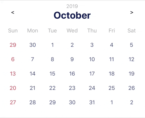
Lightweight date range picker without dependencies for React Native.
Install
$ npm i rn-lightweight-date-picker --saveExample
  state = {
    minDate: new Date(2018, 12, 31)
  }

  onChange(data){
    const { start, end } = data;
    if(start && data) api.fetchSchedule(start, end);
  }

  render(){
    return(
      <Calendar
        locale = "ru"
        userStyles = {{ topBar: { controls: 'flex-start' }}}
        userColors = {{ title: 'blue' }}
        maxRange = {10}
        minDate = {this.state.minDate}
        onDateChange={this.onChange}
        format="dd.mm.yyyy"
      />
    )
  }
Contributing
Feel free to open new issues if you have any problems or suggestions.
Properties
All properties are optional
| Prop | Type | Default | Desc |
|---|---|---|---|
locale |
String |
Device language | Calendar localization. |
onDateChange |
Function |
(date) => {} | Returns chosen date. Range mode: {start: value, end: value}, single: value. value: if date selected - Date object, if selected and format specified - String, if not selected - false. |
format |
String or false
|
false | Example: "dddd. mmmm - yyyy". See below for details. |
userColors |
Object |
{} | Override colors. See below for details. |
userStyles |
Object |
{} | Override styles. See below for details. |
minRange |
Number or false
|
false | Minimum avaliable size of selected range. |
maxRange |
Number or false
|
false | Maximum avaliable size of selected range. |
minDate |
Date or false
|
false | Minimum avaliable date to be selected. . |
maxDate |
Date or false
|
false | Maximum avaliable date to be selected. |
mode |
String |
range |
single or range. Gives opportunity to select only one date or range(If range you can select one date too). |
titleFadeDuration |
Number |
300 | Title switching duration in ms. |
swipeDuration |
Number |
300 | Month switching duration in ms. |
initialDate |
Date |
new Date() | This date will be shown in calendar on load. Default is Current Time. |
showControls |
Bool |
false | Specified if arrows controls are visible(doesnt disable swipes). |
leftControl |
Component |
<Text>{ "<" }</Text> |
Specified left control. |
RightControl |
Component |
<Text>{ ">" }</Text> |
Specified right control. |
highlightToday |
Bool |
true | Specified if current date should be highlighted. |
rowheight |
Number |
30 | Week height in calendar. |
rowPadding |
Number |
7 | Week padding in calendar. |
Styles
All styles could be overwritten. If you want you can also easily change only colors. Below you can see what values are responsible for styles or colors, you can override them in userStyles or userColors.(Components are colorized just to facilitate understanding)

Date format
Example dd dddd mmmm : yyyy will become 01 Sunday September : 2019.
| Prop | Type | Default | Desc | Default | Desc |
|---|---|---|---|---|---|
dn |
T | mn |
S | yy |
19 |
d |
1-31 | m |
1-12 | yyyy |
2019 |
dd |
01-31 | mm |
01-12 | ||
ddd |
Thu | mmm |
Sep | ||
dddd |
Thursday | mmmm |
September |