Responsive React Accordion
Installation
# npm install
npm i responsive-react-accordion
# yarn install
yarn add responsive-react-accordion
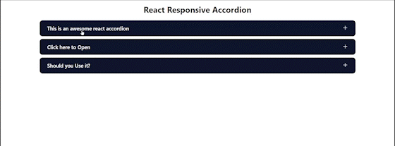
Demo
Usage
// import the npm package
import { Accordion } from 'responsive-react-accordion';
Simple example
// Simple example
<Accordion
  title='This is an awesome react accordion'
  content='This is hell awesome 🔥'
/>
Render prop example
// Props example
<Accordion
  title='This is an awesome react accordion'
  content='This is hell awesome 🔥'
  openIcon={Opening Icon}
  closeIcon={Closing Icon}
  spacing={10}
/>
Props
| Prop |
Type |
Description |
| title |
String |
The title of the accordion. |
| content |
String |
The content inside the accordion. |
| spacing |
Number |
The spacing between the accordion. |
| openIcon |
any |
The customizable opening icon. |
| closeIcon |
any |
The customizable closing icon. |
Complete example
import { Avatar } from 'user-profile-avatar'

function App() {
  return (
    <div className="App">
      <Avatar
        src='Enter your image Link'
        alt='profile'
        size={80}
      />
    </div>
  );
}

export default App;
CSS Styling access to containers
/* .accordion-container is the parent container */
.accordion-container {
  /* enter your css */
}

/* .accordion this is a extra wrapper for the main component */
.accordion {
  /* here you can add a univeral bg color and style the remainig component according */
  /* example */
  background-color: #0d152d;
  border: 2px solid white;
  border-radius: 12px;
  color: white;
}

/* .accordion-title this is where the title of accordion is kept */
.accordion-title {
  /* style the title of the accordion  */
  /* example */
  font-size: 20px;
  font-weight: 600;
}

/* .accordion-collapsible the collapsible content */
.accordion-collapsible {
  /* style the content of the accordion */
  /* example */
  background-color: white;
  border-bottom-left-radius: 12px;
  border-bottom-right-radius: 12px;
  color: black;
}

/* .accordion-icon  the icons in the .accordion-title element */
.accordion-icon  {
  /* to set the size of the icon */
  /* example */
  width: 20px;
}